Thursday 31 October 2013

Studio Brief 3: Name tag

To make the name tag, I scanned in the letterforms needed and placed them together on photoshop to the right scale like below. 


I then printed it and traced over it onto the right sized card. I found this quite difficult because of the small scale. I prefer how the letters look when they are much larger, which reflects that this typeface wouldn't work that great as a body font.

Studio Brief 2: Illustrator

The next step I've taken is putting the alphabet of Garamond Bold (the original font I worked with) into a 4 x 7 grid.


I did this because the changes I'm making can be made in mass, which will save me copious amounts of time. This layout is also the requirement for the brief. Next I removed areas of the letters as I have previously shown, except that I elongated the boxes so they covered four letters when removing parts of them. I made measurements of the width between the cap-height and baseline, so that I could split the letters into three equal parts. 


Studio Brief 2: Illustrator

For the first few illustrator sessions we were taught some basics to help us with Brief 2. We learnt how to make shapes and how to manipulate objects in the program. I thought these sessions were useful as I have used illustrator very little before, and its quite different from Photoshop.

After scanning the letter 'A' in, I placed the original drawing in an illustrator file and typed an 'A' in Garamond bold next to it in a similar size, to make the crossover of manipulation clearer and easier. I drew a box that was a similar size to the gap in the 'A', which I laid over the letter and aligned it with the original.

We were introduced to the pathfinder in the earlier workshops, which now has come in handy so that I can cut out the two areas of the 'A'. I clicked 'minus front' which cut out the area of the letter, leaving a gap in the object like below.


I then added the other empty segment to the letter, so it was then a replica of the original manipulation I drew by hand. 


I then experimented with different weights of the letter in terms of the empty space, making a few different variations.


The one I prefer is the letter with the third widest space. It doesn't break up the letter so that it is not legible, yet it still has enough impact. I think the most extreme variation I created isn't very legible as a letterform, whereas the A with very thin spacing manipulation still looks too whole; I want to portray different segments.

Wednesday 30 October 2013

Studio Brief 3: Further development

I'm set on portraying Matthew's comfort zone and pessimistic attitude in the alphabet, but without making the whole of the letterforms revolve around it.


I've experimented with varying the sharpness and softness of the corners of the stems on the letter 'm'. This shows Matt's fun side paired with his pessimism, as the harsh edges make me think of this. I don't think I want to use these ideas but this has led on to more ideas of how I can portray these chracteristics.


As a lead on from the last experimentations, I am trying out small boxes on parts of the letters. This is reflecting Matthew's comfort zone and pessimism, which contrasts with his ability to find humour in many aspects of life.
I have picked the letter 's' as a starting point because its a very rounded letter so making the sharp corners work with the curves may be a challenge. 
I think that keeping the boxes in the corners of the letter like the 's' on the far right is the best way to go, as it contrasts again the large curves and gives the impression of a box or cage around the whole letter. I'm not sure what size to draw them yet, but I don't want the boxes to take over the whole letter, nor do I want them to look unclear and too small.


Above is experimentation with the layout of the small boxes. I think its important to try out a variation of letters which all have different anatomies, so I can figure out if my manipulations will work through the whole alphabet. 
I definitely want only two boxes on each letter and for them to be diagonal from each other. 


I've decided that I want the boxes to be in this orientation as I've found with some letters it works better around the anatomy.

Tuesday 29 October 2013

Design Principles: task 3

  • There are different families of typefaces. Faces of the same typeface can look very different but still be part of the same family. They divide into Regular, Bold, Italic, Light - with the addition of ultra/extra to them.
- X-height is the height of lowercase letters, when descenders and ascenders are excluded.
- Cap height is the height of a capital letter.
- Baseline position is the line on which all characters sit.

- The standard font size is 12 points = 1 pica, and 1 point = 0.3527mm. Point size is the measurement of the cap height to where the descender ends.

- Fonts are made up of glyphs, which includes numbers, punctuation marks, and different kinds of symbols.

- Typefaces are font families, and have one or more fonts which each share the same design features. Regular, bold, italic, and light are common fonts within a family.

- There are four categories when it comes to classifying fonts:

  • Roman: slim fonts that contain serifs
  • Block: chunky fonts with wide lettering
  • Script: have a brush stroke effect
  • Gothic: simple and sans serif


Task set: choose 6 fonts, one for each process that we have learnt about in the last session. Bring in 'a, b, c, x, y, z, A, B, C, X, Y, Z'.

I chose:
Stone: Century

Silicone: Braggadocio

Lead: Droid Sans


Wood: Abadi MT

Bone: Zapfino

Sable: Brush Script MT Italic


From these five we had to choose one of them to alter by either cutting away or adding things to the letterforms. I chose the Abadi typeface, which is a wood typeface. I slimmed down the letters using a scalpel.


I found this task quite hard to make creative as I'm very new to typography. I don't think that the letterforms are consistent as a set, but I have learned from this.
We were then set the task of creating regular, bold, light and italic of our adapted font:


I found it difficult to keep the letterforms matching when creating the bold and light, but I think I did an alright job. I don't think I made the italic slanted enough; I wasn't sure about how to go about creating it.

Studio Brief 3: Further development

 In the interim crit I was told by a few people that Cooper Black wasn't the best option for Matthew, but I am going to carry on developing and experimenting with it as I personally think it is suitable. I also think that my manipulations will justify it in the end.


 I have experimented with the letter 't', as the original design of it in Cooper Black is quite unusual.
I want to elongate the ascenders in the whole alphabet, as I think the font in its original length is too short and Matthew is quite tall and slim. This seems like a very irrelevant reason to use, but fonts have sub-conscious effects on the brain, and for me having a taller typeface is more relevant.
Out of these experiments I prefer the second, as it keeps some of Cooper Black's style. However, a slimmer version of this letter may end up in the crossbar and stem joining look incorrect.


To reflect Matthew's comfort zone, I want to look into decreasing the size of the empty space in letters in the bowls, eyes and counters. Here I've experimented with an extreme shrinking of the eye, which I won't take forward.


Type Journal: Colours May Vary tote bag


The kerning has been set so that 'colours' is the same width as 'may vary' to create a nice balanced logo.
The typeface is sans serif, straightforward and simple. It is uppercase.
The o's are particularly wide, and the bars on the letters are very low.

Monday 28 October 2013

Studio Brief 4: Interim crit

In this crit I was told that:

  • going down the route of sensationalism of subject matters like terrorism or women in newspapers may make a good body of research
  • looking at women in terrorism further may not provide enough substantial research
  • possibly look at what is reported in the news and what isn't: the media chooses which is more entertaining.
this feedback helped and I will not go down the route of women in terrorism any further as I agree that it won't be fulfilling as other paths I can choose.

Studio Brief 4: Mental illness, Islam or revenge?

I have looked at a few different articles that focus on acts of mass violence and the differences between mental illness and terrorism.
Aaron Alexis who perpetrated the mass killing at Washington’s Navy Yard is part of the now familiar pattern of lone gunmen striking at American society with sickening frequency. There was no rational, political, social, or religious arguments behind what Alexis did.  His actions, though thoroughly condemned, were explained away as the wayward and solitary acts of a mentally disturbed individual. America made the right noises–the president said the right words–and then went about its business.
The American media, after sniffing about for any Muslim connection and discovering none, did not use the word “terror” to describe the incident at the Navy Yard. Terrorism has unfortunately become a shorthand for “a violent act committed by a Muslim.” We see no “terror experts” pouring through the verses and holy books of Alexis’s former religion, Christianity, or his new religion, Buddhism, to find any reasons for his murderous act, as is the case whenever a Muslim commits any such violent crime. They rather pointed to his history of mental illness and paranoia, such as reports of hearing voices and claiming people followed him with a microwave machine.
What happened in Nairobi and Peshawar was quite different. In Peshawar, the Taliban group responsible for the attack declared that they had committed the suicide bombing of All Saints Church in revenge for American drone strikes in the Tribal Areas. A Taliban statement read, “Until and unless drone strikes are stopped, we will continue to strike wherever we will find an opportunity against non-Muslims.”  In Kenya, al Shabab announced its assault on the Westgate Mall in Nairobi as revenge for the 2011 Kenyan military invasion to oust al Shabab from control of southern Somalia, where Kenyan troops are still stationed. An al Shabab spokesman stated, “Either leave our country or live with constant attacks.”It is clear that the actions of the Taliban and al Shabab, both emerging from tribal societies (the Pashtun and Somali, respectively) with defined codes of honor, is not motivated by religion but a mutation of tribal behavior which emphasizes revenge. All their violent actions, despite the ominous warnings of the “terror experts” who point to verses of the Quran, are in fact antithetical to both their tribal and Islamic traditions.
 Islam categorically rejects this kind of violence, calling upon Muslims to practice compassion above all. Abu Bakr, the first caliph after the prophet, laid down the rules of war which were to be practiced by all Muslims, among them the forbidding of killing innocent people. The prophet was, likewise, explicit about the prohibition of violence against Christians. In a letter to St. Catherine’s Monastery in Sinai, he wrote, “No one is to destroy a house of their religion, to damage it, or to carry anything from it to the Muslims’ houses…The Muslims are to fight for them…Their churches are to be respected. They are neither to be prevented from repairing them nor the sacredness of their covenants.” The violence in places like Peshawar and Nairobi has nothing to do with religion, but rather the broken relationship between central governments and tribal peripheries. 
http://www.washingtonpost.com/blogs/on-faith/wp/2013/09/24/mental-illness-islam-or-revenge-understanding-terrorism-from-the-navy-yard-to-pakistan-to-kenya/
Firstly, the preponderance of religiosity in psychotic episodes is a well-documented phenomenon. That’s not to say that religion causes psychosis, of course, but that, probably due to religion’s central role in much of society, people given to psychotic episodes oftentimes latch on to religion in strange and severe ways.
http://www.thenation.com/blog/169063/why-cant-terrorists-be-mentally-ill-too#

Sunday 27 October 2013

Studio Brief 4: Tabloid islamophobia


http://www.mirror.co.uk/news/world-news/pictures-white-widow-samantha-lewthwaites-2477940

In the above article, the 'white widow' is referred to as "the British Muslim Convert" instead of using her name. To me this gives off bad ideas, like she is a terrorist because she converted to Islam. It seems like a very small detail that people may not pick up on but its subtleties like this that make people think Islamophobia is completely acceptable.

On the morning of 7 October 2006 The Sun newspaper splashed a dramatic story across its front page. The story – billed as exclusive – concerned a callous and cynical crime committed by Muslims. A team of Sun reporters described in graphic detail how what the paper labelled a "Muslim hate mob" had vandalised a house near Windsor. The Sun revealed that "vile yobs hurled bricks through windows and daubed obscenities. A message on the drive spelled out in 4ft-letters: 'Fuck off '."
One Tory MP, Philip Davies, was quoted venting outrage at this act of vandalism. "If there's anybody who should fuck off," Davies was quoted as saying, "it's the Muslims who are doing this kind of thing. Police should pull out the stops to track down these vile thugs".
The Sun left its readers in no doubt as to why the outrage had been committed. Local Muslims were waging a vendetta against four British soldiers who hoped to rent the house on their return from serving their country in Afghanistan. The paper quoted an army source saying that: "these guys have done nothing but bravely serve their country – yet they can't even live where they want in their own".
But there was one very big problem with The Sun story. There was no Muslim involvement of any kind. It is true that a house had been vandalised in Montagu Road, part of the comfortable and prosperous Windsor suburb of Datchet – as The Windsor Express had reported the previous day. It also looks very likely that the attack was connected with the potential arrival of four household cavalry officers.
http://www.independent.co.uk/news/media/the-shameful-islamophobia-at-the-heart-of-britains-press-861096.html

The above snippet is from an Independent article, which outlines racism/islamophobia practised in The Sun. I think in recent years newspapers have actually toned down anything offensive like this, but it can still be slightly picked up on. The more important issue is how the word MUSLIM being associated with terrorism has been fed to everybody in our society through the media.

Friday 25 October 2013

Studio Brief 4: Women in terrorism


The 'Black Widows'
An example of where females are used prevalently in terrorist attacks are the "Black Widows" within Chechnya. The Black Widows are female suicide bombers generally of Chechen origin, who have lost husbands (though sometimes also sons and brothers) in the Chechen secession wars against Russia.
Some attacks have been carried by group calling itself the "Black Widows Brigade". 
The 'Mother of Believers'
One of the more controversial cases of the utilisation of women as terrorists was a previous tactic used by Ansar al Sunnah in Iraq. Known as the "Mother of Believers", Samira Jassim admitted to recruiting, indoctrinating and training women to carry out suicide attacks for the organisation, particularly in the Baghdad and Diyala provinces.
On her arrest, Jassim said she had recruited 80 female suicide bombers, 28 of whom went on to carry out attacks. She also admitted to taking advantage of these women and had some of them raped to shame them into conducting the suicide attacks. After the rape, Jassim told the women that the only way they could escape this shameful act was to act as a suicide bomber.
Though this type of manipulation of females is incredibly rare and not generally used by terrorist organisations and insurgencies, in this case it was used as a means to carry out an attack while avoiding detection.
 Why do women commit acts of terror?
If the terrorist organisation or insurgency's membership is depleted, women are often recruited into the movement to not only build up numbers, but also to fill tactical gaps. Women are often considered capable in achieving "surprise attacks", because they are least expected.
Particularly in relation to attacks on "soft targets", such as public gatherings, markets and ceremonies, women are often considered to be able to blend into the crowd and subsequently are able to avoid detection. However in some movements, such as the Revolutionary Armed Forces of Colombia (the FARC), women are considered the military and are put on the frontline.
Why women choose to become terrorists depends on the individual, the organisation, and the political goal or aim of the group. In the case of some females – such as the Black Widows – it is to avenge the loss of a loved one such as a husband, brother, son or cousin. Sometimes the act of terrorism is also conducted to redeem the family name.
In this respect, women can become involved in terrorism for personal, rather than ideological, reasons. However, in the case of some movements like the FARC, female involvement is seen as a means of evening out patriarchy, and giving women a sense of empowerment, participation and accomplishment.
It is not surprising that significant attention has been given to the alleged involvement of the "White Widow", because the idea of a female terrorist is unexpected and quite confronting for some. However, it is also highly unlikely this will be the last time a female terrorist is propelled onto the scene.

http://phys.org/news/2013-09-white-widow-black-female-terrorists.html

I find this article about female terrorists really interesting, as its something that has never crossed my mind before; I always associate men with terrorism and huge acts of violence. This is what makes this story so unusual and provocative. I'm not sure if I should take this line of research further however, as I am unaware as to what I could research next and if I could put together a sufficient body of information.

Studio Brief 3: Interim Crit

For today's crit we displayed our work on the desks and walked around looking at eachother's work. From this we wrote down our feedback on an A3 piece of paper next to the work.
Below is my A2 sheet which I put together especially for the crit.


Some feedback that is especially useful to me:
  • 2 people said they prefer cooper black, however 4 people said they prefer gill sans. This is interesting because I prefer cooper black as a starting point, which is the unpopular opinion.
  • Look at Arial Rounded or Helvetica Rounded, as Matthew seems to like comfort and soft shapes.
  • Don't focus too much on what he prefers, ('smooth edges') as this is my representation of him.
  • Comfort zone > sans serif > the font doesn't get out of its comfort zone, should look tight like its very boxed in.
  • Gills sans works better at communicating his personality. Seems a very black and white personality, what you see is what you get, the sharp tones support this.
  • Matt is funny, so pick a playful looking font, however make sure it is not childish.
  • Could play on 'Pub landlord' and his surname 'Brewer', he also drinks a lot of alcohol.
  • He has childlike tendencies yet doesn't like children, look into this more so as these are opposing ideas.
  • Cooper Black seems like quite a loud/bold font to me - which doesn't link in with not being a 'loud, in your face person'.
  • Cooper Black seems like a warm typeface and says he likes winter. Maybe think about using a more angular typeface?

I don't necessarily agree with all of this feedback but I think they are important points that I can look into and work from when I further my development and experimentation.

 General points we picked up on as a group:

  • Hard to give some people feedback because of poor layout or unclear presentation. This is fair as we aren't used to crits just yet; we're still learning how to present our work in the right way.
  • I've learnt that the best way to present my work in a crit is on an A2 piece of paper, where I can stick down sketches and research all together on one page. This makes it much more straightforward when someone comes to leaving feedback. Some people put out their sketchbooks  and random piece of paper which is quite confusing, as I didn't know which page the project started on and where it ended, and which work was the most important to look at in more detail.
  • Some of us had too little work or too much, which can both make a crit difficult. Having too much work shows the exploration has been very broad so it gives less to focus on when giving feedback in such a short space of time, and having too little work doesn't show enough development.
  • It was good to see that people are researching further afield, for example looking at their partner's favourite designers or design movements. Other areas are colour theory and analysing handwriting. I haven't thought about looking at these things yet in my own work, but I definitely want to.

Studio Brief 3: Removing serifs and thinning letters

(red is the original font)


I've experimented with slimming the letters down, as although I like the boldness of Cooper Black, I feel its too extreme. Matt's personality is full of characteristics but his personality isn't in-your-face, so I don't want to start with an extreme block font. Block fonts are very loud and Matt isn't.
I don't want to make the change in width too drastic, just a few millimetres, I think that taking too much away from the original font will make my choice of Cooper Black seem pointless.

(red is the original font)


While working with the font Cooper Black, I've decided that I want to try removing the serifs from the letters, as the connotations of serifs are:
  • traditional
  • old-fashioned
  • roman
  • elegant
  • formal
I feel like none of these connotations fit particularly hand in hand with Matthew's personality. Even though the font overall is quite modern and informal, I still would like to remove them as it also gives more of a clean slate when manipulating the letters.
I will definitely not include serifs in my final alphabet.


(red is the original font)
Another experimentation I created was to soften the edges of the letters slightly. This is for more reasons than one:
  • Matthew told me that in terms of shapes, he prefers curves and smooth edges.
  • His personality is not harsh and doesn't have the connotations of sharpness.
  • it increases the reflection of fun.


Tuesday 22 October 2013

Design Principles: Introduction to type

The letter A - what is it? It is much more than just a letter, we have to think outside the box. It is:
  • vowel
  • sound
  • symbol
  • shape
  • lines
  • language
  • capital
  • uppercase
  • serif letter
We learnt about the processes of typography, and sorted our three chosen fonts into groups (our previous task was to choose three fonts with distinctively different characteristics). Mine were:

  • Colonna MT
  • Edwardian Style
  • Bauhaus 93

In groups we attempted sorting our fonts into 5 categories:

  • stone - has been carved into through history, and the serifs give curved edges so the stone does not crack.

  • sable - the use of a brush that originated in the far east. Curved lines are used.


  • bone - a quill or nib, which originated in the middle east. There is a clear contrast in line weights.

  • wood - originated in Europe in the 1400's. Thick and simple letterforms worked best in wood, and allowed type to be mass produced.

  • lead - a durable metal which can develop a whole range of possibilities, including thin lines.

  • silicone - developed digitally, with the ability to 'undo' and endless possibilites. Type that isn't able to be created any other way.

This is what we discovered about our types:

  • Bauhaus 93 - we first thought it was wood, but then realised it is silicone.
  • Colonna MT - stone, because of the serifs.
  • Edwardian script - bone
  • Times new roman - stone
  • Arial - wood
  • American type writer - silicone

These are some  features that help to make the decisions:

Anatomy
bold
italic
serif
line/stroke weight
consistency
curves/apex
case
straight or curved edges
legibility
formality

Identity
symmetrical
condensed
italic
bold
formality
font name
mass produced
context

Character
bold
corporate
feminine
decorative
simplicity
heavy
playful
industrial
geometric


Saturday 19 October 2013

Studio Brief 1: ALPHABET: - Final Nobility letters


These are my 10 chosen letters that represent the word 'nobility', which are manipulated from the font Garamond in bold.
I chose to explore the meaning of the nobility in the sense of 'the quality of belonging to the aristocracy'. The aristocracy is a small group of people that are considered the highest social class in a society. They have a great amount of privilege and power. The royal family are in this class, so I have looked into royalty aswell as money and power.

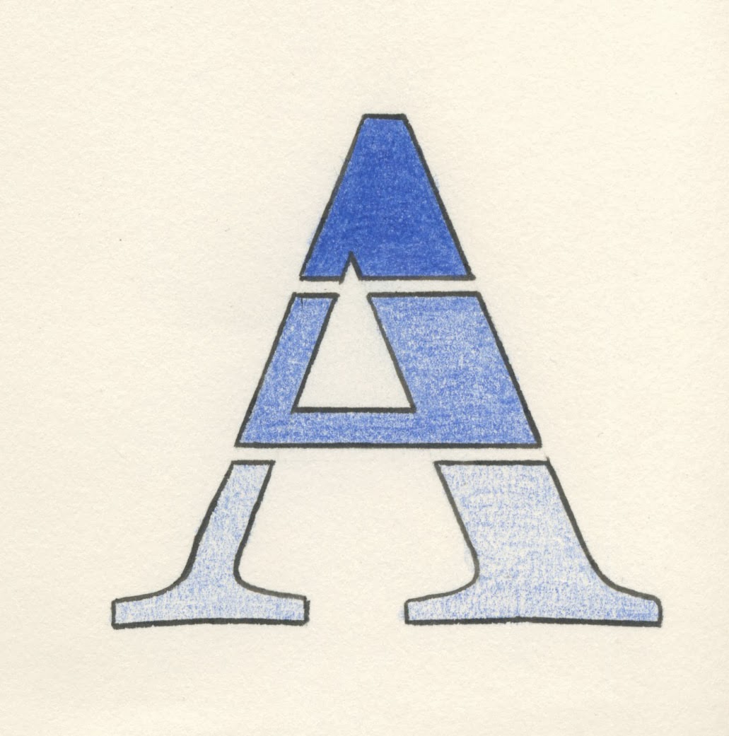
A - it is split into 3 sections to show the hierarchy of class in our society, and the colour blue has been used to reflect the 'blue blood' that in the royal family. I chose this letter because it is in the shape of a triangle which is often used to display hierarchies.

J - For this letter I have turned the tail of the 'J' into a drop of blue blood, to simply refer to royalty again.

N - I incorporated a sword into the crossbar for this letter, as the connotations of nobility are knights (in my group, somebody said that) and armour and medieval-ness. Nobility also makes me think of patriotism, which is linked to soldiers and defense of the royal family.

O - I've found that with nobility and the upper ruling class, the traditional crests are a deep connotation. I have incorporated the design that is found quite commonly in old styled crests into half of the letter.

P - Power is hugely related to nobility and the ruling class. The royal family have such incredible power over the country so I decided to represent this by drawing strong lines off the letter P in gold. I kept it subtle with thin outlines.

Q - I incorporated the queen's profile into the letter's bowl as if it is a coin. It represents money and the power that comes with it, and the royal family having such power. I outlined it with silver to subtly represent a coin.

R - I added a four-pointed star to the counter of the R, to represent glistening or shimmering jewels. This is linked to the royal jewels which represents wealth and the upper class very clearly.

T - I created the stem of the T from a pile of coins to again represent wealth of the upper class and the nobility's power with it.

Y - I created the edge of the left stem with pearls, which are iconic within the royal family and the female members over the years. I added a hint of gold to each pearl to give it a slightly fancy touch.

Z - For my final letter, I chose Z because I could show the clear difference between the rich and poor within our society as the letter is mirrored from top to bottom but pointing opposite ways. The top of the letter is the upper ruling class, which I have filled in with solid black and outlined in silver to represent the sturdiness and strength that they have as a class. The bottom of the letter has been quickly drawn in a rough manner to show the unsafe and weak nature of the lower classes in comparison.