Showing posts with label studio brief 3. Show all posts

Wednesday, 22 October 2014

OUGD504 // Studio Brief 03: Web design session 2

Important:
UI User Interface
UX User Experience
Always consider when web designing


Limitations
Web safe colours
12 shades of grey
or
216 colours
Not a good habit to type in the colour's name instead of the code

Never start designing while working in dreamweaver - always away from the computer.

Web safe colours
RGB is capable of reproducing nearly 17 million colours - 16,777,216
The 216 are web safe, the rest are not.
Colours are created by specifying the percentage of 255 per RGB.
100% red is: rgb(255, 0, 0)

Web safe fonts
For a chosen font to display consistently across different computers a standard font must be used.
Most computers will not have uncommon fonts installed so they will not show up.
A font with multiple words in the name need to be grouped together with speech marks, otherwise they will try to be identified as two separate fonts.
Fonts that you want to be chosen will need to be put in order of preference incase the first is not found or available.
eg Arial, Helvetica, sans-serif
using @font-face with CSS breaches copyright with font foundries, so be careful.

Size, dimension, pixel resolution
640 x 480
800 x 600
1024 x 768
2880 x 1800 (220 ppi)

1024 x 768 is recommended.
Be aware of different screen sizes when web designing.

File formats
PNG, GIF, PDF, JPEG
72ppi, RGB
lossy, compressed

JPEGs do not support transparency, while PNGs do.
PDFs for multiple page documents.

There is always a bandwidth limitation, which is cut into every time a web page is visited. Using 72ppi makes the file sizes a lot smaller, rather than say 90ppi.

Best to do 3 sketch designs initially.
If you sign a design that a client agrees to, they have to pay you even if they aren't happy with it when it's finished.
Make all measurement decisions on paper, which is called a wire frame. 


User work
everything has to go in the same folder
Hard drive > Local > images

Dreamweaver
Site>New site>


save the home page as 'index' because the web is universal

Add CSS as link to html, not import.
Do not delete the file extension when saving.

Do not go File > Open. From the side bar.
HTML
Only things that affect the functionality of the website go in between <head> and </head>, nothing visible.
Content goes in between <body> </body>, and will only become visible this way.

(Sitemaps) -

HTML
index.html
>about.html
>contact.html
>gallery.html
>shop.html
coding has to be done on all separate pages.

CSS
>stylesheet.css
coding only has to be done once, it links to all of the pages.

CSS
/* notes here */
Anyone can see notes.
Never import a CSS file into a html file.


Useful books
Html & CSS - John Duckett
CSS Mastery

For next session
A scamp
Sitemap -
Wireframe - measurements

Wednesday, 22 January 2014

Studio Brief 3: Final 5 spread layouts


Typefaces:

  • Cooper Black Italic - headings. I chose this typeface because it is especially retro when in italic, and comes across as friendly and soft. I wanted to keep the spreads very informal. Also, cooper black is very adaptable when it comes to different age ranges.
  • Avenir Book - body text. This font is easy to read and isn't so generic that it goes unnoticed - I wanted to use something fresh that hasn't been overused, seeing as the spreads are so minimal I wanted to add character.

Target audience: music lovers, between the ages of 18 and 60.

Spread 1 - 8 facts, 1 photograph
Spread 2 - 10 statistics, 4 photographs
Spread 3 - 8 words, 10 photographs
Spread 4 - 20 opinions
Spread 5 - 7 statistics

These spreads were created to represent my 100 research. I based my research on audio formats and album artwork, as album covers are really intriguing to me personally.
I wanted to create a booklet that informs the reader of different formats of audio and their decline, such as cassettes being nearly extinct and vinyls rising to the top again because of their distinct novelty. I included images of album covers that I think are exceptional in their aesthetics that make the reader realise how awesome vinyl covers used to be when they were much more important and recognised than they are now.
I included new and old album covers on the page with the opinions; this shows an interesting range of opinions and what is noticed in this day and age. A lot more new album covers were favoured than I thought they would be... personally, older covers come to my mind sooner than newer ones.
They are a collection of 5 lighthearted spreads that could be found in a zine or leaflet in a music shop of some sort.
I gained inspiration from free zines and booklets I came across in vinyl stores; such as Howard Assembly Room and The City Talking. These helped me figure out what layout is about when to do with music, as I had no clue before this brief.


For printing, I chose antique white paper to give a old, faded effect which is to reflect the vinyl album artwork I researched. I didn't go with bright white paper or normal printer paper because when printing for the crit, I thought the spreads looked tacky and cheap.
The faded colours blue and pink have added subtle vividness to the spreads, which are linked to common colours I've spotted in artwork on album covers.
The thin dark lines that I have used here and there on the spreads come together to subtly reflect the lines found on sheet music, that started off as a more bold part of my designs but I toned it down.

The images on the spreads came out quite grainy, which reflects my new abilities in inDesign; something went wrong there. However, I quite like the effect, as it suits the paper and the faded colours I used. An accidental success, that will help me learn for the future. I think if I had more time on this brief, I would make the content even more specific.

Tuesday, 21 January 2014

Studio Brief 3: Layout development - spread 4

For this spread I want to have visual statistics on it. I've taken them from my survey on surveymonkey and made them colour co-ordinated with the other spreads on photoshop.


I am replacing the headings with my own in italic cooper black to fit the spreads. This page is going to be straightforward and to the point. Not sure whether to add photographs somewhere, but I don't think there will be much room.


I've resized and lined them up very neatly for effect. The lines at the bottom are like the sheet music type lines I got rid of, however they are less obvious here and just add a little something to the page.
I added a few more statistics at the bottom of the right page, to fill the space a little bit.

Studio Brief 3: Layout development - spread 3


This was what I put together for the final crit, which was obviously unfinished. The grey boxes show where the photogrpahs will be placed and the placeholder text is to show possible facts or statistics, although I'm not sure now that I even want to use any text at all on these pages.


I've started adding my photographs to the page, I've picked ones that reflect vinyl artwork solely.


I'm trying to make the layout more interesting here, but I'm not sure if it'll work with the text, I may need to add more photos. I have also adjusted the opaqueness of the colouring, which I got told in the crit to do to make it all look more faded. I like this effect and I want to use it through all the spreads.


I got rid of the text, as I don't need it on this page. I like it with just photographs and words from my 20 words. I removed the music note bars from the top and bottom of the spread; I think they look tacky and I've changed my mind. I just made the lines very minimal so add little touches to the spread. They are still slightly reminiscent of sheet music.
The photographs are in a similar layout but I have made them uneven across the two pages to add more of an interesting dimension.

Studio Brief 3: Layout development: spread 1


Above is what I finished for the final crit. I learnt from people that the text in pink isn't very legible and clashes with the photograph. I was also advised to stick to the same colours for text; which I understand, but I want to use both white and black throughout. I like this layout of the text, but I think that I want to make it even more simplistic. I've looked at my research again to help me with this, as one spread I looked at used a photograph over two pages like this.


This is the layout I settled on. I changed the body font to Avenir, which I think has a great retro and informal feel about it. I also took some text off the spread and lined up the text boxes very neatly. Changing the text colour from pink to white had definitely improved it overall and has made it more neat and classy.

Studio Brief 3: Layout development - spread 2

Below is what I created for the final crit.


  • I created this in inDesign, by adding four photographs of my own and some placeholder text (for now). I want this page to hold information about each audio format, using statistics/facts from my research. I have used cooper black through out because I feel it had a retro feel about it, and gives me an instinct feeling of the past. I want to instill a retro feel because a big focus of my research was vinyl and record album covers.
  • I've chosen to use blue and pink because they are common colours I found when looking through vinyl albums. They represent the vividness in old album artwork.
  • I added lines at the bottom to show a reading music bar, which runs through most of the spreads for a clear individual theme to do with music in general.
  • I want to keep all spreads simple and clean looking, as I don't want to overdo with the information and I want a big of the focus to be on photographs.
  • The crit said that the layout of the text with the images on this spread didn't look right, and that the bars at the bottom aren't very flattering.

From this I've decided to change it round...


Here I have made the photographs boxy in shape, which someone in the crit told me to work with in my layout to reflect album covers/etc... I thought this was a great idea to try out and I like it.


The boxes weren't too aesthetically pleasing, so I've narrowed them down to small thin rectangle/lines underneath them to give them a big of a highlight. From here, I'm trying to decide where to place the text so that everything will fit together nicely.


 From looking at my layout research, I have decided to have both pages very similar in their composition; photographs on right, text on left. I'm making the text boxes very square to reflect the box theme throughout which reflects albums.


I felt the pages were too simple so I've added thin outlines to the text boxes and two thin lines at the middle and bottom of the pages to give a finishing touch.

Studio Brief 3: Layout development - spread 5


Above is the layout I created for the crit which includes my 20 opinions from my research. The 20 opinions are the favourite albums of 20 people I asked. It is filled with placeholder text at this point.
The dark circle is to represent a vinyl record,which also fits in with the shape of a CD. The pink side shows a sort of sleeve effect. I like these add ons, as its unique, but it may be a bit overbearing, along with the pink. I don't know yet what text to put on this spread, maybe some information about which albums they are?


I want to develop this spread more. In doing this I have collected each individual album photo again from the internet and saved them as psd files to maintain quality.
Below I have changed "Popular album covers" to "20 Favourite Album Covers"to make the spread mroe precise. I have also experimented with moving the circle shape around the pages.


I like this placing, as it isn't too in your face like it was in the middle of the spreads. It gives the albums room to breathe, and it can give a nice backdrop for the text.


I've put the names of the 20 albums in the corner in white text to contrast with the dark circle/vinyl shape. I've spread out the albums compared to when I first made the layout, as I think they were too cramped before. I like the uneven overlapping on the two pages; it gives an interesting slant to it as a spread.

Tuesday, 7 January 2014

Studio Brief 3: Layout ideas

  • black background, white text - I think the only problem with using a black background for a spread is that the printers in the studio don't print black well at all and fitting in a session at the digital print resource will be too hard.
  • use curves or circles to represent vinyl/CDs - I want to create conceptual designs in my layouts, while staying subtle, so the idea of using curves or circles seems pretty plausible, however I do like boxes and sharp edges so I don't know how often I would want to use this kind of feature.
  • photo background - this is a feature I've seen used before and I think its really effective and looks great. It creates a visual context for the content.
  • 4 photos on each spread - it is quite known that some people lose interest when there is nothing interesting to look at on a page, so using photographs each time to brighten it up would be a good idea.
  • use vectors of line images of vinyl/CD/tape - I want to possibly use some illustrations based on audio formats, if I have time to draw them, to make the layouts more 

I want to spread out my information across the 5 spreads, rather than have them separated and given a spread each. This is because from looking at other booklets etc this is what normally happens with page layouts. I think that one entire page of 20 statistics would be too much for the reader to take in.
I also want to use less than 100 things, however I may be able to fit them all in in the end. I just don't want to focus on squeezing in lots of information more than my actual designs.

Layout idea 1 
Across the double spread:

  • 3 facts
  • 4 photos
  • 1 statistic


Layout idea 2
Across the double spread:

  • 20 opinions - album covers

Layout idea 3
Across the double spread:

  • One photograph as the background
  • 5 statistics

Layout idea 5
Across the double spread:
  • 4 statistics
  • some sort of line image of earphones, maybe white on a blue block colour
  • 4 photos
  • words from my 20 words


I've thought of the idea of having music notes across all the spreads at the top and bottom, possibly. I'm not confident with this idea yet as I want to try it out on indesign to see how it'd look properly. However I think it would add a nice conceptual touch to it, and a clear theme throughout.
    Text on left in three uneven columns, with a large statistic of fact on the right page taking up all the space. I like this idea of unevenness between the pages, on one side there is small body font and then big typography on the other side. I've seen this in some of my research and it certainly drew me (the viewer) in.


Saturday, 2 November 2013

Studio Brief 3: Final crit


We did a crit in a group of around 25 people, where we all took turns to present our work. I talked about why I've manipulated Cooper Black in the ways that I chose, and how Matthew's personality is reflected by the letterforms.
Some feedback I got:
  • Cooper Black is a fun and informal font, so that was a good choosing
  • The comfort zone is definitely reflected by the boxes
  • the manipulations aren't very clear from far away
  • the letters work better when large and close up, they aren't as successful on a name tag.
I think I agree with these points. If I had more time to complete this brief, I would have maybe developed my ideas more and come up with better solutions. I definitely think that if I did the brief again, I would complete the final letters on illustrator and print them for the final crit. This way the boxes would look a lot neater and sharp, they were harder than I expected to draw by hand. I thought that drawing each letter by hand would be more straightforward than on illustrator, however it was very time-consuming in the end.

Friday, 1 November 2013

Studio Brief 3: Final alphabet


Original version of Cooper Black

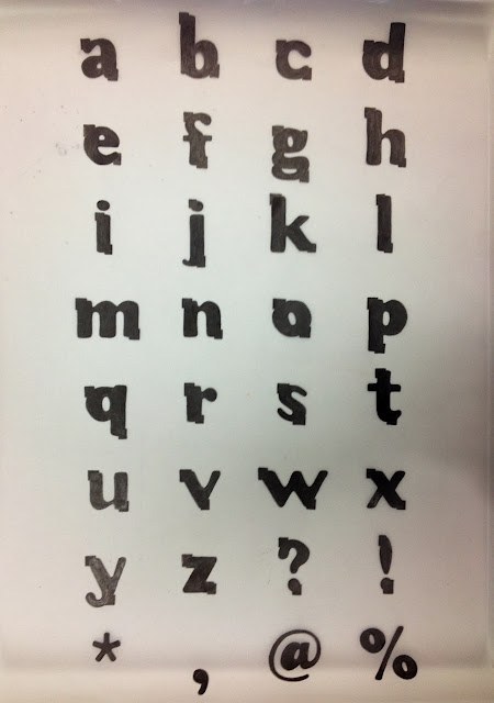
Manipulated typeface
Above is my finished final typeface that has been manipulated from Cooper Black. My partner for this brief was Matthew Brewer, whom I had not talked to prior to this project so I made sure I found out plenty about his personality and interests.

  • I slimmed down the letters so they weren't so loud and in your face, as Matthew isn't a loud or obnoxious person at all. However I kept the letters bold still to represent how he has some strong characteristics, such as his humour, which is a very big part of his personality.
  • I lengthened the ascenders, to make the font taller; this is to reflect Matt's physical exterior. I felt a short and wide font didn't fully match him.
  • I removed the serifs from the font, as the connotations of serif fonts are that they are traditional, roman, and formal. These descriptions are not what I would associate with Matt. I wanted to keep the font as simple and as modern as possible, I also wanted to keep it young looking; he is a teenager after all.
  • I made the closed negative space in the appropriate letters smaller, to show the letters are closed. This is to represent Matt's need for comfort and how he describes himself as close-minded.
  • The small boxes framing the letterforms are representing his comfort-zone; the letters are supposed to be boxed in. They are also representing his negative attitude to some things, and his pessimistic outlook. These details contrast with the bubbly and curvy letters, which show his fun side.


Thursday, 31 October 2013

Studio Brief 3: Name tag

To make the name tag, I scanned in the letterforms needed and placed them together on photoshop to the right scale like below. 


I then printed it and traced over it onto the right sized card. I found this quite difficult because of the small scale. I prefer how the letters look when they are much larger, which reflects that this typeface wouldn't work that great as a body font.