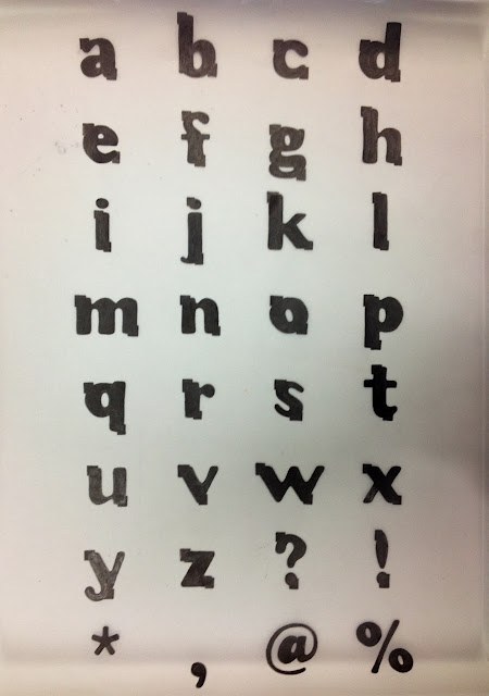
We did a crit in a group of around 25 people, where we all took turns to present our work. I talked about why I've manipulated Cooper Black in the ways that I chose, and how Matthew's personality is reflected by the letterforms.
Some feedback I got:
- Cooper Black is a fun and informal font, so that was a good choosing
- The comfort zone is definitely reflected by the boxes
- the manipulations aren't very clear from far away
- the letters work better when large and close up, they aren't as successful on a name tag.
I think I agree with these points. If I had more time to complete this brief, I would have maybe developed my ideas more and come up with better solutions. I definitely think that if I did the brief again, I would complete the final letters on illustrator and print them for the final crit. This way the boxes would look a lot neater and sharp, they were harder than I expected to draw by hand. I thought that drawing each letter by hand would be more straightforward than on illustrator, however it was very time-consuming in the end.


No comments:
Post a Comment