This is a task following on from:
http://s-mcdonald1316-dp.blogspot.co.uk/2013/10/design-principles-task-3.html
http://s-mcdonald1316-dp.blogspot.co.uk/2013/11/design-principles-our-own-font.html
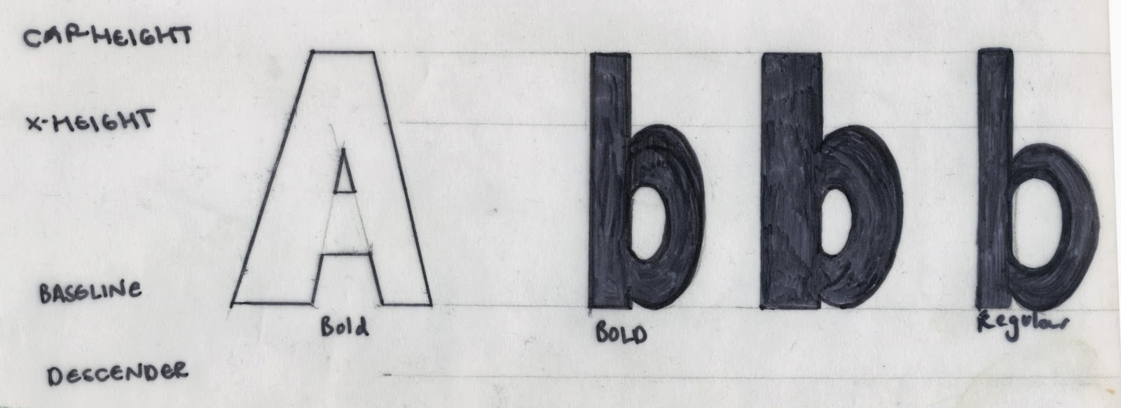
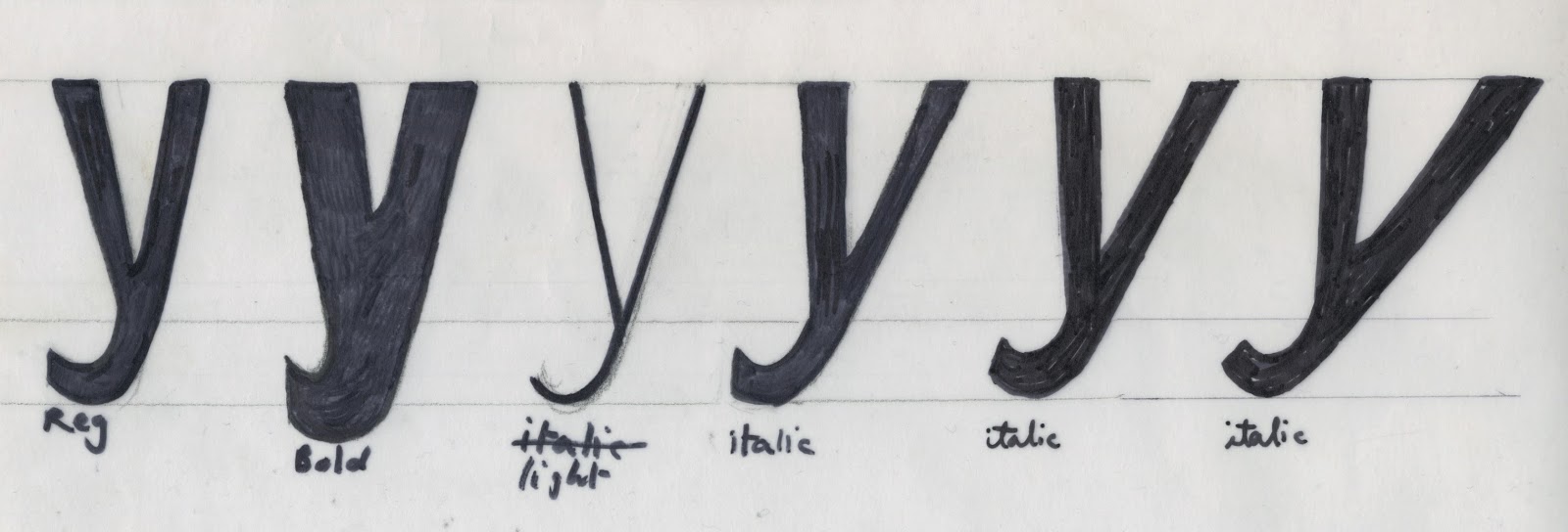

I experimented with the weight of the letters before making my final letters. I tried out the extremes of bold and light and italic, to see how far I could push the typeface. I found some were too extreme and weren't appropriate.

Above shows my final hand rendered font family.

No comments:
Post a Comment