 |
| Original version of Cooper Black |
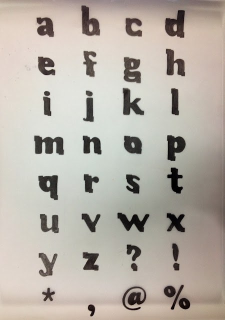 |
| Manipulated typeface |
Above is my finished final typeface that has been manipulated from Cooper Black. My partner for this brief was Matthew Brewer, whom I had not talked to prior to this project so I made sure I found out plenty about his personality and interests.
- I slimmed down the letters so they weren't so loud and in your face, as Matthew isn't a loud or obnoxious person at all. However I kept the letters bold still to represent how he has some strong characteristics, such as his humour, which is a very big part of his personality.
- I lengthened the ascenders, to make the font taller; this is to reflect Matt's physical exterior. I felt a short and wide font didn't fully match him.
- I removed the serifs from the font, as the connotations of serif fonts are that they are traditional, roman, and formal. These descriptions are not what I would associate with Matt. I wanted to keep the font as simple and as modern as possible, I also wanted to keep it young looking; he is a teenager after all.
- I made the closed negative space in the appropriate letters smaller, to show the letters are closed. This is to represent Matt's need for comfort and how he describes himself as close-minded.
- The small boxes framing the letterforms are representing his comfort-zone; the letters are supposed to be boxed in. They are also representing his negative attitude to some things, and his pessimistic outlook. These details contrast with the bubbly and curvy letters, which show his fun side.


No comments:
Post a Comment