Through this module I have worked on 5 studio briefs. I have found that each brief has been more challenging than the one before, as they have grown in depth and broadened in terms of research.
I've acquired a number of skills that previously I didn't have, such as on Adobe Illustrator where I have learnt how to make basic shapes and manipulations. The workshop gave me confidence to experiment digitally, although I still find the program a challenge to use as its relatively different to software I have used previously. I hope to increase my speed as I progress through the first year, and learn how to use Illustrator with more complexity.
I've learnt a lot about typography in general; I have never work with solely type before so it was all new to me. Briefs such as 1 and 3 gave me great scope to develop my skills with not only drawing letterforms but also contextual development. I feel happy with my outcome of the first brief, but I think I could have experimented a lot more with materials for the final outcome of the 10 letterforms. After the first brief I learnt how to manage my time more effectively, and I grew in confidence when battling my outcomes.
Crits have helped me a lot, and before this course I was not used to them at all so at first I found them a challenge, but I learnt to give others feedback and receiving feedback has been really useful to my progression, especially in brief 5 where I got about 15-20 post-it notes with feedback on. This brief was a challenge and I wish I had left myself more time to develop my ideas as I think that I jumped into it too quickly. I also felt quite unprepared for the presentation crit. However I am quite happy with the outcomes.
Overall I have grown as a designer with the pressure put on me through this module that I am not used to.
Showing posts with label OUGD403. Show all posts
Showing posts with label OUGD403. Show all posts
Friday, 15 November 2013
Tuesday, 12 November 2013
Studio Brief 5: Presentation of Final Crit

For the final crit I had to stand up in front of the year group and give a brief presentation of my three posters. I talked about how everybody is aware of the discriminations muslims can face on a day-to-day basis, but does anyone care enough or know enough about it?
My article was about a female British muslim convert who is apparently a terrorist threat, and sent a 'love letter' to the late Bin Laden. From this I turned my attention to terrorism and islam in the media, and how it has brainwashed so many people across the globe about what terrorism really is, and what islam promotes as a religion.
With these three posters, I am trying to convey a very simple message: Islam is not a hateful, terroristic religion. You may think that that is a very unpopular view in our country but it is so sneakily subtle that it doesn't seem like a huge problem anymore. But subtle racism and islamophobia is deeply problematic towards minorities in this country. Simple posters like this may open people's eyes a little bit more, whether it is a sub-conscious switch that is turned on in their heads, or if it sparks up discussions.
I chose the simple colours to give the idea of urgency and politics, this colour scheme screams IMPORTANCE. The white stock makes the text and images pop off the paper.
Type: I used a simple, shocking statistic. I added "are you surprised?" to add a guilt effect. If someone looks at this poster and feels surprised by the statistic, then they should rethink everything they have learnt about terrorism in the past... nobody should be surprised.
Image: I used a very simple layout and design which I think is eye-catching as a final outcome. It is clear what it is conveying; if anything else was added I think it would take away from my original point.
Image and type: I included an illustration of an islamic headscarf and the phrase "Respect others." because everybody should respect people that are different from them.
Feedback:
- The contrast of the illustration with the bold text and harsh, clean boxes works wonderfully
- don't need "are you surprised?" because I AM very surprised.
- maybe just "surprised?"
I disagree with the feedback about my type poster, so I am not going to change it, as I think it works well as a guilt trip.
If I had more time to work on this brief, I would possibly mono print these posters. I have recently done an induction in it and I think it can create really great, bold effects.
Saturday, 9 November 2013
Studio Brief 5: developing the image poster
For my image poster I want to convey peace and religion together. I tried to draw my own peace gesture like below but I found it was taking too much time so I used a template. I like it because it is very simple and neat looking, and also modern and fresh.

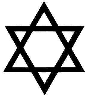
I want to include symbols of popular religions, but not too many, so I picked the 3 main religions of the western world. Christianity, Judaism, and Islam. This is because many people connotate Christians with peacefulness, also Jewish people, so I wanted to place them next to an Islamic symbol to show they are all widely practiced religions with peacefulness behind them. I like the simplisticness of these images together, I think they look bold and very neat.


Friday, 8 November 2013
Studio Brief 5: developing the image and type poster
I want to definitely use a islamic headscarf illustration, as I think it is very powerful and clear. I've tried to draw a new one from scratch on illustrator:

But I've soon realised that it looks like hair, and isn't as iconic as my drawing I did by hand. So what I have done is draw over the scan of my original drawing as below. I turned it white to experiment with it. Red and a very dark navy are my two colours I have chosen (with white stock).


But I've soon realised that it looks like hair, and isn't as iconic as my drawing I did by hand. So what I have done is draw over the scan of my original drawing as below. I turned it white to experiment with it. Red and a very dark navy are my two colours I have chosen (with white stock).

I've found that the whiteness of the illustration is too vibrant against the dark background, I don't think it works too well. I'm also not happy with the arrangement of boxes, but I'm glad I've had the chance to play around and make mistakes.
Studio Brief 5: developing the type poster

Above is a brief idea I came up with, but I don't think I'm going to use it for my final poster. It is a different spin I've taken on the statistic, which if I had more time for this brief I may have worked with a little more. I was pushed for time so I stuck with my original sentence which is below.


I have used helvetica for my posters, because it is simple and straightforward and described as an 'invisible typeface'. It does it's job and doesn't distract: I am trying to put across a bold and blunt message.
Here I have played around with different layouts of colour. I know that I can only have 2 colours and stock but I wanted to play around with red and blue first. If I could use another colour I would use blue, red and a dark colour similar to black, because blue and red have deep political connotations and I really want that to be conveyed with my posters. However, I don't want to use JUST blue and red for my two colours, as I think it would make my posters too colourful and too busy, I feel that a dark neutral colour is needed somewhere.
I also realised after these experimentations that the boxes around the words may be seen as image, so I have had to discontinue that part of my designs. I would use them if it was allowed.
Thursday, 7 November 2013
Studio Brief 5: INTERIM CRIT
.JPG)
I was given plenty of feedback on my poster ideas at the interim crit. I decided to give no explanation or leave any research on the table so that the posters could speak for themselves, and nobody said that they were unclear which is good.
- I was told that for the image posters it looks sometimes like I'm try to advertise islam, or sell it. Maybe because of the gimmicky illustration of the hand.
- I was also told that the statistic is 'just a fact' so nobody will listen. I strongly disagree with this statement as it is straight to the point and by being a fact it is hard-hitting. I think it will shock a lot of people.
- 'pie charts are boring' - reading this feedback made me realise that they are boring. I won't be using that idea.
- Somebody suggested that the headscarf could spell out 'Respect others' - but I think that idea would be too time consuming for me considering I only have a day or two left to create these digitally. Maybe if I had more time I could experiment with that idea, as I do think it is interesting.
- I was told I need to work on my layouts, which I haven't properly thought through yet. Layout is very important on posters like this.
I left everyone else feedback, such as which kind of colours to go for and I let many people know that their messages weren't as clear as they should be. I think that looking and criticising other people's work helps my work progress as it opens my mind to new ideas and viewpoints. It was also interesting to see the range of viewpoints and ideas everybody has taken forward.
Tuesday, 5 November 2013
Studio Brief 5: Poster ideas
For my posters I want to reach out to the public and open their eyes to islamophobia and racism in our society, and how it effects minorities. I don't think enough people care about religious discrimination, whereas personally I feel it is hugely problematic to attack whole religions because of a tiny percent of individuals who harm others. I've been aware of other mainstream awareness campaigns but not many for Islam.
I have used a statistic which is quite dramatic and extreme, I think it is a real eye-opener. The third idea is a very simple illustration of a woman wearing a headscarf, which is a symbol of islam to passers by if they saw her in the street. Women like this get judged every day; it is a hard task to where one and it takes courage. They should be able to wear whatever they want with no ignorant backlash.
Here I've played around with the same statistic again, as I'm not sure which poster to use it in. I think it works quite well with no image at all. The two other posters aren't very strong at the moment, as I think they would need images to get peoples attention, whereas numbers and percentages always interest people.
 |
| 3 ideas for the type and image poster |
 |
| 3 ideas for the type poster |
 |
| 2 ideas for the image poster |
Creating posters that are solely image is always a struggle, so I've had to use the symbol of Islam to portray my message. Even when using the symbol, it is still quite difficult... this is something I can develop further. I prefer the first idea as the peace symbol is clear, but I think I will make it sufficiently smaller on the poster if I take this forward.
Saturday, 2 November 2013
Studio Brief 3: Final crit


We did a crit in a group of around 25 people, where we all took turns to present our work. I talked about why I've manipulated Cooper Black in the ways that I chose, and how Matthew's personality is reflected by the letterforms.
Some feedback I got:
- Cooper Black is a fun and informal font, so that was a good choosing
- The comfort zone is definitely reflected by the boxes
- the manipulations aren't very clear from far away
- the letters work better when large and close up, they aren't as successful on a name tag.
I think I agree with these points. If I had more time to complete this brief, I would have maybe developed my ideas more and come up with better solutions. I definitely think that if I did the brief again, I would complete the final letters on illustrator and print them for the final crit. This way the boxes would look a lot neater and sharp, they were harder than I expected to draw by hand. I thought that drawing each letter by hand would be more straightforward than on illustrator, however it was very time-consuming in the end.
Friday, 1 November 2013
Studio Brief 3: Final alphabet
 |
| Original version of Cooper Black |
|
| Manipulated typeface |
- I slimmed down the letters so they weren't so loud and in your face, as Matthew isn't a loud or obnoxious person at all. However I kept the letters bold still to represent how he has some strong characteristics, such as his humour, which is a very big part of his personality.
- I lengthened the ascenders, to make the font taller; this is to reflect Matt's physical exterior. I felt a short and wide font didn't fully match him.
- I removed the serifs from the font, as the connotations of serif fonts are that they are traditional, roman, and formal. These descriptions are not what I would associate with Matt. I wanted to keep the font as simple and as modern as possible, I also wanted to keep it young looking; he is a teenager after all.
- I made the closed negative space in the appropriate letters smaller, to show the letters are closed. This is to represent Matt's need for comfort and how he describes himself as close-minded.
- The small boxes framing the letterforms are representing his comfort-zone; the letters are supposed to be boxed in. They are also representing his negative attitude to some things, and his pessimistic outlook. These details contrast with the bubbly and curvy letters, which show his fun side.
Thursday, 31 October 2013
Studio Brief 3: Name tag
To make the name tag, I scanned in the letterforms needed and placed them together on photoshop to the right scale like below.

I then printed it and traced over it onto the right sized card. I found this quite difficult because of the small scale. I prefer how the letters look when they are much larger, which reflects that this typeface wouldn't work that great as a body font.

Studio Brief 2: Illustrator
The next step I've taken is putting the alphabet of Garamond Bold (the original font I worked with) into a 4 x 7 grid.


I did this because the changes I'm making can be made in mass, which will save me copious amounts of time. This layout is also the requirement for the brief. Next I removed areas of the letters as I have previously shown, except that I elongated the boxes so they covered four letters when removing parts of them. I made measurements of the width between the cap-height and baseline, so that I could split the letters into three equal parts.

Studio Brief 2: Illustrator
For the first few illustrator sessions we were taught some basics to help us with Brief 2. We learnt how to make shapes and how to manipulate objects in the program. I thought these sessions were useful as I have used illustrator very little before, and its quite different from Photoshop.
After scanning the letter 'A' in, I placed the original drawing in an illustrator file and typed an 'A' in Garamond bold next to it in a similar size, to make the crossover of manipulation clearer and easier. I drew a box that was a similar size to the gap in the 'A', which I laid over the letter and aligned it with the original.

We were introduced to the pathfinder in the earlier workshops, which now has come in handy so that I can cut out the two areas of the 'A'. I clicked 'minus front' which cut out the area of the letter, leaving a gap in the object like below.


I then experimented with different weights of the letter in terms of the empty space, making a few different variations.


After scanning the letter 'A' in, I placed the original drawing in an illustrator file and typed an 'A' in Garamond bold next to it in a similar size, to make the crossover of manipulation clearer and easier. I drew a box that was a similar size to the gap in the 'A', which I laid over the letter and aligned it with the original.
We were introduced to the pathfinder in the earlier workshops, which now has come in handy so that I can cut out the two areas of the 'A'. I clicked 'minus front' which cut out the area of the letter, leaving a gap in the object like below.

I then added the other empty segment to the letter, so it was then a replica of the original manipulation I drew by hand.

I then experimented with different weights of the letter in terms of the empty space, making a few different variations.


The one I prefer is the letter with the third widest space. It doesn't break up the letter so that it is not legible, yet it still has enough impact. I think the most extreme variation I created isn't very legible as a letterform, whereas the A with very thin spacing manipulation still looks too whole; I want to portray different segments.
Wednesday, 30 October 2013
Studio Brief 3: Further development
I'm set on portraying Matthew's comfort zone and pessimistic attitude in the alphabet, but without making the whole of the letterforms revolve around it.

I've experimented with varying the sharpness and softness of the corners of the stems on the letter 'm'. This shows Matt's fun side paired with his pessimism, as the harsh edges make me think of this. I don't think I want to use these ideas but this has led on to more ideas of how I can portray these chracteristics.


I've experimented with varying the sharpness and softness of the corners of the stems on the letter 'm'. This shows Matt's fun side paired with his pessimism, as the harsh edges make me think of this. I don't think I want to use these ideas but this has led on to more ideas of how I can portray these chracteristics.

As a lead on from the last experimentations, I am trying out small boxes on parts of the letters. This is reflecting Matthew's comfort zone and pessimism, which contrasts with his ability to find humour in many aspects of life.
I have picked the letter 's' as a starting point because its a very rounded letter so making the sharp corners work with the curves may be a challenge.
I think that keeping the boxes in the corners of the letter like the 's' on the far right is the best way to go, as it contrasts again the large curves and gives the impression of a box or cage around the whole letter. I'm not sure what size to draw them yet, but I don't want the boxes to take over the whole letter, nor do I want them to look unclear and too small.


Above is experimentation with the layout of the small boxes. I think its important to try out a variation of letters which all have different anatomies, so I can figure out if my manipulations will work through the whole alphabet.
I definitely want only two boxes on each letter and for them to be diagonal from each other.

I've decided that I want the boxes to be in this orientation as I've found with some letters it works better around the anatomy.
Tuesday, 29 October 2013
Studio Brief 3: Further development
In the interim crit I was told by a few people that Cooper Black wasn't the best option for Matthew, but I am going to carry on developing and experimenting with it as I personally think it is suitable. I also think that my manipulations will justify it in the end.


I have experimented with the letter 't', as the original design of it in Cooper Black is quite unusual.
I want to elongate the ascenders in the whole alphabet, as I think the font in its original length is too short and Matthew is quite tall and slim. This seems like a very irrelevant reason to use, but fonts have sub-conscious effects on the brain, and for me having a taller typeface is more relevant.
Out of these experiments I prefer the second, as it keeps some of Cooper Black's style. However, a slimmer version of this letter may end up in the crossbar and stem joining look incorrect.

To reflect Matthew's comfort zone, I want to look into decreasing the size of the empty space in letters in the bowls, eyes and counters. Here I've experimented with an extreme shrinking of the eye, which I won't take forward.
Monday, 28 October 2013
Studio Brief 4: Interim crit
In this crit I was told that:
- going down the route of sensationalism of subject matters like terrorism or women in newspapers may make a good body of research
- looking at women in terrorism further may not provide enough substantial research
- possibly look at what is reported in the news and what isn't: the media chooses which is more entertaining.
this feedback helped and I will not go down the route of women in terrorism any further as I agree that it won't be fulfilling as other paths I can choose.
Studio Brief 4: Mental illness, Islam or revenge?
I have looked at a few different articles that focus on acts of mass violence and the differences between mental illness and terrorism.
Aaron Alexis who perpetrated the mass killing at Washington’s Navy Yard is part of the now familiar pattern of lone gunmen striking at American society with sickening frequency. There was no rational, political, social, or religious arguments behind what Alexis did. His actions, though thoroughly condemned, were explained away as the wayward and solitary acts of a mentally disturbed individual. America made the right noises–the president said the right words–and then went about its business.
The American media, after sniffing about for any Muslim connection and discovering none, did not use the word “terror” to describe the incident at the Navy Yard. Terrorism has unfortunately become a shorthand for “a violent act committed by a Muslim.” We see no “terror experts” pouring through the verses and holy books of Alexis’s former religion, Christianity, or his new religion, Buddhism, to find any reasons for his murderous act, as is the case whenever a Muslim commits any such violent crime. They rather pointed to his history of mental illness and paranoia, such as reports of hearing voices and claiming people followed him with a microwave machine.
What happened in Nairobi and Peshawar was quite different. In Peshawar, the Taliban group responsible for the attack declared that they had committed the suicide bombing of All Saints Church in revenge for American drone strikes in the Tribal Areas. A Taliban statement read, “Until and unless drone strikes are stopped, we will continue to strike wherever we will find an opportunity against non-Muslims.” In Kenya, al Shabab announced its assault on the Westgate Mall in Nairobi as revenge for the 2011 Kenyan military invasion to oust al Shabab from control of southern Somalia, where Kenyan troops are still stationed. An al Shabab spokesman stated, “Either leave our country or live with constant attacks.”It is clear that the actions of the Taliban and al Shabab, both emerging from tribal societies (the Pashtun and Somali, respectively) with defined codes of honor, is not motivated by religion but a mutation of tribal behavior which emphasizes revenge. All their violent actions, despite the ominous warnings of the “terror experts” who point to verses of the Quran, are in fact antithetical to both their tribal and Islamic traditions.
Islam categorically rejects this kind of violence, calling upon Muslims to practice compassion above all. Abu Bakr, the first caliph after the prophet, laid down the rules of war which were to be practiced by all Muslims, among them the forbidding of killing innocent people. The prophet was, likewise, explicit about the prohibition of violence against Christians. In a letter to St. Catherine’s Monastery in Sinai, he wrote, “No one is to destroy a house of their religion, to damage it, or to carry anything from it to the Muslims’ houses…The Muslims are to fight for them…Their churches are to be respected. They are neither to be prevented from repairing them nor the sacredness of their covenants.” The violence in places like Peshawar and Nairobi has nothing to do with religion, but rather the broken relationship between central governments and tribal peripheries.http://www.washingtonpost.com/blogs/on-faith/wp/2013/09/24/mental-illness-islam-or-revenge-understanding-terrorism-from-the-navy-yard-to-pakistan-to-kenya/
Firstly, the preponderance of religiosity in psychotic episodes is a well-documented phenomenon. That’s not to say that religion causes psychosis, of course, but that, probably due to religion’s central role in much of society, people given to psychotic episodes oftentimes latch on to religion in strange and severe ways.http://www.thenation.com/blog/169063/why-cant-terrorists-be-mentally-ill-too#
Sunday, 27 October 2013
Studio Brief 4: Tabloid islamophobia
http://www.mirror.co.uk/news/world-news/pictures-white-widow-samantha-lewthwaites-2477940
In the above article, the 'white widow' is referred to as "the British Muslim Convert" instead of using her name. To me this gives off bad ideas, like she is a terrorist because she converted to Islam. It seems like a very small detail that people may not pick up on but its subtleties like this that make people think Islamophobia is completely acceptable.
http://www.independent.co.uk/news/media/the-shameful-islamophobia-at-the-heart-of-britains-press-861096.html
On the morning of 7 October 2006 The Sun newspaper splashed a dramatic story across its front page. The story – billed as exclusive – concerned a callous and cynical crime committed by Muslims. A team of Sun reporters described in graphic detail how what the paper labelled a "Muslim hate mob" had vandalised a house near Windsor. The Sun revealed that "vile yobs hurled bricks through windows and daubed obscenities. A message on the drive spelled out in 4ft-letters: 'Fuck off '."One Tory MP, Philip Davies, was quoted venting outrage at this act of vandalism. "If there's anybody who should fuck off," Davies was quoted as saying, "it's the Muslims who are doing this kind of thing. Police should pull out the stops to track down these vile thugs".The Sun left its readers in no doubt as to why the outrage had been committed. Local Muslims were waging a vendetta against four British soldiers who hoped to rent the house on their return from serving their country in Afghanistan. The paper quoted an army source saying that: "these guys have done nothing but bravely serve their country – yet they can't even live where they want in their own".But there was one very big problem with The Sun story. There was no Muslim involvement of any kind. It is true that a house had been vandalised in Montagu Road, part of the comfortable and prosperous Windsor suburb of Datchet – as The Windsor Express had reported the previous day. It also looks very likely that the attack was connected with the potential arrival of four household cavalry officers.
The above snippet is from an Independent article, which outlines racism/islamophobia practised in The Sun. I think in recent years newspapers have actually toned down anything offensive like this, but it can still be slightly picked up on. The more important issue is how the word MUSLIM being associated with terrorism has been fed to everybody in our society through the media.
Friday, 25 October 2013
Studio Brief 4: Women in terrorism
The 'Black Widows'
An example of where females are used prevalently in terrorist attacks are the "Black Widows" within Chechnya. The Black Widows are female suicide bombers generally of Chechen origin, who have lost husbands (though sometimes also sons and brothers) in the Chechen secession wars against Russia.
Some attacks have been carried by group calling itself the "Black Widows Brigade".
The 'Mother of Believers'
One of the more controversial cases of the utilisation of women as terrorists was a previous tactic used by Ansar al Sunnah in Iraq. Known as the "Mother of Believers", Samira Jassim admitted to recruiting, indoctrinating and training women to carry out suicide attacks for the organisation, particularly in the Baghdad and Diyala provinces.
On her arrest, Jassim said she had recruited 80 female suicide bombers, 28 of whom went on to carry out attacks. She also admitted to taking advantage of these women and had some of them raped to shame them into conducting the suicide attacks. After the rape, Jassim told the women that the only way they could escape this shameful act was to act as a suicide bomber.
Though this type of manipulation of females is incredibly rare and not generally used by terrorist organisations and insurgencies, in this case it was used as a means to carry out an attack while avoiding detection.
Why do women commit acts of terror?
If the terrorist organisation or insurgency's membership is depleted, women are often recruited into the movement to not only build up numbers, but also to fill tactical gaps. Women are often considered capable in achieving "surprise attacks", because they are least expected.
Particularly in relation to attacks on "soft targets", such as public gatherings, markets and ceremonies, women are often considered to be able to blend into the crowd and subsequently are able to avoid detection. However in some movements, such as the Revolutionary Armed Forces of Colombia (the FARC), women are considered the military and are put on the frontline.
Why women choose to become terrorists depends on the individual, the organisation, and the political goal or aim of the group. In the case of some females – such as the Black Widows – it is to avenge the loss of a loved one such as a husband, brother, son or cousin. Sometimes the act of terrorism is also conducted to redeem the family name.
In this respect, women can become involved in terrorism for personal, rather than ideological, reasons. However, in the case of some movements like the FARC, female involvement is seen as a means of evening out patriarchy, and giving women a sense of empowerment, participation and accomplishment.
It is not surprising that significant attention has been given to the alleged involvement of the "White Widow", because the idea of a female terrorist is unexpected and quite confronting for some. However, it is also highly unlikely this will be the last time a female terrorist is propelled onto the scene.
http://phys.org/news/2013-09-white-widow-black-female-terrorists.html
I find this article about female terrorists really interesting, as its something that has never crossed my mind before; I always associate men with terrorism and huge acts of violence. This is what makes this story so unusual and provocative. I'm not sure if I should take this line of research further however, as I am unaware as to what I could research next and if I could put together a sufficient body of information.
Studio Brief 3: Interim Crit
For today's crit we displayed our work on the desks and walked around looking at eachother's work. From this we wrote down our feedback on an A3 piece of paper next to the work.
Below is my A2 sheet which I put together especially for the crit.


General points we picked up on as a group:
Below is my A2 sheet which I put together especially for the crit.


Some feedback that is especially useful to me:
- 2 people said they prefer cooper black, however 4 people said they prefer gill sans. This is interesting because I prefer cooper black as a starting point, which is the unpopular opinion.
- Look at Arial Rounded or Helvetica Rounded, as Matthew seems to like comfort and soft shapes.
- Don't focus too much on what he prefers, ('smooth edges') as this is my representation of him.
- Comfort zone > sans serif > the font doesn't get out of its comfort zone, should look tight like its very boxed in.
- Gills sans works better at communicating his personality. Seems a very black and white personality, what you see is what you get, the sharp tones support this.
- Matt is funny, so pick a playful looking font, however make sure it is not childish.
- Could play on 'Pub landlord' and his surname 'Brewer', he also drinks a lot of alcohol.
- He has childlike tendencies yet doesn't like children, look into this more so as these are opposing ideas.
- Cooper Black seems like quite a loud/bold font to me - which doesn't link in with not being a 'loud, in your face person'.
- Cooper Black seems like a warm typeface and says he likes winter. Maybe think about using a more angular typeface?
I don't necessarily agree with all of this feedback but I think they are important points that I can look into and work from when I further my development and experimentation.
General points we picked up on as a group:
- Hard to give some people feedback because of poor layout or unclear presentation. This is fair as we aren't used to crits just yet; we're still learning how to present our work in the right way.
- I've learnt that the best way to present my work in a crit is on an A2 piece of paper, where I can stick down sketches and research all together on one page. This makes it much more straightforward when someone comes to leaving feedback. Some people put out their sketchbooks and random piece of paper which is quite confusing, as I didn't know which page the project started on and where it ended, and which work was the most important to look at in more detail.
- Some of us had too little work or too much, which can both make a crit difficult. Having too much work shows the exploration has been very broad so it gives less to focus on when giving feedback in such a short space of time, and having too little work doesn't show enough development.
- It was good to see that people are researching further afield, for example looking at their partner's favourite designers or design movements. Other areas are colour theory and analysing handwriting. I haven't thought about looking at these things yet in my own work, but I definitely want to.
Studio Brief 3: Removing serifs and thinning letters
 |
| (red is the original font) |
I've experimented with slimming the letters down, as although I like the boldness of Cooper Black, I feel its too extreme. Matt's personality is full of characteristics but his personality isn't in-your-face, so I don't want to start with an extreme block font. Block fonts are very loud and Matt isn't.
I don't want to make the change in width too drastic, just a few millimetres, I think that taking too much away from the original font will make my choice of Cooper Black seem pointless.
 |
| (red is the original font) |
While working with the font Cooper Black, I've decided that I want to try removing the serifs from the letters, as the connotations of serifs are:
- traditional
- old-fashioned
- roman
- elegant
- formal
I will definitely not include serifs in my final alphabet.
 |
| (red is the original font) |
- Matthew told me that in terms of shapes, he prefers curves and smooth edges.
- His personality is not harsh and doesn't have the connotations of sharpness.
- it increases the reflection of fun.
Subscribe to:
Posts (Atom)