


Selected Sketches, Thomas & Jurgen
Dutch design studio Thomas & Jurgen has produced a threesome of zines for their third instalment, all exploring varying iterations of “three”. Providing engaging insight into the development process of creative projects, Thomas & Jurgen’s trident of Selected Sketches zines takes symbols read as “three” and demonstrates how sketching is integral to the creation of a unique design by articulating and answering provocative questions in a visual format.
In the third edition of Selected Sketches we examine symbols referring to the concept of 'three'. The zines '3', 'III' and 'Δ' provide an insight into sketches that often arise outside our sketchbooks. These sketches regularly consist of spatial experiments, collages, paintings and photographs. By choosing a simple starting point for this process, we challenge ourselves to review and reshape the obvious.
'Three' gives an insight into the infinite possibilities of experiment and shows an important part of our search for new visual languages, materials and ideas.


Pentagram partner Marina Willer has created a new book of rubbings of London drain covers, entitled Overlooked. The publication forms the agency’s 45th Pentagram Paper, and comprises 22 rubbings taken of London’s street covers “from Islington to Kensington” alongside an essay by Willer.
According to Pentagram, the tome “tells the history of London through street covers, outlining the vital roles that each piece of street furniture had in serving Londoners” and “serves as a reminder that a city’s beauty isn’t limited to art galleries or grand architecture, and that intricate design is everywhere.”
http://www.itsnicethat.com/articles/matthew-brown-orientation-100216


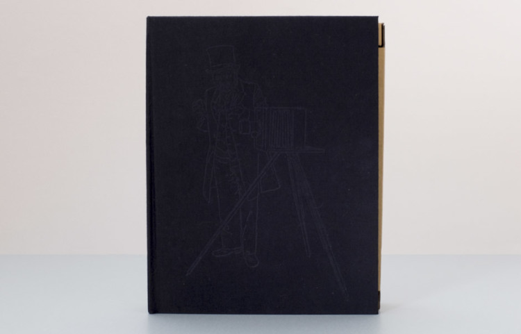
Kiss Me I’m Dying, Brad Philips
Published by Stanley/Barker, Kiss Me I’m Dying draws from “a vast trove of cultural detritus – the tongue-in-cheek slogans of bumper stickers and needlepoint pillows to the sardonic quips of a misanthrope.” The slogans become almost like images, in their cursive style and scale shifting from “Fifty Shades of Greige” to “I Had the Time of Your Life.”
http://www.sofiaclausse.com/Windy-Zine-City


Zine created as a response to my visit to Chicago, the "windy city". The distortion of the building windows and the Cloud Gate sculpture served as inspiration for the warped images and type.


http://thebookdesignblog.com/book-design-inspiration/simona-noli-hand-bound-books?utm_source=feedburner&utm_medium=feed&utm_campaign=Feed%3A%20TheBookDesignBlog%20%28The%20Book%20Design%20Blog%29


https://www.behance.net/gallery/26304781/VOW_Philia


https://www.behance.net/gallery/9351721/portfolio


https://www.behance.net/gallery/23334561/Recall-Collages


Oliver Jeffers

Alec Soth
http://www.itsnicethat.com/features/fletchers-sketchbooks-an-exclusive-insight-into-the-sketchbooks-of-the-late-great-alan-fletcher


http://www.cromerdesign.com/pyr-ro.html


http://www.hamburgereyes.com/
No comments:
Post a Comment