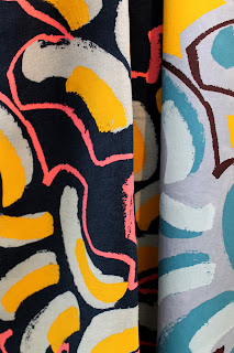
I asked Tamar to take some clear photographs of her work, as this gives much more of a realistic insight into her designs - photographs show the texture, the way they drape. Even how they work together as a set. Using only scans would result in a very 2D vision of her work.
Below are her photographs she took of her work in her studio space.
We sorted through them together, whilst I picked out the best ones and advised her on which we should not use - some have bad lighting or have a lot of creases in the fabric. Also, the last couple of designs don't seem to fit in with the rest of the collection at all - the colours blue and brown together aren't used anywhere else. Tamar agreed with me on this and said I didn't have to use them.
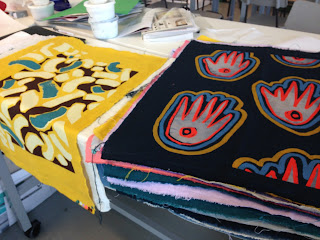
She showed me her physical final fabrics that she will be submitting as this collection. It was great to see them all in person for the first time and get a feel for the textures and sizing - the patterns are all massive.
What I took from this is that the size of her designs should factor into the layout of the lookbook - such as a few full spreads of individual designs to show the size.


No comments:
Post a Comment