Showing posts with label studio brief 2. Show all posts

Sunday, 12 October 2014

OUGD504 // Studio Brief 02: Final 'Woozy' kickstarter logo


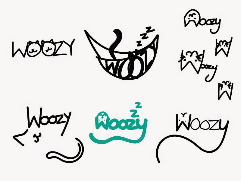
I created the final logo by using a graphics tablet to draw both the type and the imagery. I warped the shapes and angles to make them neater and I played around with different sizing and placing.
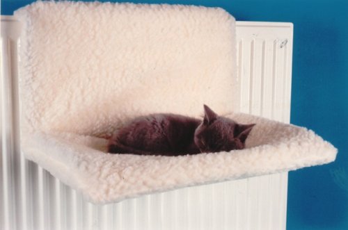
The 'z' stood out to me early on as a feature that relates to sleeping; cats use the hammock to relax and cats are known to sleep very often. 'Zzz' in a diagonal line seems to fit perfectly with the word, with clear connotations.
I have used negative space within the 'W' to create a cats head, which is a clever and humorous detail. I added the tail to complete the illustration, which adds softness to the logo with its curves and mimics the shape of a cat curled up asleep, thus suiting the product.
For placement on photographs, I think that a fluffy cloud type shape to frame it works well; it adds to the connotations of softness and comfort.
I find the logo very suiting to the product. In terms of target market - people who are interested in stylish and minimal furniture, young cat owners - it has maybe a little too much of a playful looking style, as it probably wouldn't appeal to everyone in them categories. However, it is difficult to design a logo that portrays the hammock for what it is - a pet product - while trying to be 'stylish and minimal'. It is also impossible to ignore the branding for already existing pet care, which is successful partly due to the clear and concise appropriate branding. So bearing these points in mind, the logo has a nice balance of both animal care and youthful stylishness.
Having been given more time, I would have liked to experiment more with the logo fitting in to a shape or being joined more together, which it lacks because of the angles and imagery sprouting off the name 'Woozy'.
Overall I think that the logo emits comfort and friendliness. It clearly portrays the product without giving too much away or including too much detail. The hand rendered type fits well with the word which is playful and silly.

Saturday, 11 October 2014

OUGD504 // Studio Brief 02: Logo colour

Deciding on colour is quite tricky, and its also hard to not fall victim to the ideas of colour that are ingrained into us, for example green: health, clean, eco. However, certain colours are picked for a reason, and its impossible to ignore colour ideals entirely when there is a target audience.
Below are some colours I think suit the project.


I want to use two colours to distinguish between the product name and the imagery around it. More than two colours will complicate things.
Teal and dark blue appeal to me, as they are friendly looking and are easy on the eyes; they aren't harsh like primary colours, or black. They go together well. I think I'll choose the last image, as it feels right that the name is the darker colour for boldness.

Friday, 10 October 2014

OUGD504 // Studio Brief 02: Logo development


These images show my development of logo ideas in illustrator. I can't choose which one to fully develop so I have worked on all of them simultaneously.
1. The top left logo is simple, cute and playful. the minimalistic style is quite effective, however why are there two cats? This seems like something that would need reasoning behind it other than there being two 'o' characters. It also doesn't say enough about the project or product.
2. (top right) I like the informal style of this one, which is why I can't seem to let go of it, but also why I don't think it is professional enough. The upside down face is maybe a little confusing because of it's orientation and isolation.
3. I like the hammock logo, but I feel like it has maybe too many details for a logo, as well as the shape being quite awkward compared to the rest. It is definitely lighthearted and playful, however.
4. This is one of the more logo-looking ones. It has 3 details that effectively communicate the product: sleep, cat face, and cat tail. However again the upside down cat face isn't quite right.
5. This logo has the most potential, I think. It is simple, informal, and the negative space of the 'W' is clever and works really well.

Others opinions have said that 1. isn't clear enough, and 3. is effective.
I am not decided on colours quite yet.

OUGD504 // Studio Brief 02: Study Task 04

Branding considerations


Faults I have gathered from the Woozy project:

  • There is no branding; the closest thing is 'WOOZY'  in a playful typeface on a photograph of the product.
  • The grammar isn't perfect as English is not their first language, so some sentences don't make sense.
  • The typeface used on the images is very undesirable and ugly.

Qualities that give branding potential:
  • Cats are very popular pets, so a unique product for pets has a lot of potential.
  • It is compact and fits in nicely to any home, as it hangs on already existing objects.
  • It can be assembled very easily and quickly.
  • Comes in a variety of colours etc.
  • The video shows it being used effectively by a cat.
Pet product research: 
Whats already out there? I looked into similar products for cats on Amazon.


None of these products have appealing designs to relatively young people, or people who don't want to ruin the look of their homes with a chunky bed. They seem very outdated and only appealing to older people.
This is where the Woozy comes in. With some effective modern branding, it could take the place of these unappealing beds.


Context/market audience:
  • Cat (and potentially dog) owners.
  • People who want a stylish alternative to normal pet products.
  • People between 24 years old and 40 years old: a younger alternative to products already on the market.
Brand positioning:
  • 'Woozy' - a unique and memorable name.
  • Stylish and minimal design that appeals to a new, younger market who own pets.
Brand values:
  • innovative
  • modern and up-to-date
  • multifunctional
  • eco-friendly
  • high quality
Reproducibility/adaptability - how would it appear in different situations?

  • It needs to be appropriate for product packaging, Kickstarter, websites, emails, and letter headings.
Communication (audience/customer)

  • Comfort for the customer's pet is what needs to be communicated the strongest, as well as trustworthiness and quality, as by paying towards the Kickstarter they are putting trust in the product.

Thursday, 9 October 2014

OUGD504 // Studio Brief 02: Logo development

Key aspects i am using in my design ideas:
  • cats, as it is aimed at cat owners/lovers
  • playfulness
  • friendliness
  • lightheartedness


  • The first things I noticed about the name 'Woozy' is that the 'w' resembles cat ears, and the 'y' a cat tail, so I've incorporated them into some sketches.
  • The 'w' makes for a upside down cat head, so I tried that as if the cat is playfully stretching or poking its head down. However, I think if its the wrong way up then it is confusing and doesn't work as a product logo. 
  • The top left sketch works better, as it is a nice use of negative space. I'm just skeptical about the neatness of it as some may think it is an extra letter stuck on if it isn't clear enough.
  • The 'oo' in 'Woozy' has potential, so I have played about with paw prints and cat eyes. However I think both may be too typical and widely used enough as it is.
  • I used the 'z' and added more of them to add the affect of sleep, while keeping the tail in the 'y' to make it seem cat orientated.


  • I have tried to fit the name in the shape of a cat or around the edge of the cat to make the shape. 
  • I drew realistic cat eyes with Woozy underneath, which I'm quite fond of. However, I don't know if it's clear enough that the eyes are feline.


  • I'm not crazy about any of these ideas,  however I like the idea of the cat profile outline. 


  • I thought of adding the visual of a proper hammock that people use, for imagery value. The ears and tail poking out make it clear that its for cats, and its quite minimal.


Chosen initial ideas:


Crit feedback:
  • The top left design is most popular
  • The big eyes don't reflect comfort, so it doesn't really suit the product.
  • Top right is effective

OUGD504 // Studio Brief 02: Study Task 03

LOGO REQUIREMENTS


Specific requirements of the logo based on what I have learnt about the client...

Colour
These are the available colours for the hammock, so the colours I use in the logo should coincide with these designs.


I've researched some pet brands that already exist, and their colour choice. I've found that there is no clear colour that is often associated with pet/cat products. Green, blue and red seem like colours that are popular as they are common colours that don't have negative or gendered connotations. They are bright and enthusiastic.
I might want to challenge this and set my own rules, however I don't think using too bright colours would suit Woozy as I'm trying to aim for sleek and clean modern branding.

Typeface
Century Gothic seems to be the staple typeface for Woozy (seen above under the hammock colours). This font is playful and modern, but I don't think it is effective in any branding, so I want to get rid of it.
For 'Woozy' I think that the typeface should definitely be sans serif, as a serif font would be too serious and formal for such a product. It should also be hand rendered as this adds a personal and unique touch.

Reproducibility/Adaptability
The logo needs to be suitable for the Kickstarter page, but also for the packaging that the hammock bed comes in. It also needs to be flexible for other use, such as emails, videos, adverts and websites.

Client needs
The Woozy needs innovative, stylish and fun branding, as that is what the product is about. Simplicity would also suit as the product is very minimal.

Communication (audience/customer)
The logo needs to communicate pet-friendliness as the product is for cats (although can be suitable for other small animals). Positivity and comfort should also be communicated as pet owners care about the safety of their animals.


Wednesday, 8 October 2014

OUGD504 // Studio Brief 02: Kickstarter project 'Woozy'

BRAND NAME:
Woozy

WHAT IS IT?:
A hammock/bed for cats, which can hang on a radiator or place on the ground anywhere you like.


The following information is on the Kickstarter page:

54 backers
€4,169 pledged of €6,500 goal
23 days to go
The Woozy is an elegant, strong and multifunctional cat hammock/bed made for every interior and suits every cat. 
WOHOOD Dutch Design, made in Holland.We wanted to design an affordable cat bed that is a part of your interior. Something everyone wants to hang on their radiator for their cat. The quality, looks and opportunity’s of the bed were the most important aspects in the design. Our cat hammock design is more advanced than any before. 
Multifunctional?!We want to reach every cat owner with this design. No matter if your home has a different model radiator or no radiator. The woozy fits in every interior. That’s why we decided to make the woozy multifunctional. It’s easy to adjust to every radiator.
Other cat beds.We looked into other cat beds and hammocks. We noticed that there were no hammocks that could fit on every radiator. And the ones that could were, lets say 'not so pretty' Before the Woozy there was no hammock that could fit on the radiator and also could be placed on the ground. 
ColorsWe decided to offer the woozy in six different colors.
Fabric colors
Fabric colors
QualityThe quality is the most important aspect in the design. That’s why we chose for strength. We used high quality beech for the frame, coated steel for the hooks and strong recycled polyester for the fabric. The fabric is easy to replace and washable. 


Dimensions 52,5 x 36 x 17,5 cm. (Length x Width x Height)
 20,7 x 14,1 x 6,9 Inch (Length x Width x Height) 
How does it work?The Woozy is easy to install. In less than 5 minutes your Woozy is ready for use. The manual below shows you just in 6 steps how to install the Woozy.

Tuesday, 7 October 2014

OUGD504 // Studio Brief 02: Kickstarter research

For this brief we have to choose a Kickstarter project to rebrand. Some projects I found interesting are these:

Diabetic tracker app
https://www.kickstarter.com/projects/582344391/diabetictracker?ref=category_newest

This project has no branding and has a very poor and uninteresting video. This is why I was intrigued by it, as it drastically needs rebranding to gain a good amount of interest and support. However, the idea of the app isn't very appealing now that I've spotted other projects I like.

Vriliac: human powered generator
https://www.kickstarter.com/projects/852476234/vriliac-human-powered-generator?ref=category_newest
http://vriliac.com/

This invention is something that has a lot of potential in my eyes, but needs a stronger identity. Their personal website is very outdated looking and doesn't reflect something that should be fresh, exciting and good for the planet.

Moku: a wooden paper dispenser
https://www.kickstarter.com/projects/2040275847/moku?ref=category_newest

This is one of my favourite inventions I have come across on Kickstarter, and the branding is very simplistic and not so exciting. However, I think that the product speaks for itself enough, so maybe I should pick another to work on.

Art House: pay for your food with your art
https://www.kickstarter.com/projects/736040551/art-house?ref=category

An unusual and unique idea, with really awful graphics to support it... except I can't seem to be inspired by this kickstarter much further than how bad the branding is.

'Woozy' seems the most approachable -
https://www.kickstarter.com/projects/1045699505/woozy-the-hammock-bed-for-cats?ref=category

This project is to support the making of hammock beds for cats. They attach to radiators and things alike. They also stand upright on the floor.
It's a cute idea and to a cat lover like myself, seems like something that would be super successful. So I want to help it by giving it a substantial identity; all there is on the page is a video explaining the product, and the image below with the name on it.


Thursday, 6 March 2014

Studio Brief 2: Final Posters


These are our three designed posters for our viral project, Selftea. We decided to incorporate health benefits to add another feature; they are facts that will encourage people to drink tea for their health. It is another incentive that is part of our project to get people to drink more tea.
Joe designed most of the second and third posters, and me, Alec and Rebecca worked on the first and edited little parts of the second and third.
We then printed them in the digital print room, and stuck them on the doors of the studio. We chose these places because they are always seen when people are entering or leaving the studio, people can't miss them. We are hoping they will remind people of #selftea, or just tea in general.
We wanted to incorporate an informal, youthful feel with the imagery, and also the social side of having cups of tea.


Thursday, 31 October 2013

Studio Brief 2: Illustrator

The next step I've taken is putting the alphabet of Garamond Bold (the original font I worked with) into a 4 x 7 grid.


I did this because the changes I'm making can be made in mass, which will save me copious amounts of time. This layout is also the requirement for the brief. Next I removed areas of the letters as I have previously shown, except that I elongated the boxes so they covered four letters when removing parts of them. I made measurements of the width between the cap-height and baseline, so that I could split the letters into three equal parts. 


Studio Brief 2: Illustrator

For the first few illustrator sessions we were taught some basics to help us with Brief 2. We learnt how to make shapes and how to manipulate objects in the program. I thought these sessions were useful as I have used illustrator very little before, and its quite different from Photoshop.

After scanning the letter 'A' in, I placed the original drawing in an illustrator file and typed an 'A' in Garamond bold next to it in a similar size, to make the crossover of manipulation clearer and easier. I drew a box that was a similar size to the gap in the 'A', which I laid over the letter and aligned it with the original.

We were introduced to the pathfinder in the earlier workshops, which now has come in handy so that I can cut out the two areas of the 'A'. I clicked 'minus front' which cut out the area of the letter, leaving a gap in the object like below.


I then added the other empty segment to the letter, so it was then a replica of the original manipulation I drew by hand. 


I then experimented with different weights of the letter in terms of the empty space, making a few different variations.


The one I prefer is the letter with the third widest space. It doesn't break up the letter so that it is not legible, yet it still has enough impact. I think the most extreme variation I created isn't very legible as a letterform, whereas the A with very thin spacing manipulation still looks too whole; I want to portray different segments.

Saturday, 19 October 2013

Studio Brief 2: Illustrator

For Brief 2 I have to choose a letter from the set of 10 letterforms I created based on the word 'nobility', which were manipulated from Garamond Bold.

[ http://s-mcdonald1316-dp.blogspot.co.uk/2013/10/brief-2-alphabet-soup-final-nobility.html ]

I thought about choosing the 'J':

But I was told in the crit that it wouldn't have the same impact when just in black and white; I won't be able to use the blue, which is a huge part of what the letter is standing for (blue blood).
I was also told in the crit that the letter 'A' that I manipulated would work better as a whole alphabet, as it is very clean cut:

It could also be applied to every letter of the alphabet with no restrictions, whereas the droplet in the 'J' may prove to be difficult when designing the other letterforms. I also am restricted with time for this brief so a straightforward solution would help.