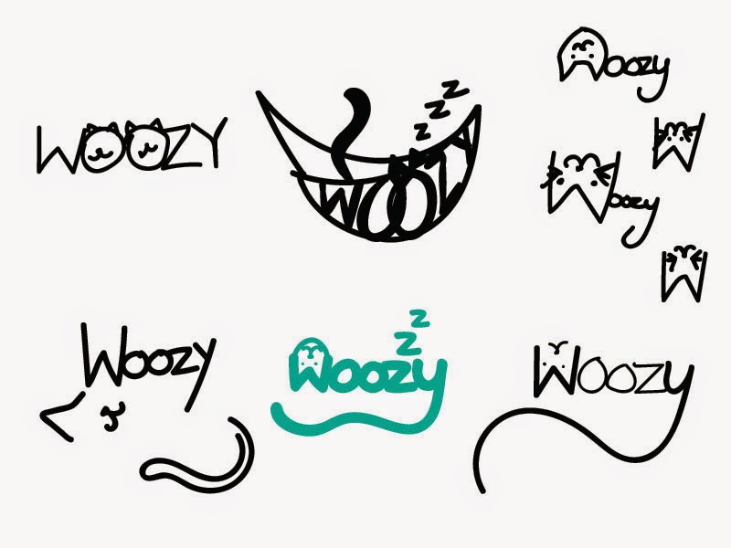


These images show my development of logo ideas in illustrator. I can't choose which one to fully develop so I have worked on all of them simultaneously.
1. The top left logo is simple, cute and playful. the minimalistic style is quite effective, however why are there two cats? This seems like something that would need reasoning behind it other than there being two 'o' characters. It also doesn't say enough about the project or product.
2. (top right) I like the informal style of this one, which is why I can't seem to let go of it, but also why I don't think it is professional enough. The upside down face is maybe a little confusing because of it's orientation and isolation.
3. I like the hammock logo, but I feel like it has maybe too many details for a logo, as well as the shape being quite awkward compared to the rest. It is definitely lighthearted and playful, however.
4. This is one of the more logo-looking ones. It has 3 details that effectively communicate the product: sleep, cat face, and cat tail. However again the upside down cat face isn't quite right.
5. This logo has the most potential, I think. It is simple, informal, and the negative space of the 'W' is clever and works really well.
Others opinions have said that 1. isn't clear enough, and 3. is effective.
I am not decided on colours quite yet.
No comments:
Post a Comment