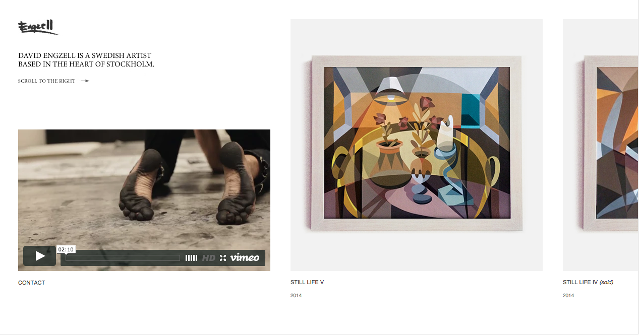
David Engzell - davidengzell.com
This website belongs to an artist called David Engzell, who is an abstract artist. This ties into my summer project so I decided to look at it for this brief. It is a side scrolling website, which suits the content of mainly images. I like the idea of this as its not the norm and it reminds me of an art gallery. A lot of my research is image based so this would suit, however with text it would be more difficult.
Printed Pages - printedpagesmagazine.com
- Simplistic
- menu across the top which accompanies the content as you scroll through - this makes it easy to use and accessible.
Ross Gunter - rossgunter.com
The permanent 'R' logo standing for the designers name is quite a bold move, as it doesn't move at all when scrolling through the website and content, it's also right in the centre of the whole page. I think that it's a bit too distracting; it would work better if it was to the left or right of the page, as it the white does work well against the muted colours.
The horizontal scrolling is, like the first website, like an art gallery and I like that. However it makes it feel quite one-dimensional and restricted.
Art Fucks Me - artfucksme.com
I'm not sure that the teal colour suits the websites content, it feels a little too clean and social media like... or maybe its just my personal preference. I'm not too keen on white and teal together, they are quite clinical colours.
The layout works well and it is straightforward.
Mirko Borsche - mirkoborsche.com
 |
| scroll up to get a drop down visual menu. |
To go through images, the viewer navigates with left and right arrows. Scrolling up and down makes two different menus pop up, which I quite like, as it is interactive and makes the website nice and clean if you just want to look at the featured images. The all white with black text design seems to work quite well, as the images speak for themselves and add the colour and detail.
Superpaper - superpaper.de
The articles are all clear and I like the neatness and small size of each feature, as it gives a better overview of the content and doesn't force you to scroll a lot. However I feel quite uninspired by the overall design... it's quite boring. A bit more colour wouldn't do any harm.
Karmarama - karmarama.com
This website is one of my favourites that I've looked at, as the colours pop out and create an exciting and vibrant atmosphere. Some may think that too many different colours are being used, however so I'm not sure about using such an idea in my own website.


No comments:
Post a Comment