 |
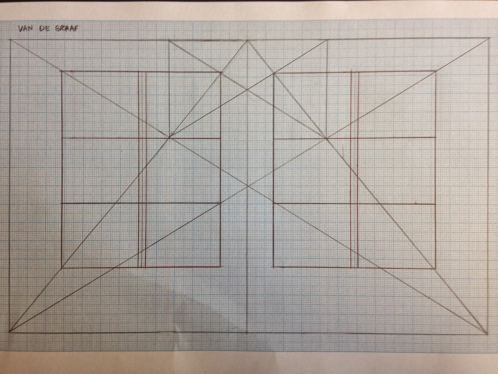
| Van De Graaf grid with columns and paragraphs. |
 |
| Newspaper grid |
 |
| Magazine grid |
The newspaper has a large image overriding both pages, eliminating room for more columns. It is perfectly symmetrical whereas the magazine grid is uneven, with four columns on the left page and three wider columns on the right page.
No comments:
Post a Comment