Showing posts with label studio brief 03. Show all posts

Tuesday, 4 November 2014

OUGD504 // Studio brief 03: Web design initial ideas

Website concept:
A simplistic and fun website exploring modern art movements.
Target audience: Young adults, aged roughly from 14 - 25.
A lot of art history websites I have come across, as seen in my research, are heavily information based and have no real design behind it. I aim to change that and make an enjoyable alternative that sums up information on art movements and artists in simple terms. Often websites based on this kind of information can seem very off putting and boring.

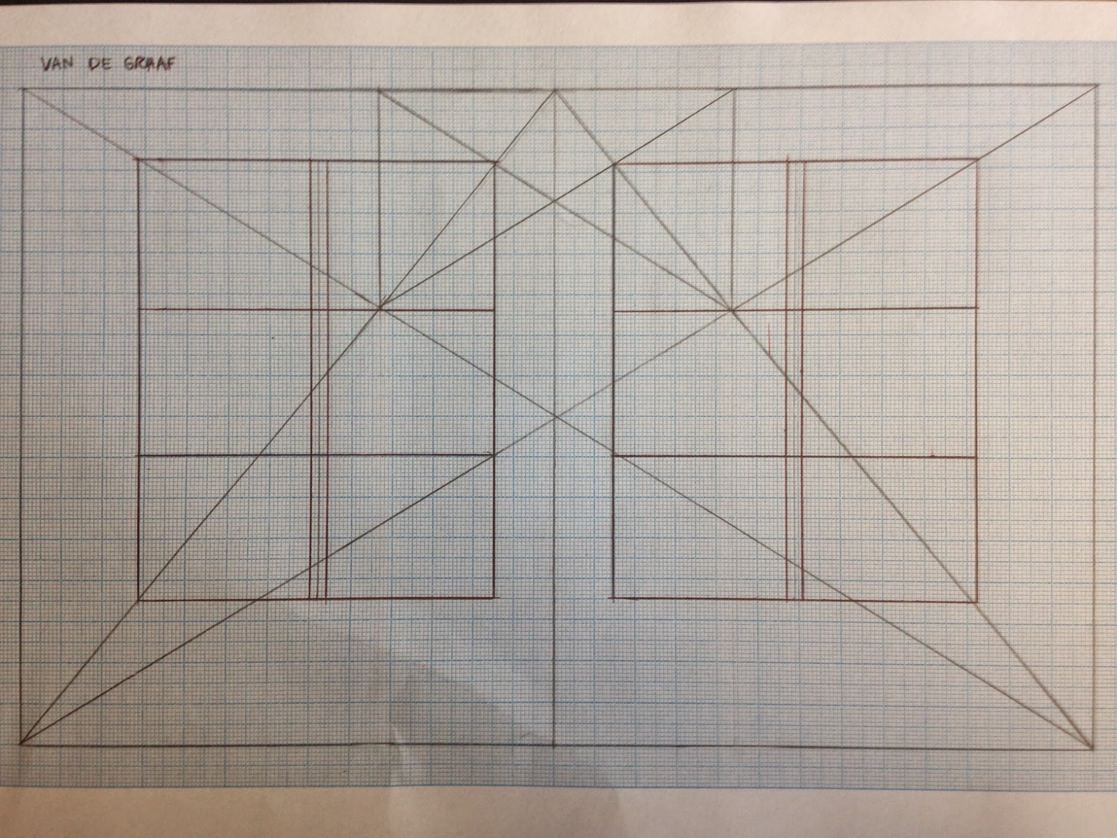
Some scamps I came up with, being quite experimental with composition (the crossed squares represent images, and to be more specific, artwork:

Homepage


I want to include imagery on the homepage so that it draws the visitor in straight away, rather than just lots of text which is the problem with art history websites that I am trying to solve.

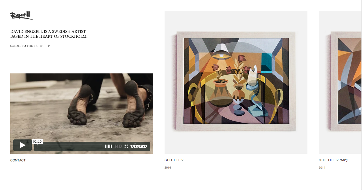
  1. The first scamp shows an idea similar to blog websites. The thumbnails would be close ups of the artwork, showing the amazing detail in one of the paintings that can be clicked through to reveal the whole artwork. I think this might be too much imagery for the homepage, and not simple enough. It may be overwhelming.
  2. (across) This is a minimised version, where small thumbnails are provided of artwork to click through, so that if a viewer likes the look of something they can explore it straight away.
  3. Smaller spread out thumbnails which may be clearer to decipher different images.
  4. Square thumbnails in a line, which I think are too small, they would all blend into each other.

The menus seen would be drop down for better user experience, rather than clicking through and giving a list on a whole new page which would be unnecessary.


  1. Lots of different sized thumbnails that fit together like a puzzle, with a simple menu at the top.
  2. (across) A menu down the left side of the page, with the logo above. The circle feature is segments (like a pie chart) of different artists, movements or artwork in general. This would be a unique and interactive feature for the user to explore the website.
  3. Randomised artwork is displayed under the menu with some information, and it could be changed daily or weekly. This gives a simple taster into the kind of work that is featured on the website. I think I like this idea the best in terms of user experience, as it is easy to navigate and isn't overwhelming. Trying too much to be different and unique may not always work for the user.
  4. A left sided menu with small segments of art from each movement with the movement name on top. I like this idea of an image-based menu.


Feedback on initial ideas:
  • very small thumbnails look cramped and would probably be cluttered.
  • The pie chart style feature menu is a bit unnecessary - if there is already a regular menu then why this one too?
  • a blog scrolling style on the homepage seems like it would work well.

Wednesday, 29 October 2014

OUGD504 // Studio Brief 03 : Study task 07

User experience design

What is user experience?
It is a person's experience with a product in terms of effectiveness, efficiency and emotional satisfaction. A good user experience comes from a user friendly website such as Google, which always wins over Yahoo because of its design. Another example would be Facebook being more successful than MySpace.

How does this apply to my website?
When designing my website I will have to think about user experience and the point of view of the viewers.
Jesse James Garrett created a user experience design model:

User needs: Certain clear, simple information that they are interested in learning about, with images as examples.
Website objectives: Interest viewers with exciting content and easy to use navigation.

Functional specifications/content requirements: A simple menu with the different pages for different content. Images on every page to support text that click through to websites. Links to artists' websites where need be. Artists themselves can submit their work to be on the page if they so wish.

Interaction design/information architecture: Homepage > About, Art movement 1, Art movement 2 (and so on), Artists, Contact, Submit, Browse by...

Sensory design: Simple layout which is easy to navigate. Creative and inspiring design which is appealing to young artists/curious creatives.


How does the user experience of my website relate to other similar/competing sites?
My website is providing simplified information about art history and current art movements with both iconic and recent artworks. I have struggled to find a site like this already, however websites like pinterest or tumblr seem to be somewhere where great artwork can be found, but it is not organised and it is through individual blogs... So I am providing people with somewhere to find a clear and concise array of artwork and the techniques behind them.

What are 'personas'?
They describe specific people with behaviour that belongs to a certain target audience. In creating a persona it is made clear what needs to be put in place when designing the website, as you know what to avoid and what to aim for.

Persona for my website:
Key goals -
Wants to learn about a certain art movement
Wants to find artists for inspiration
Behaviours -
Gets bored by a lot of text
Is excited by images to look at 
Finds heavy homepages offputting and confusing
We must -
Make all the website features clear and straightforward to find
Use a good balance of images against text
We must not -
over complicate pages
use too much information

What are 'task flows'?
A template showing how users navigate through the website and each task they do to get to where they want to be by the end.

Task flow for my website:

Task: information on an art movement >
Find relevant page >
Read information and look at art works >
Find artists websites to look at >
Leave page/look at other pages

How can I use these to inform my website structure and design?
It will help me to design a way for the user to easily get from the start to finish.


Tuesday, 28 October 2014

OUGD504 // Studio Brief 03: Research: Website designs

David Engzell - davidengzell.com


This website belongs to an artist called David Engzell, who is an abstract artist. This ties into my summer project so I decided to look at it for this brief. It is a side scrolling website, which suits the content of mainly images. I like the idea of this as its not the norm and it reminds me of an art gallery. A lot of my research is image based so this would suit, however with text it would be more difficult.


Printed Pages - printedpagesmagazine.com


  • Simplistic
  • menu across the top which accompanies the content as you scroll through - this makes it easy to use and accessible.


Ross Gunter - rossgunter.com


The permanent 'R' logo standing for the designers name is quite a bold move, as it doesn't move at all when scrolling through the website and content, it's also right in the centre of the whole page. I think that it's a bit too distracting; it would work better if it was to the left or right of the page, as it the white does work well against the muted colours.
The horizontal scrolling is, like the first website, like an art gallery and I like that. However it makes it feel quite one-dimensional and restricted.


Art Fucks Me - artfucksme.com


I'm not sure that the teal colour suits the websites content, it feels a little too clean and social media like... or maybe its just my personal preference. I'm not too keen on white and teal together, they are quite clinical colours.
The layout works well and it is straightforward.


Mirko Borsche - mirkoborsche.com

scroll up to get a drop down visual menu.


To go through images, the viewer navigates with left and right arrows. Scrolling up and down makes two different menus pop up, which I quite like, as it is interactive and makes the website nice and clean if you just want to look at the featured images. The all white with black text design seems to work quite well, as the images speak for themselves and add the colour and detail.


Superpaper - superpaper.de


The articles are all clear and I like the neatness and small size of each feature, as it gives a better overview of the content and doesn't force you to scroll a lot. However I feel quite uninspired by the overall design... it's quite boring. A bit more colour wouldn't do any harm.


Karmarama - karmarama.com


This website is one of my favourites that I've looked at, as the colours pop out and create an exciting and vibrant atmosphere. Some may think that too many different colours are being used, however so I'm not sure about using such an idea in my own website.

Friday, 24 October 2014

OUGD504 // Studio Brief 03: Canons of Page Construction 2

Van De Graaf grid with columns and paragraphs.

Newspaper grid
Magazine grid
 Surprisingly the magazine spread has more columns than the newspaper spread.
The newspaper has a large image overriding both pages, eliminating room for more columns. It is perfectly symmetrical whereas the magazine grid is uneven, with four columns on the left page and three wider columns on the right page.

OUGD504 // Studio Brief 03: Numiko web design

Two designers from Numiko gave us a talk about how their design studio runs. They said that they like to focus on projects that they care about and that matter. Some of the examples they showed are Make Things Do Stuff & Design Council.
They told us that not every single individual page on a website needs to be designed; a content management system means that the core aspects of a page are designed.


The navigation of this website is really straightforward and easy to use. Bright and youthful colours are used but only in small amounts so that they aren't too overbearing for children.


I made the screen slightly smaller and everything on the page changed size and placing to work with it.

I made the screen even narrower.

This website is very well designed and has been designed for different formats, and for different screen sizes. This makes it a responsive website.
I like how the menu down the side of the screen gets minimal when the screen is smaller, and the simple 3 colour theme works well with the information heavy style of the pages.

Wednesday, 22 October 2014

OUGD504 // Studio Brief 03: Canons of Page Construction 1

The Golden Ratio is a mathematical proportion that has been studied for centuries. It is used in many aspects of design and is believed to be harmonious and aesthetically pleasing.


In the diagram above I drew the golden ratio diagram that is as so:

Ratio used: 1:1.618

Width divided by 1.618 to get height of rectangle, and so on.
I then created columns from the diagram which can be seen in the photo. I did this by flipping the golden ratio around to make the measurements on the opposite side of the rectangle.
This grid is used often in web design and could be a starting point for our own designs for web.

Potentials
A neatly thought out layout with ideal proportions
Avoids boring straightforward symmetry and introduces contrasting proportions
Problems
Quite unnecessary in modern design
Restricting if small changes are wanting to be made


Van De Graaf Canon grid.