Showing posts with label OUGD504 study tasks. Show all posts

Thursday, 1 January 2015

OUGD504 // Studio Brief 04: Study Task 13

Print Finishes

Definition:
Finishing is a process applied to a design’s substrate, or surface, that can provide your work with a specific look and feel, add decorative elements, alter its shape and size or provide functionality and presentation enhancements. Finishes can transform an ordinary design into something much more interesting and unique.

production methods
digital preparations
costs
potential uses
include your own visual example.


Varnishes

A varnish is a colourless coating that can both protect the substrate from wear-and-tear and enhance the look/feel of a design, with a glossy, dull or satin finish. An example is magazine covers.

  • Gloss — typically used to enhances photographs
  • Matte (or dull) — helps improve readability; most used in the interior pages of publications
  • Satin or silk — the middleman between gloss and matte; not too glossy, not too dull
  • Neutral — used to protect the substrate without the appearance of the varnish
  • UV varnish — provides more shine than typical varnish; applied with an ultraviolet light
  • Full-bleed UV — very high gloss effect; most common
  • Spot UV — enhances specific parts of a design; can create a variety in texture
  • Textured spot UV – creates a specific texture; ie: leather, rubber, etc.
  • Pearlescent — provides more of a “luxurious effect”

Die Cut


Die cutting is when the shape of the paper is altered or areas are cut out to enhance the visual purpose of the design. Often die cuts are used to see beyond a page and onto the proceeding one.

Embossing and Debossing


Embossing (above the surface) and debossing (below the surface) is a stamping technique in which particular elements are three-dimensional and textured. This technique can be accomplished with or without (blind) the use of ink or foil.

Foil Stamping


Foil stamping, which is the process of pressing colored foil onto a substrate with a heated die, can add texture and elegance to a design. It can also be used as a mirror to show reflections adding to the overall effect of a printed piece.

Fore-edge printing


Printing technique applied to the outside edges of a publication that can give the appearance of color, display words, or create texture (ie: gold or silver).

Tuesday, 9 December 2014

OUGD504 // Studio Brief 04: Study Task 12

Augmented: critical questions


Augmented design is design that has had extra elements added to it that makes it interactive.

Layar app - interactive print


The Layar interactive magazine creates a digital platform for readers to engage with, by introducing videos and moving images that seem like they are on the physical pages.

  • This idea is very unappealing to me as it defeats the whole object of why people choose to buy magazines over browsing the internet. Why add digital elements to something that is getting pushed out by technology as it is?


Tide Dirt Magnets 'Magttraction'


This video shows a magnet moving dirt on the page of the advert to make it seem like the clothing is being cleaned; thus demonstrating the potential of the product.

  • I find this idea quite fun and clever. It makes the product memorable and it doesn't require faffing about with your phone or an app.


QR codes
QR codes are a way of accessing information fast using an app on smartphones to take a picture of the unique barcode for a product. Personally I have never used one, and I don't really know how to, like a lot of people. For some things, they may be a quick alternative, eg information about a certain product or buying a product.

More interactive design I find effective...


These ideas are very simple and don't require an unnecessary amount of participation and are quite natural (except for the McDonalds puzzle perhaps).

What is the potential of interactivity in print?
There is potential to connect to the public in more interesting and unique ways, as technology takes over and people's attention is harder to get with just simple old fashioned print. Creativity can be unleashed in many new ways. However, I don't see it as necessary for successful advertising, I believe that if what is being advertised is well made and is aimed at the right demographic then ordinary print is enough.

Can augmented design help draw people to your website?
Yes, if it is used appropriately, without seeming too much of a pointless gimmick. If I decide to advertise for an exhibition, then surely the exhibition itself is interactive enough?

Is it all just a bit gimmicky? Or, are there opportunities?
Augmented design is definitely a fad, and seem to ruin already brilliant design just by trying to be out of the ordinary. The aesthetics are hard to polish so it ends up looking pretty cringe worthy.

What kind of interactivity would be effective for my campaign?
Something that gets people inspired to learn about art and the beauty of it. A digital interaction seems unnecessary because the advertising will be for an easily accessed website, unless its something simple. Some initial ideas:

  • QR code for a quick website preview on the viewer's phone - these barcodes are overlooked by most people, but useful to some.
  • scratch card effect -Q&A about an artist or movement, they scratch the surface of a flyer to reveal an image or answer.
  • Freebie of some sort, such as a badge or bookmark.
  • sliding puzzle of a piece of famous artwork.
  • peel off big unnecessary amount of information/jargon to reveal simplicity of the website.

Wednesday, 3 December 2014

OUGD504 // Studio Brief 04: Study Task 11

Writing a project rationale

Purpose
Attract the target audience to the website through eye-catching, straightforward advertisement that clearly portrays what the website is about.

Audience
16-26 year olds
People interested in the history of art
Artists and creatives in general

Message
Modern Art Movements is a simple, fun website to use with information on popular and iconic movements that is easy to digest. 

Tone-of-voice
Informative, informal and friendly, as the website is aimed at young people and is all about information.

Format
Printed advertisements - Magazine advert, poster, and flyer.

Materials
Quality stock to be printed on such as matte paper and gloss paper, and quality printer ink.

Budget
As I am a student my budget is quite low and that needs to be taken into consideration. 
A fairly low budget will be in place.

Placement/distribution
Poster - Around universities and colleges, especially art and design departments.
Flyer - Universities and colleges, cafes, bars that are popular with young creative people.
Magazine ad - local art and design magazines/zines.

Must do's and Must not's
Must contain important information needed for people to access the website.
Must use eye-catching and exciting imagery that reflects the website.
Must use legible and readable type and appropriately sized text for the format.
Must not use too much text; only what is necessary. The website will speak for itself mostly.
Must not use too many different colours, this can be off putting.

Time-frame
The advertisements will be printed at the latest 8/1/15, meaning the designing will happen during the rest of December.

Monday, 1 December 2014

OUGD504 // Studio Brief 04: Study Task 10

Advertising considerations

Audience
  • People interested in the history of art
  • Artists and creatives in general
  • Young people - aged 16 - 26
Message
  • There is a new website being launched that is about modern art movements. It is simple, easy to use and displays amazing and iconic works of art.
  • Is is a lot easier and more enjoyable to navigate than already existing art history website databases.
Tone of voice
  • Friendly
  • Informative
  • Straightforward

Thursday, 20 November 2014

OUGD504 // Studio Brief 03: Study Task 09

Search Engine Optimization

Search Engine Optimization is the process of affecting the visibility of a website or page in a search engine's organic (un-paid) search result.
The primary results that show up are what the search engine finds most relevant to the user

Google SEO starter guide - http://static.googleusercontent.com/media/www.google.com/en//webmasters/docs/search-engine-optimization-starter-guide.pdf

Page titles

  • Using the <title> tag lets users and search engines know what the page topic is. (placed within the <head> tag.
  • These words will end up in the first line of the results.
  • Create unique titles for each page to make each distinct from the others on the website.
  • keep titles short as Google has a limit to how many words it uses.
Description
  • A page's description 'meta tag' will gives search engines a summary of what it is about.
  • Placed within the <head> tag.
  • search engines may use the meta tags as snippets in search results.
  • Accurately summarise and be unique.
URLs
  • Keep them simple and easy to understand.
  • Keep relevant... if they reflect the content, they are likely to be recognised by search engines, eg [modernart.com/100a/4348700.htm] vs [modernart.com/movement/modernism.htm]
  • Avoid generic page names (eg page1.html) and overusing key words (art-modern-art-modern.htm)
  • Prepare for visitors knocking off the end of a URL to find more general content. Often a 404 error will appear, but fixing this so that content is displayed will help keep visitors on the website.
Navigation
  • Not only helps visitors, but also search engines to understand which information is the most important.
  • Plan navigation based on the homepage/index; create a naturally flowing hierarchy.
Content
  • Write easy-to-read text.
  • Stay organised around the topic.
  • Create fresh, unique content.
  • Create content primarily for your users, not search engines.

Potential SEO changes to make to my website:
  • make sure enough key words are included in the about section.
  • make navigation even more easy to use.

Wednesday, 29 October 2014

OUGD504 // Study Task 06: New Media Theory

New Media: A Critical Introduction by Martin Lister, Jon Dovey, Seth Giddings, Iain Grant, Kieran Kelly


This extract is focusing on how new media has hints of nostalgia, and how progress isn't something that is straightforward and constantly going at a fast pace. The digital age isn't something completely seperate from whatever came before. It is something different and more complex, but it may never transcend the old. "Certain uses and aesthetic forms of new media significantly recall residual or suppressed intellectual and representational practices of relatively ... [or] extremely remote historical periods." this quote is saying that periods from history are recalled through new media in many different ways, such as the way things are designed or the uses.
It is being said that the significance of digital culture can be understood better when parts of the past are involved. "Antique" things such panoramas and old style cameras have found a place in new media and have influenced it, making a link between them.
Perhaps it is because having an entirely digital world is boring, and it eliminates the creativeness and endearing qualities of an older time. These things have been lost or suppressed over the years, then made a comeback for a new, younger audience. They seem to mark the difference between old and new media, as it shows the developments of our times.

In terms of graphic design, this could influence design in many ways depending on the designer's perspective and opinion. On the one hand, a designer could read this theory and think that they are going to use it to appeal to a large audience who are keen to be overtaken by nostalgia. It is obviously something that is popular with people who have lived it in the past, or with whom have not experienced it but wish they had. From another perspective, a designer could want to try to abolish the stream of old media, because it is in the past and we need to move forward wholeheartedly. It may be holding us down in terms of digital growth if we cling on to how things used to work... more developed ways of doing things are now invented for a reason.
Personally I think that small instances of nostalgia are entertaining and interesting to a young audience that I am a part of. Why completely forget what happened only 30 or 40 years ago? Why can't it still be relevant, and why not take advantage of it in design?

OUGD504 // Studio Brief 03 : Study task 07

User experience design

What is user experience?
It is a person's experience with a product in terms of effectiveness, efficiency and emotional satisfaction. A good user experience comes from a user friendly website such as Google, which always wins over Yahoo because of its design. Another example would be Facebook being more successful than MySpace.

How does this apply to my website?
When designing my website I will have to think about user experience and the point of view of the viewers.
Jesse James Garrett created a user experience design model:

User needs: Certain clear, simple information that they are interested in learning about, with images as examples.
Website objectives: Interest viewers with exciting content and easy to use navigation.

Functional specifications/content requirements: A simple menu with the different pages for different content. Images on every page to support text that click through to websites. Links to artists' websites where need be. Artists themselves can submit their work to be on the page if they so wish.

Interaction design/information architecture: Homepage > About, Art movement 1, Art movement 2 (and so on), Artists, Contact, Submit, Browse by...

Sensory design: Simple layout which is easy to navigate. Creative and inspiring design which is appealing to young artists/curious creatives.


How does the user experience of my website relate to other similar/competing sites?
My website is providing simplified information about art history and current art movements with both iconic and recent artworks. I have struggled to find a site like this already, however websites like pinterest or tumblr seem to be somewhere where great artwork can be found, but it is not organised and it is through individual blogs... So I am providing people with somewhere to find a clear and concise array of artwork and the techniques behind them.

What are 'personas'?
They describe specific people with behaviour that belongs to a certain target audience. In creating a persona it is made clear what needs to be put in place when designing the website, as you know what to avoid and what to aim for.

Persona for my website:
Key goals -
Wants to learn about a certain art movement
Wants to find artists for inspiration
Behaviours -
Gets bored by a lot of text
Is excited by images to look at 
Finds heavy homepages offputting and confusing
We must -
Make all the website features clear and straightforward to find
Use a good balance of images against text
We must not -
over complicate pages
use too much information

What are 'task flows'?
A template showing how users navigate through the website and each task they do to get to where they want to be by the end.

Task flow for my website:

Task: information on an art movement >
Find relevant page >
Read information and look at art works >
Find artists websites to look at >
Leave page/look at other pages

How can I use these to inform my website structure and design?
It will help me to design a way for the user to easily get from the start to finish.


Friday, 10 October 2014

OUGD504 // Studio Brief 02: Study Task 04

Branding considerations


Faults I have gathered from the Woozy project:

  • There is no branding; the closest thing is 'WOOZY'  in a playful typeface on a photograph of the product.
  • The grammar isn't perfect as English is not their first language, so some sentences don't make sense.
  • The typeface used on the images is very undesirable and ugly.

Qualities that give branding potential:
  • Cats are very popular pets, so a unique product for pets has a lot of potential.
  • It is compact and fits in nicely to any home, as it hangs on already existing objects.
  • It can be assembled very easily and quickly.
  • Comes in a variety of colours etc.
  • The video shows it being used effectively by a cat.
Pet product research: 
Whats already out there? I looked into similar products for cats on Amazon.


None of these products have appealing designs to relatively young people, or people who don't want to ruin the look of their homes with a chunky bed. They seem very outdated and only appealing to older people.
This is where the Woozy comes in. With some effective modern branding, it could take the place of these unappealing beds.


Context/market audience:
  • Cat (and potentially dog) owners.
  • People who want a stylish alternative to normal pet products.
  • People between 24 years old and 40 years old: a younger alternative to products already on the market.
Brand positioning:
  • 'Woozy' - a unique and memorable name.
  • Stylish and minimal design that appeals to a new, younger market who own pets.
Brand values:
  • innovative
  • modern and up-to-date
  • multifunctional
  • eco-friendly
  • high quality
Reproducibility/adaptability - how would it appear in different situations?

  • It needs to be appropriate for product packaging, Kickstarter, websites, emails, and letter headings.
Communication (audience/customer)

  • Comfort for the customer's pet is what needs to be communicated the strongest, as well as trustworthiness and quality, as by paying towards the Kickstarter they are putting trust in the product.

Thursday, 9 October 2014

OUGD504 // Studio Brief 02: Study Task 03

LOGO REQUIREMENTS


Specific requirements of the logo based on what I have learnt about the client...

Colour
These are the available colours for the hammock, so the colours I use in the logo should coincide with these designs.


I've researched some pet brands that already exist, and their colour choice. I've found that there is no clear colour that is often associated with pet/cat products. Green, blue and red seem like colours that are popular as they are common colours that don't have negative or gendered connotations. They are bright and enthusiastic.
I might want to challenge this and set my own rules, however I don't think using too bright colours would suit Woozy as I'm trying to aim for sleek and clean modern branding.

Typeface
Century Gothic seems to be the staple typeface for Woozy (seen above under the hammock colours). This font is playful and modern, but I don't think it is effective in any branding, so I want to get rid of it.
For 'Woozy' I think that the typeface should definitely be sans serif, as a serif font would be too serious and formal for such a product. It should also be hand rendered as this adds a personal and unique touch.

Reproducibility/Adaptability
The logo needs to be suitable for the Kickstarter page, but also for the packaging that the hammock bed comes in. It also needs to be flexible for other use, such as emails, videos, adverts and websites.

Client needs
The Woozy needs innovative, stylish and fun branding, as that is what the product is about. Simplicity would also suit as the product is very minimal.

Communication (audience/customer)
The logo needs to communicate pet-friendliness as the product is for cats (although can be suitable for other small animals). Positivity and comfort should also be communicated as pet owners care about the safety of their animals.


Wednesday, 1 October 2014

OUGD504 // Studio Brief 01: Folding leaflets

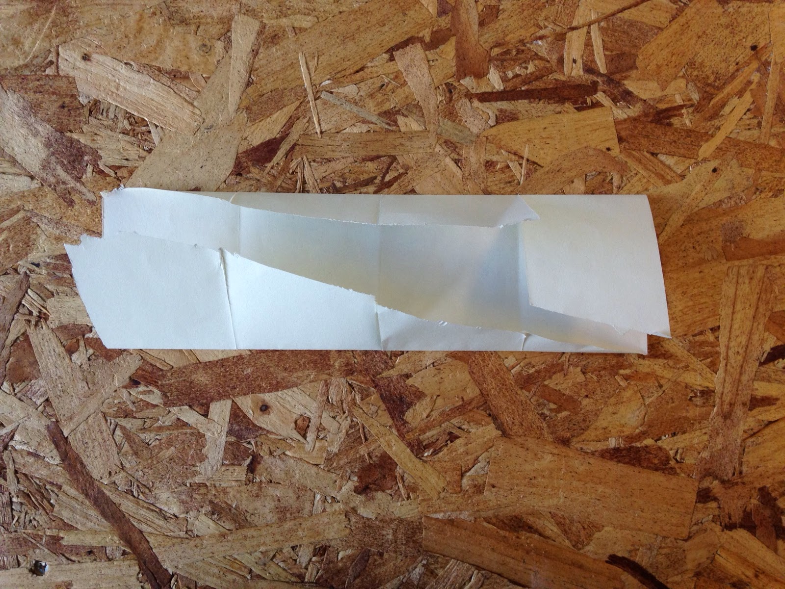
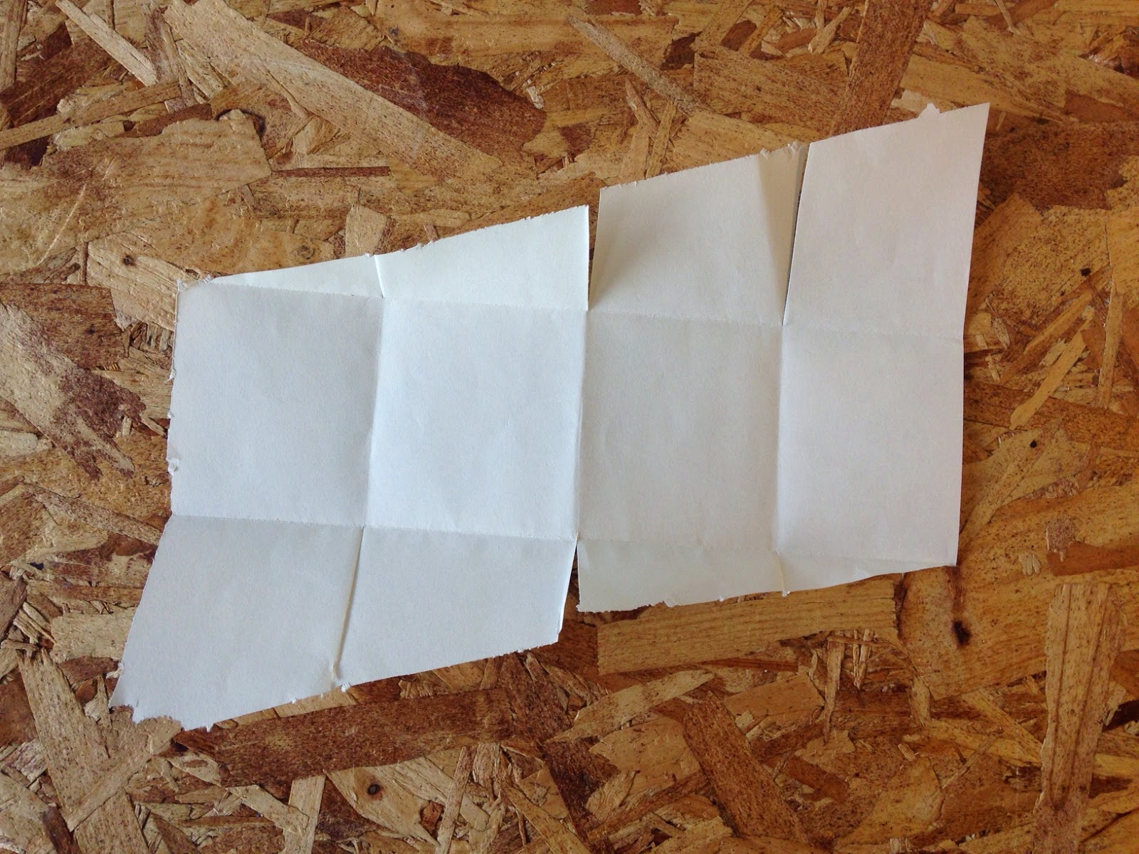
Today we carried on with leaflet experimentation. We each did some light research into folding techniques and applied them. I made a few leaflets completely out of my own head but I wasn't happy with the outcomes; I found I was trying too hard to be unique, without thinking of practicality.


I did some research and found a simplistic looking fold design that I wanted to implement. (http://www.pinterest.com/marioantoniou/fantastic-folding-formats/)

IN SITU, a collection of folding leaflets revolving around European architecture


I used thin scrap paper at first, so I could get the hang of it. It is straightforward but takes a lot of measuring to pull it off as the diagonally cut flaps have to fit perfectly with one another. Unlike what I found in my research, I cut through each fold on the inside where the diagonals meet, just to test it out. I don't think it adds anything to the leaflet and makes it seem quite messy.


I moved onto a thicker medium: thin blue card. I made it the same except I decided not to cut through anything this time.


The following images show the inside being used at the outside when folded up, which I think looks more enticing than the other way.


Tuesday, 30 September 2014

OUGD504 // Studio Brief 01: Study task 01

The Design Process
During this week you will design and produce a folded leaflet entitled "My Design Process" that describes your understanding of the design process and specifically how you apply this process to your own work. This assignment will allow you to explore the nature of design at an increasingly commercial level while also exploring creative approaches to leaflet design and folding.
This brief is only one week long and therefore will be very intensive. You will be given support by your tutors in the form of crits and tutorials while studio tasks will focus on aspects related to constructing and designing leaflets. You will be expected to explore and experiment with paper and card stock: folding techniques and styles; and graphic concepts and communication. Your progress, developments and creative decisions should be documented in your studio blog.
At the end of the week you will present your final leaflet design and plan for print to the rest of the group. You will receive feedback and points to consider during this final crit.

As a starter task, in small groups we brainstormed exactly which processes we go through to reach our final outcome when tackling a brief.

Almost everything we each wanted to jot down was around the same lines: research, concepts, thoughts/ideas. Every person pins a different amount of importance on each area, however. 

Next we put the stages into order as individuals. I picked the key aspects of the brainstorm, and left out things like 'taking a step back', because I don't understand how to do that when you have a short amount of time to work on something and you can't clear your mind of it.


I think that research is a key aspect that should crop up throughout the entire process, so on the diagram the arrows keep visiting it, but as 'broad' or 'specific'.  When I first get a brief, I do some general research to get a clear idea of whats already out there. I then jot down initial ideas before doing more research to expand these thoughts. 

I make sure to narrow down my ideas at each stage, until I have a few with a good amount of potential. This is the point where feedback from my peers is very helpful.

Next, we practiced some folding by trying to be imaginative with leaflet folds. I tried my best to stay away from folds like the concertina, as I've been using them for years. 


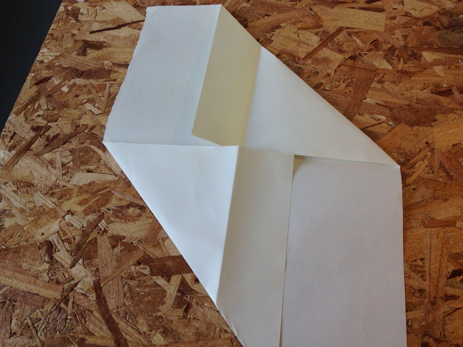
This is a leaflet I made which is quite adventurous, but I found that the orientation of the pages would be hard to navigate as each fold turns everything upside down.


 Above is another fold I made, which I then put my design process onto. I found too late that I was making the process stages too cramped, when there is a lot of space near the end of folding it out.
This fold doesn't inspire me; it seems too ordinary... which I do not want to reflect me and my way of working.