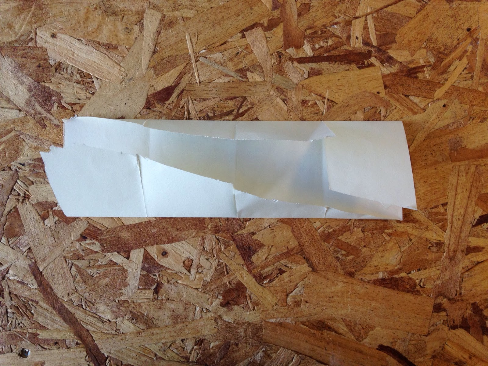
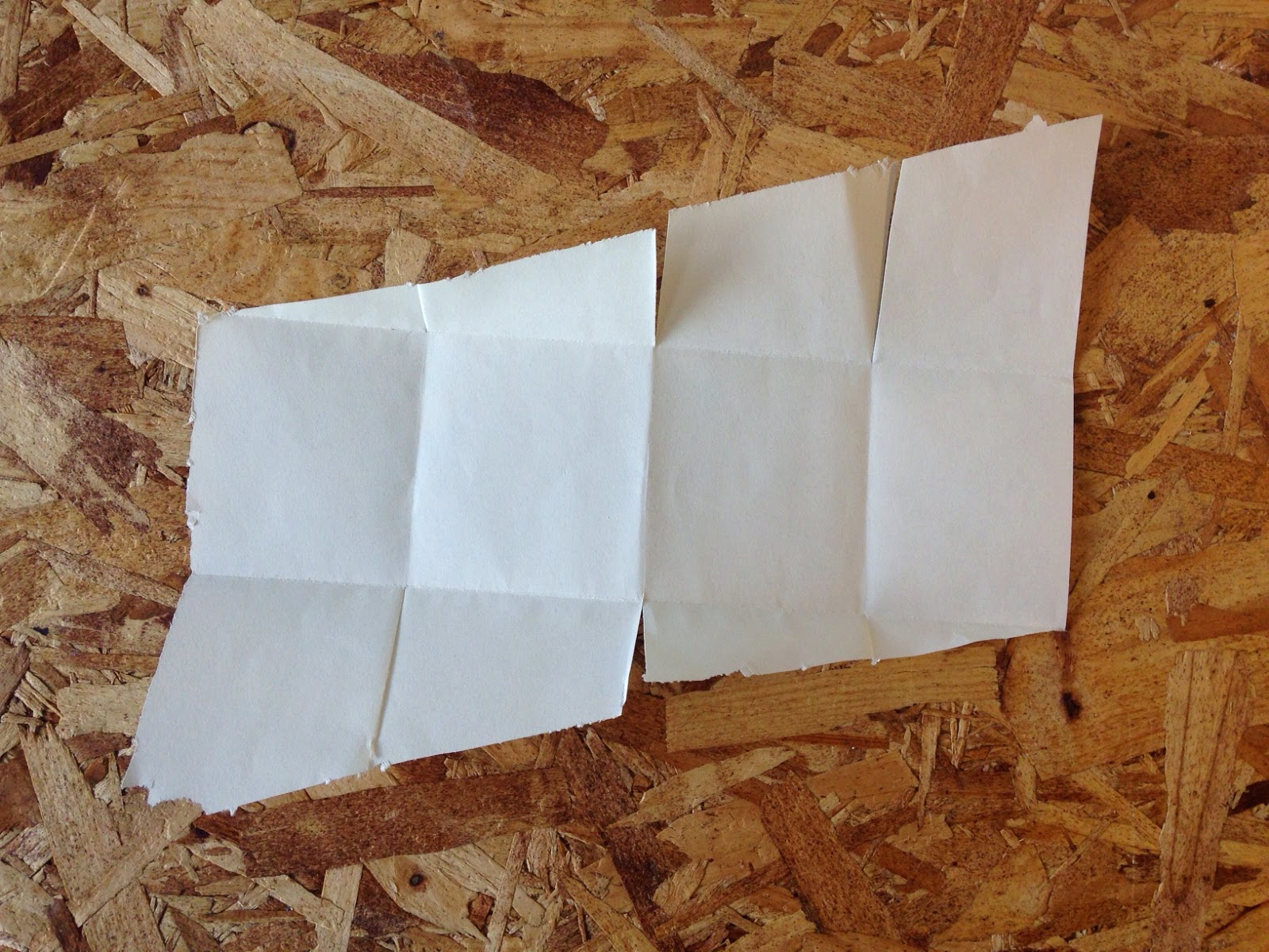
Today we carried on with leaflet experimentation. We each did some light research into folding techniques and applied them. I made a few leaflets completely out of my own head but I wasn't happy with the outcomes; I found I was trying too hard to be unique, without thinking of practicality.
I did some research and found a simplistic looking fold design that I wanted to implement. (http://www.pinterest.com/marioantoniou/fantastic-folding-formats/)
IN SITU, a collection of folding leaflets revolving around European architecture |
I used thin scrap paper at first, so I could get the hang of it. It is straightforward but takes a lot of measuring to pull it off as the diagonally cut flaps have to fit perfectly with one another. Unlike what I found in my research, I cut through each fold on the inside where the diagonals meet, just to test it out. I don't think it adds anything to the leaflet and makes it seem quite messy.
I moved onto a thicker medium: thin blue card. I made it the same except I decided not to cut through anything this time.
The following images show the inside being used at the outside when folded up, which I think looks more enticing than the other way.


No comments:
Post a Comment