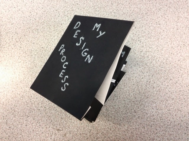
Measurements I have chosen to use are:
Full width: 32cm
Height when folded: 10cm
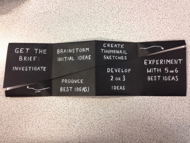
this means that each square is 8cm x 10cm, which seems like a good size for the amount of information I'm going to use.
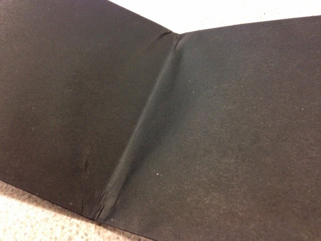
I have experimented with white paper on black card, so that I can create a two tone effect which would add to the aesthetic. However I've found that when stuck together they are too thick to fold neatly and fully, so I've decided to insert squares of white paper inside the leaflet as so:
This works a lot better and has a very tidy effect. I used PVA glue, which has made the paper a little wrinkled, but it is not visible on the inside of the leaflet. Besides, I'm not looking for a completely perfect finished product, as it is all going to be hand rendered to reflect my imperfect way of working.
As seen in the photos above of the double sided fold, I have tried out the white pen on the black card using scribbled letters, to add a touch of scruffiness and erratic-ness. The letters are dotted about the page because when I work I generally follow a process but I can jump back and forth in between the stages.
I tried out paint in the form of arrows but they came out looking too messy.


No comments:
Post a Comment