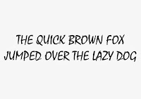
We were set the task of printing 'the quick brown fox jumps over the lazy dog' on A4 in uppercase and lowercase in block, gothic, roman and script.
Block: Haettenschweiler
Gothic: Avenir
Roman: Century
Script: Mistral
In groups we had to find which one was the most readable, and which was the least readable. We chose somebody's gothic font for most readable, and the least readable was a block font. This was a common finding in the class, and we discussed how block fonts are mostly for headings and for show; they are there to catch attention, they aren't used for readability. However, gothic fonts are used as 'invisible' types. They are extremely simplistic and make you focus on the content rather than the type characteristics.
We experimented with distance, and found that the further you move away from the sentences the easier the block fonts were to read.
Factors that contribute to readability:
- thin lettering
- sans serif
- lowercase
- distinction between glyphs
- alignment - justification
- kerning - dependant of font
- space between letters
- border around page
- uppercase and lowercase
- usage
- roman and gothic are easiest to read
- script and block - harder
- proximity of glyphs
- stretched letterforms
- lines of type
- the 'x' height - blocking
- speed of reading
- readability
- intricacy
- contrast of anatomy


No comments:
Post a Comment