Friday 27 December 2013

Type Hierarchies: Tabloid newspaper

Low-end newspaper: The Daily Mirror


the way my eyes moved around the page
I found the imagery more eye catching than the actual article. The advert was also very distracting from the editorial content.

type hierarchy - from left to right

With this page, the type in the advert caught my eye just before the article headline did, because of the huge use of the colour red. From there the bigger the text, the higher up in the hierarchy.

Type and image:
As you can see above, image takes up a very large area of the page. Tabloid newspapers tend to have less detailed text and more images to entertain the reader.

Fonts and types used:

  • Woodblock font used for article headline
  • sans serif font for smaller heading
  • serif font for body text
  • serif font for larger article quote


Type Hierarchies: High-end newspaper

High-end newspaper: The Guardian


This page is extremely dominated by the advert in the lower half, which surprised me about this type of newspaper.

Left to right in rows


The bigger the text the more it stood out to me on this page, and colour was also a huge factor, meaning the advert interfered with the article thus being more eye catching overall. However, the first piece of type that I saw was a quote from the article.

Typefaces and fonts:
  • Fonts similar to Helvetica regular and light used in the advert, along with some unidentifiable fonts such as a serif one and a handwriting-esque one.
  • Sans serif type used for body font
  • Light serif font used for article heading and quote
  • The reporter's name is boldened for effect among the light font
Type and image:
The image in the article breaks up the text very abruptly; I'm not sure if this is a good thing. It makes it seem like there are two separate articles. The image used in the advert is very large and takes up more space than any of the type used.


Monday 23 December 2013

Type Hierarchies: Free newspaper

Free newspaper: Waitrose in-store newspaper


This page is neatly laid out and has no over bearing type.

From left to right in rows


The leftover type was indistinguishable in terms of the type hierarchy

Fonts and typefaces:

  • ITC Avant Garde for Headings and large text, sans serif typeface
  • Unidentifiable serif italic font used for bigger bold text
  • serif font used for body text: quite similar to Garamond regular

Type and image: 
Image is used predominantly on the right side of the page and it doesn't interfere with the type. It is neatly laid out so it is separate.

Editorial content and commercial content:
There are surprisingly no adverts on this page considering it is a free newspaper. In this newspaper the adverts have their own pages so the articles aren't interfered with, which is different from the Metro (another free newspaper).


Type Hierarchy: Freebie magazine

Freebie magazine: ASOS monthly magazine


This page is organised within a simple grid system using photos and type. All of the text is pretty small so it was hard to figure out what drew me in first.


Because of the text size, my eyes naturally scanned the page from top to bottom, being partly distracted by the colourful imagery.


Fonts and typefaces:

  • All sans serif
  • Typeface very similar to Futura, I think it is the only typeface used on this page. Simple and straightforward, not costing too much time to plan out.
  • Bold and italic are used
Type and image:
There is more image than type and it certainly dominates the type on the page, as it is what is more important in this context. The images are colourful and placed appropriately with the small type underneath.

Hierarchy of information and hierarchy of type:
The bold type is the names of the products, so is higher up in both hierarchies.

Type Hierarchies: Average magazine

I have picked a sophisticated magazine and a freebie magazine, so for my inbetween magazine I have picked Grazia, which is a fashion and celebrity gossip magazine.


The first thing that sticks out to me is the bright yellow, which contrasts with the white heavily, which contrasts with the black type. It is an interesting layout which is well executed.

How my eyes moved around the page


Fonts and typefaces used:
  • Italic typeface for headings, looks very similar to Century
  • Garamond for body font and biggest heading
  • Sans serif font for small body text that is similar to Helvetica.
  • 'Grazia' in Didot
Type and image:
Image is the main focus point on this page, so they are quite large. The text fits aroudn the images nicely, keeping to a simple and interesting grid.


Sunday 22 December 2013

Type Journal: Stories from Toytown vinyl record


The typeface for 'TOYTOWN' is very decorative and childlike; it is reminiscent of fairgrounds. I'm quite fond of the detail and thought gone into the type design.

Production method: Wood
Identity: traditional. Found a similar font called 'Madame Letters'.
Character: childlike, playful, fun, decorative

Saturday 21 December 2013

Type Hierarchies: Sophisticated/well designed magazine

Sophisticated magazine: Red - "aimed at real women who lead busy but glamorous lives."


I displayed the hierarchy of the type on this page of Red above. The size is a clear theme in the hierarchy, and capitals. The red text was more eye catching than the plain black. I found the images quite distracting from the type.


This is the general direction my eyes moved around the page, I went from the logo and header to the smaller information then back up to the top again in a clockwise motion.

Fonts and typefaces:

  • Only 3 or 4 typefaces were used
  • Century regular and italic
  • A sans serif typeface that I couldn't identify
Type and image:
There are a few images used but they aren't overbearing, and they don't take over the type.

Type Hierarchies: Commercial webpage

I chose to look at Amazon which is a commercial webpage, as it is a buying and selling website.


I found that there are many colours on this website compared with the last two I have looked at, and there is more image aswell.  The amount of simple information that is trying to be shown on this page is high.
Below is a sketch of the layout and how my eyes wander around the page when looking at the type and image.


I seem to be drawn to the middle of the page where there are deals and images of items for sale, and coloured type. Then I move on to the squashed together information on the right, then around to the other side. Below is a break down of the type hierarchy as I saw it.


It is clear that the top of the hierarchy is swamped with colourful type, which naturally is more eye catching. Also, boldness and size is a large factor.

Fonts and typefaces:

  • Arial is used for the smaller text, that isn't trying to catch the viewer's attention straight away
  • Century is used for one large header
  • a few other sans serif fonts are used for different items
Type and image:
There is almost an equal amount of type and image on this page, which isn't suprising because it is commercial. The images back up the text.

Editorial content and commercial content:
It is all commercial content on Amazon.

Type Hierarchies: Well designed webpage

For my 'well designed' webpage I've chosen Typography Deconstructed. I think it's really simplistic and aesthetically pleasing, while being easy to navigate.


I deconstructed the type to make a hierarchy as seen above. Obviously the website name caught my eye first, as it is bold and larger than any of the other pieces of text. My eyes then travelled to the slogan placed underneath it, even though the type is very small in comparison. My eyes then travelled to the large block of blue with text in it in the middle of the page to the right, because of the contrast against the white background to most of the page. From there my eyes travelled all over the page depending on the boldness of positioning of text. The 'search' bar definitely caught my eyes last.


Typefaces and fonts:

  • The website name is in a typeface very similar to Vekta Serif Bold.
  • The body font is helvetica
  • Georgia is used for headings
Type and image:
There is one image used on the homepage, places in the middle to the left of some text. It is not overbearing and isn't distracting from the text on the page. It also follows the same colour scheme.

Editorial content and commercial content:
There is no commercial content on this page, it is all editorial content which makes the type all work together very well.

Hierarchy of information and hierarchy of type:
the information that is at the top of the type hierarchy is about posters that the website is selling, showing that is what they want the viewer to see first.

Type Hierarchies: Information heavy webpage

I chose the Wikipedia main page for my first webpage. It's main purpose is delivering information, and it is very busy with text. It is a very simple website that doesn't aim to entertain with imagery or colours.


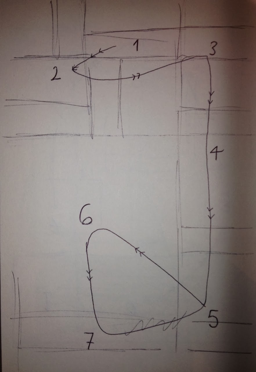
Below is a sketch of the layout I did, and the numbers 1-5 are showing the order my eyes travelled over the different pieces of text.


After no. 5, my eyes wander all over the page.
The layout of this webpage reminds me of a broadsheet newspaper, there are no adverts and it is very neatly organised.
the type hierarchy
 I found that the bolder and the bigger the type, the more it catches my attention. Also, some headings have pale colours behind them which makes the words stand out a lot more. The text with the bullet points is quite small and not bold, but the layout and the bullet points themselves made the whole chunk of text prominent.

After deconstructing the page, I was left with the larger paragraphs of text which are quite hazy in terms of hierarchy, because of the amount of text.

Fonts and typefaces:

  • I found that the typeface used for most of the text is extremely close to Helvetica although I can't be 100% certain on this.
  • Bold, regular and italic are used.
  • The only other typeface I could find is a serif font used for the Wikipedia logo: Linux Libertine.

Type and image:
There is very little image used, and the images are very small on the page compared to the amount of text. This shows it is very information orientated.

Editorial content and commercial content:
There is no commercial content used, it is all editorial.

Friday 20 December 2013

Type Journal: RCA


The letters R and A have been designed to match the C with the negative space. They are still legible as the same letters but have different features. the A has also been designed so that the stems have the same angles as the R to make it a very mirrored logo.

Wednesday 18 December 2013

Type Journal: Chipotle advert


Has a hand drawn style, but is actually a typeface as the 'P's are the same. The script style is to make it seem personal and on people's level.

  • Script
  • Friendly
  • Informal
  • Uppercase

Tuesday 17 December 2013

Type Journal: Vertigo


This poster was designed by Saul Bass who always uses a similar style. This typeface is hand rendered, uppercase, sans serif. It has a sketchy style to it. I think it is successful as a typeface and suits the poster perfectly.

Monday 16 December 2013

Type Journal: Man on the moon vinyl cover


This typeface has a futuristic feel because it is the audio from the first man landing on the moon. It has a stencil effect because of the gaps in each letter. These gaps make it a little less legible.

Saturday 14 December 2013

Type Journal: Elephant


Production
Digital, or hand drawn as it is an image used as type and vice versa.

Anatomy
The letters are all different sizes to create an image, so there is no set anatomy. This typography doesn't have a proper typeface.

Identity
It is the logo for Jumbo Records, which is a record shop in Leeds.

Character
The word 'jumbo' means very large, which is connotated with elephants, and after some researching I found that there was a famous elephant around in the 19th century called Jumbo.
The name 'Jumbo' has been created using a simple image of an elephant: the 'J' symbolizes the trunk, the M is the biggest letter to create the legs of an elephant, and the flick of the 'o' is the tail. Two flower symbols are used for the eye and tail to give it more character and life.

Friday 13 December 2013

Edible Type Brief: making the type


 We bought the ingredients for gingerbread, along with some white chocolate and food colouring. We made the mixture and printed out letters to use as templates for the letters. We decided to use Didot, which is a serif typeface. The letters looked really neat before they put it the oven.


After they were taken out of the oven, the letters became very fat and out of shape, which was really disappointing. We tried to reshape them but the gingerbread was too delicate and would crack quite easily. Not quite what we had anticipated! We made the letters a second time, and the C came out really nicely (seen above) the rest weren't too bad, but I resorted to making them neater with a knife because I'm a perfectionist, and I cracked the C. After it not going as planned, we decided to leave the serifs put, because the whole letters would fall apart if we tried to disconnect them. This was really disappointing because this defeated the whole idea, but it was our fault for not leaving enough time to do a trial and error.


We covered the letters in melted chocolate mixed with blue and pink food colouring, which was also more difficult than we thought it would be, as the chocolate was hardening really quickly so it turned into more of a lumpy paste as we were applying it. However, we got them to the tasting session, which is the most important part, and they tasted really nice.