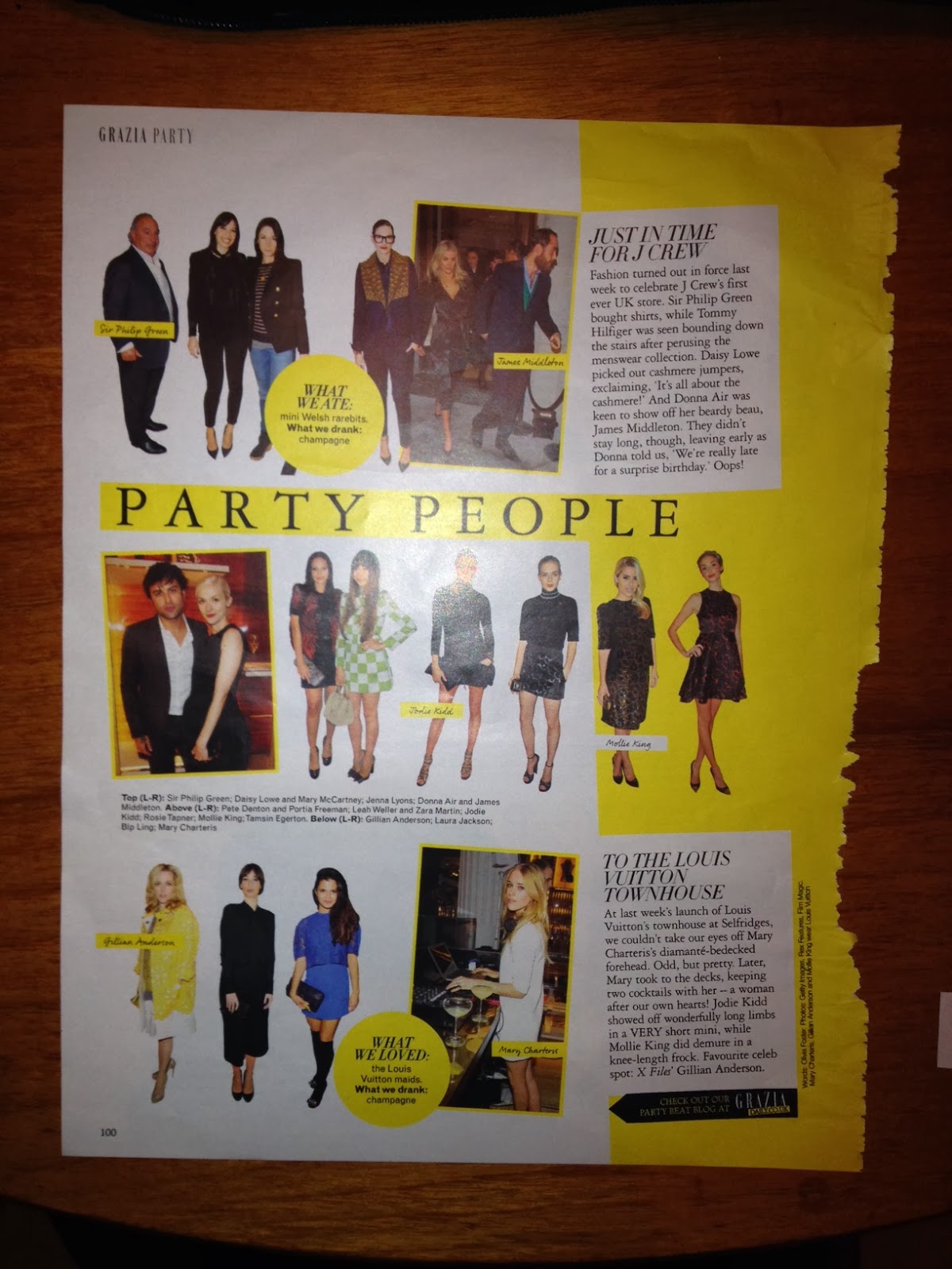
The first thing that sticks out to me is the bright yellow, which contrasts with the white heavily, which contrasts with the black type. It is an interesting layout which is well executed.
 |
| How my eyes moved around the page |


Fonts and typefaces used:
- Italic typeface for headings, looks very similar to Century
- Garamond for body font and biggest heading
- Sans serif font for small body text that is similar to Helvetica.
- 'Grazia' in Didot
Type and image:
Image is the main focus point on this page, so they are quite large. The text fits aroudn the images nicely, keeping to a simple and interesting grid.
Image is the main focus point on this page, so they are quite large. The text fits aroudn the images nicely, keeping to a simple and interesting grid.
No comments:
Post a Comment