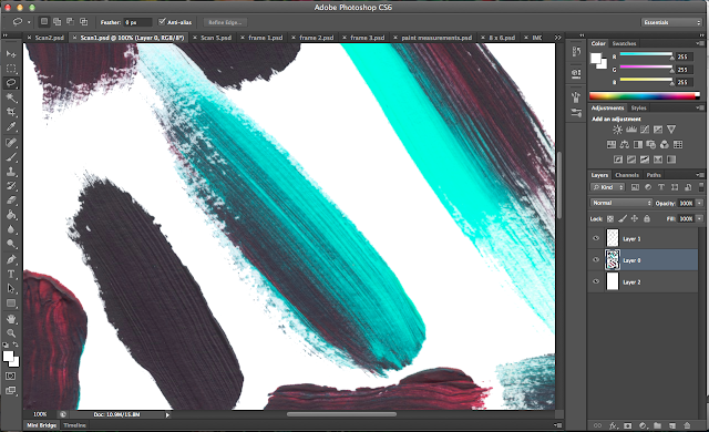
I imported my scanned paint into photoshop and experimented with changing the colours using tools such as:
- Hue/Saturation
- Colour Balance
- Brightness/Contrast
I've found that the colour scheme can be completely changed by toggling hue and saturation. Below are some colours that resulted, that I like.
Both of these images are vibrant and youthful; they are a lot more eye catching than the original that I imported. I think that the second is more effective and appeals to a larger audience so I'm going to develop my ideas using that colour scheme.

As you can see, the strokes are very detailed and realistic because I made them myself and didn't create them digitally. The contrast between the dark red and brown and the turquoise colour is brilliant.
Below is another experiment I did with acrylic paints on a small A6 piece of paper that I scanned in. I think that it would be more effective if I'd have used so lighter and brighter colours, however.
Below are some manipulations I have done on photoshop with this scanned image. I'm trying to recreate a similar colour scheme to the paint strokes I did earlier.


No comments:
Post a Comment