Freebie magazine: ASOS monthly magazine
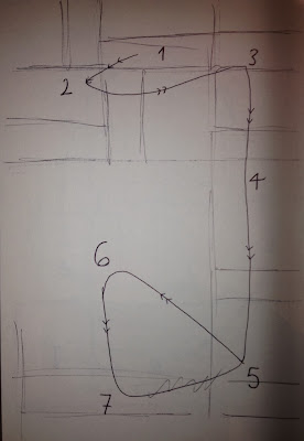
This page is organised within a simple grid system using photos and type. All of the text is pretty small so it was hard to figure out what drew me in first.
Because of the text size, my eyes naturally scanned the page from top to bottom, being partly distracted by the colourful imagery.
- All sans serif
- Typeface very similar to Futura, I think it is the only typeface used on this page. Simple and straightforward, not costing too much time to plan out.
- Bold and italic are used
Type and image:
There is more image than type and it certainly dominates the type on the page, as it is what is more important in this context. The images are colourful and placed appropriately with the small type underneath.
Hierarchy of information and hierarchy of type:
The bold type is the names of the products, so is higher up in both hierarchies.


No comments:
Post a Comment