In the last session we cut up each individual word used in 'the quick brown fox' in lowercase and mixed them up like this:
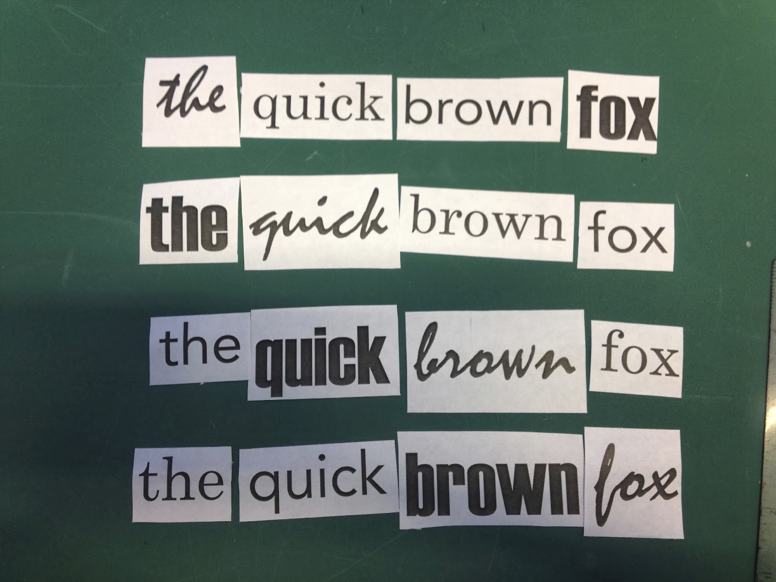
We were set the task of taking these and arranging them four times, so that the words would be read in order; 'the' needs to be seen first, then 'quick', and so on. I found this quite puzzling as I needed to keep looking at the arrangements with fresh eyes, which was a hard task.
I think the most successful is the third one down, as the sizing of the types works the best. Haettenschweiler made it difficult as its boldness is overpowering and catches your eye very quickly no matter what, but I tried to size it effectively. Mistral is also a bold font, but not as readable as the other fonts. This made it a tricky situation as it is the first word, but I just made sure it was the largest word on the page.
I experimented with the layout, especially in the last design. I wanted to see how the sentence would work, and I found that in a diagonal line the words can still be read in order when the sizes are adjusted.


yurtdışı kargo
ReplyDeleteresimli magnet
instagram takipçi satın al
yurtdışı kargo
sms onay
dijital kartvizit
dijital kartvizit
https://nobetci-eczane.org/
46FD4