High-end newspaper: The Guardian

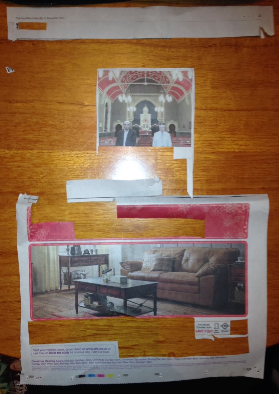
This page is extremely dominated by the advert in the lower half, which surprised me about this type of newspaper.
 |
| Left to right in rows |
The bigger the text the more it stood out to me on this page, and colour was also a huge factor, meaning the advert interfered with the article thus being more eye catching overall. However, the first piece of type that I saw was a quote from the article.
Typefaces and fonts:
- Fonts similar to Helvetica regular and light used in the advert, along with some unidentifiable fonts such as a serif one and a handwriting-esque one.
- Sans serif type used for body font
- Light serif font used for article heading and quote
- The reporter's name is boldened for effect among the light font
Type and image:
The image in the article breaks up the text very abruptly; I'm not sure if this is a good thing. It makes it seem like there are two separate articles. The image used in the advert is very large and takes up more space than any of the type used.
No comments:
Post a Comment