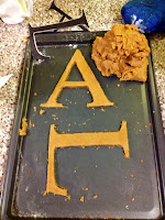
We bought the ingredients for gingerbread, along with some white chocolate and food colouring. We made the mixture and printed out letters to use as templates for the letters. We decided to use Didot, which is a serif typeface. The letters looked really neat before they put it the oven.
After they were taken out of the oven, the letters became very fat and out of shape, which was really disappointing. We tried to reshape them but the gingerbread was too delicate and would crack quite easily. Not quite what we had anticipated! We made the letters a second time, and the C came out really nicely (seen above) the rest weren't too bad, but I resorted to making them neater with a knife because I'm a perfectionist, and I cracked the C. After it not going as planned, we decided to leave the serifs put, because the whole letters would fall apart if we tried to disconnect them. This was really disappointing because this defeated the whole idea, but it was our fault for not leaving enough time to do a trial and error.
We covered the letters in melted chocolate mixed with blue and pink food colouring, which was also more difficult than we thought it would be, as the chocolate was hardening really quickly so it turned into more of a lumpy paste as we were applying it. However, we got them to the tasting session, which is the most important part, and they tasted really nice.


No comments:
Post a Comment