- could use different fonts/production methods for different letters
- coat in chocolate to make smooth
- the chocolate could be white chocolate so that food colouring can be mixed in
- possible materials for this could be shortbread, biscuits, cake or cookies
- the serifs could be jumbled and they have to be matched with the letters, and they have matching colours to the letter they belong to
Thursday, 12 December 2013
Edible Type Brief: idea development
We have decided to develop my idea of the serif idea, which will have detachable serifs so you can make it serif or sans serif.
Tuesday, 10 December 2013
Type Journal: Flow


I found this typography featured in a It's Nice That article and I thought it was really intriguing.
Production
It has been created using acrylic paint on plastic, and folds and shadows to create "dimensionality".
Anatomy
There is no identifiable anatomy apart from that it is sans serif.
Identity
It is a personal experimentation using acrylic paint, and it is image used as type (or type used as image). It was created by Sawdust.
Character
This type is colourful, playful and fun.
Monday, 9 December 2013
Type Journal: Starbucks advert

The title is a serif font. The kerning seems very tight, but I'm not sure why. This advert is on the wall of a underground train track, so maybe it needed to be more readable.
Edible Type Brief: brainstorm
Me, Daria and Elliot have decided to work together for this short project.
very brief ideas:
very brief ideas:
- our initials
- Massimo Vignelli - subway design
- chocolate keyboard
- adobe icons
- open up a biscuit (like an oreo) and a letter is inside
- chocolate puzzle, like a jigsaw
- serifs on a letter that are edible
- lasercut chocolate
- 'LCA'
- negative space
- fortune cookie
Edible materials that could be used:
- cake
- chocolate
- jelly
- meringue
- fudge
- waffles
- biscuits
- marshmallows
- fortune cookies
- brownie
- rocky road
- food colouring
Thursday, 5 December 2013
Studio Brief 1: Final designs

I gave my designs an off white colour to numb the overall brightness, and to make the actual 'frame' the centre of attention. I picked the typeface Ostrich Sans for the words and Basic Title Font for the measurements; the numbers in Ostrich Sans didn't work as well as Basic Title Font, but still kept in synch because they are very similar typefaces.
I picked these fonts because they are modern and have a feeling of youth about them; my target audience is young people. They are both sans serif, which definitely appeals to a young audience more than serif fonts, which can be viewed as old fashioned and too traditional.
The background I have used is a line drawing I created from a photograph of my own. This is inspired by cliche, typical photoframes, but I've taken a less cheesy and more simple take on that by stripping the photo and simplifying it. I made sure all of the paint strokes were similar in colour and size but were all unique; I've never seen designs using an artistic approach such as this before.
I think that these designs are successful in creating a simplistic yet creative approach to this brief. If I was given more time to work on it, I would create 3 completely different line images to make it more interesting, or given them more personality. However, I don't think that a deep ironic or thought-provoking concept is needed for photo frames. Personally designs like that wouldn't particularly draw me to buy the frame, because it is about how the frame itself will look in a home, after all.

Studio Brief 1: Backing paper in the frame using photoshop

I have taken a photograph of a photo frame I own. It is simple and has a young style about it, so I think it's appropriate for the style of backing paper I've gone for.

My frame is roughly 8 x 6 inches, so I used my 8x6" design to super impose into it. I used the 'transform' menu to distort the design, which was fairly easy. As you can see, it looks like that is what I've done, when what I want is for it to look as if it really is in the frame.

To capture a natural look, I tweaked the brightness/contrast and hue/saturation in certain areas to affect the lighting, because the design is so bright digitally. I then used the gradient tool to create shadowing around the inside edges of the frame, based on the original image I took. A nearby lamp was coming from the right hand corner of the photo, so I used this to help me choices of shading.
I think that the colours still seem a little off, but this is as close as I could get it without it taking up too much of my time. It gives a clear idea of what it looks like in a frame which is what my aim was.
Wednesday, 4 December 2013
Studio Brief 1: Paint labels development

I think that this layout is the best, as it exposes the imagery well by leaving the middle blank. It also keeps the paint strokes parallel with the frame edges.
 |
| Add caption |

I also think this composition is successful, as the paint is in the sky area of the line image which works well. I want to keep the text on the paper minimal. I plan to use 'photo frame' in there, because I think with just measurements it might be too boring, and it needs some more basic information.
 |

In the above two screenshots, I added another piece of text: 'insert photo here', because it adds a little bit of personality and an extra colourful feature to the backing paper. The font I have tried out here is Ostrich Bold, which doesn't work as well with the paint; the details clash.

I have realised that for the different sizes of frame backings, I need to be conscious of the sizes of the text etc, and the composition. I have tried laying out the 6x4" frame backing here, which has two lines for 'photo frame' so that it can be read clearer, because it is the smallest frame.
I want to change the paint that is the background for '6x4', as I don't think it matches the other well enough.

I've experimented with the different brush strokes to see which fit the best.

This layout seems appropriate for the 6x4" frame. I'm not going to use 'insert photo here' because of the size of the frame and it would be too cramped.
Studio Brief 1: Paint labels - development


Looking at the strokes above, I am looking for ones that could make an effective backdrop for type.
I have chosen these paint strokes as the most interesting, as they are neat and long. I also think that text looks good on top of them. I want to use white text to match the background, and it stands out very bold against the paint.

I've tried out different looking paintstroke, which is wavy and very bright. I have enlarged it and stretched it across the whole image, which is definitely intriguing but quite overbearing, so I don't think I'll use this idea.

I made the paint smaller on the page so that it only takes up a corner of the whole image. This way it can be used as a background for the frame measurements, like above. However, I will not use black text.

I'm currently trying to figure out how to place the paint on the page. If placed in the middle, I think the composition will fall apart and will be TOO distracting from the actual frame. I also don't know whether to use the paint strokes that have very contrasting colours in them like above; it makes finding a text colour difficult.
Tuesday, 3 December 2013
Studio Brief 1: Paint idea further development
I want to try to collaborate the idea of using paint and the idea of a line drawing of a landscape that is a subtle example of a photo for the buyer. To do this I have found a photograph I once took of a beach, and I have altered the hue/saturation etc so that I can see the clouds clearer. From this I've outlined the hill, sea, clouds and beach very simplistically.

I've taken away the original image which has left a simple line drawing. I've discovered I want to make portrait frame backings - because more frames can fit on the shelves - so I have cropped and resized the image as seen below.

Next I have made the selection white and used the paint experiment as the background:

I've found that it would look better if the line drawing fits the whole image, so I've then made manipulated it like below.

 |
| design using typeface 'Basic Title Font' |
I have mocked up some measurements to see how it could look if taken further. I am interested in using the typefaces Ostrich and Basic Title Font, which are very similar and very light in weight. They have a very modern and contemporary feel about them that I feel suits my target audience.
Overall, I don't think I'm going to stick with this design as I find it too in your face to be used in a frame. I think the colours are too dark, even if the paint has an interesting texture. The white is too hars against the background.
Design Principles: Type hierarchy in newspapers
In this session we broke down newspaper pages based on which pieces of type are read first. I took a page from the Metro, which is a free tabloid.


Below is the order I laid the type in. I found that colours were pretty prominent in making words stand out, as '...be more' in the O2 advert is what I first saw, even before a bold header to the main article on the page. This is because white text and colour are quite rare in newspapers, so they catch your attention easily. I found on this page the advert is what I looked at before any of the actual newspaper content.

Studio 1: Paint idea development

I imported my scanned paint into photoshop and experimented with changing the colours using tools such as:
- Hue/Saturation
- Colour Balance
- Brightness/Contrast
I've found that the colour scheme can be completely changed by toggling hue and saturation. Below are some colours that resulted, that I like.

Both of these images are vibrant and youthful; they are a lot more eye catching than the original that I imported. I think that the second is more effective and appeals to a larger audience so I'm going to develop my ideas using that colour scheme.

As you can see, the strokes are very detailed and realistic because I made them myself and didn't create them digitally. The contrast between the dark red and brown and the turquoise colour is brilliant.
Below is another experiment I did with acrylic paints on a small A6 piece of paper that I scanned in. I think that it would be more effective if I'd have used so lighter and brighter colours, however.

Below are some manipulations I have done on photoshop with this scanned image. I'm trying to recreate a similar colour scheme to the paint strokes I did earlier.


Monday, 2 December 2013
Studio Brief 1: Paint development


Exploring my initial idea of paint being used, I have come up with some compositions it could take the shape of.
- paint around the measurements to make the numbers, so the whole background is paint except for the measurements and other type that may be used
- long paint strokes around the sides
- measurements/text made with paint - acrylic or watercolour
- measurements and text on individual paintstrokes
- large paint stroke for background
- use paint with the line drawing 'cut out' idea, put paint strokes over the landscape drawing
- paint background with the line drawing of a landscape over the top of it
- cut the frame measurements out of paint
To start the process, I created strokes of paint with acrylics and used a few different colours.


I scanned in the two images above which I am going to use in photoshop to play around with.
Design principles: 'the quick brown fox'
In the last session we cut up each individual word used in 'the quick brown fox' in lowercase and mixed them up like this:
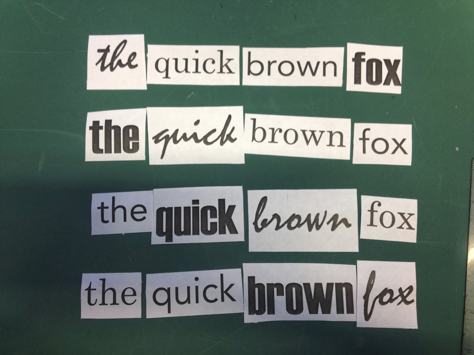
We were set the task of taking these and arranging them four times, so that the words would be read in order; 'the' needs to be seen first, then 'quick', and so on. I found this quite puzzling as I needed to keep looking at the arrangements with fresh eyes, which was a hard task.
I think the most successful is the third one down, as the sizing of the types works the best. Haettenschweiler made it difficult as its boldness is overpowering and catches your eye very quickly no matter what, but I tried to size it effectively. Mistral is also a bold font, but not as readable as the other fonts. This made it a tricky situation as it is the first word, but I just made sure it was the largest word on the page.
I experimented with the layout, especially in the last design. I wanted to see how the sentence would work, and I found that in a diagonal line the words can still be read in order when the sizes are adjusted.


Subscribe to:
Posts (Atom)