Saturday 30 November 2013

Type Journal: Sabbath bloody Sabbath vinyl cover


This typeface is very medieval or traditional looking, and emits an atmosphere of violence. It is for the band Black Sabbath who were a very hard metal rock band, which makes this typeface fitting.

Anatomy: The 'S' and 'h' descend extremely further than the other letters descend or ascend, which makes them look like swords or a sharp weapon of some kind.

Thursday 28 November 2013

Studio Brief 1: Initial concepts - 1


 My first initial concept that I have come up with is pictured above. I've played on the idea of poking fun at cliche family photos that can often be seen in photo frames on shelves, by using stick figure illustrations. This turns the poses and features of photo shoots humorous as it has been applied to cartoon-like imagery.
I'm not sure at this stage whether to have a background to these images or just stick figures on a plain background.
Could possibly have the phrase "Insert memories here".

Studio Brief 1: Initial concepts - 4


As seen in my research, I've looked at brush strokes of paint, and how I like the look of it as a photograph. This idea has less of a concept than my other ideas so far, but that could be developed later if I choose to move forward with it, for example I am thinking of taking a photograph of something very detailed and intricate, or something cliche, and painting over it messily.

Studio Brief 1: Initial concepts - 3


This rough idea is using the measurements found on the frame to create images; so using type as image. The images could be generic and cliche, and to make this ironic a slogan could possibly be added somewhere. However, it doesn't have to be ironic, and it could just be a clever way of creating a design.
The numbers/measurements could spell out 'INSERT PHOTO'?

Studio Brief 1: Initial concepts - 2


This concept consists of line images that are based on typical, generic photos that are often found in photo frames in shops. Some possible ideas to take the concept further:
  • make it look like the people have been cut out of the photograph. Could have parts of the photograph still there but other parts removed, eg the people or the sea or sky.
  • line image, but parts of the actual photograph show through, like in the dimensions ('8 x 6' for example), so the filling of the letters is the photograph.
  • gives the customer a template for filling it with their own photographs... gives ideas. This is a less ironic approach.

Wednesday 27 November 2013

Studio Brief 1: Brief ideas

Some initial ideas:
  • stick figures - pokes fun at the cliche family photos. have a fun, lighthearted sketch.
  • simple illustrations of things or people - black and white, or 2 or 3 colours. - gives the effect that the customer should 'fill in the blanks'. 
  • sketchy numbers and letters
  • photograph of paint strokes as a background.

Type Journal: Aja vinyl cover


I'm very fond of this typeface as it is very unique and dramatic looking.

Production method: bone
Character: sophisticated, delicate
Identity: cultural - has an East Asian style which fits in with the production method of bone.

Tuesday 26 November 2013

Type Journal: Wild Art


This is a book about art and design that I came across in Waterstones.

Production
lead

Anatomy
italic, sans serif, tall and narrow

Identity
I couldn't find out which font it is, but it is an italic sans serif gothic font.

Character
This type is bold and simple.

Wednesday 20 November 2013

Type Journal: Young Turks


Young Turks are a record label, and this is an album cover.

Production
woodblock, or digital.

Anatomy
sans serif, consistent in style, very tall, narrow and slender.

Identity
Rama Gothic Condensed or Headline Gothic are the closest fonts I could find to this type if the shadowing wasn't there, but I haven't been able to identify it.
It is condensed and symmetrical.

Tuesday 19 November 2013

Type Journal: Yalla Yalla sign


Yalla Yalla is a Beirut food stall in London. This type seems very modern and digital. It is sans serif.

Saturday 16 November 2013

Type Journal: Sheffield Doc/Fest


I found this type on an advertisement for a festival. It is digital but has a typewriter style to it to make it seem dated and scruffy and personal.

Friday 15 November 2013

Design Skills: End of Module Evaluation

Through this module I have worked on 5 studio briefs. I have found that each brief has been more challenging than the one before, as they have grown in depth and broadened in terms of research.
I've acquired a number of skills that previously I didn't have, such as on Adobe Illustrator where I have learnt how to make basic shapes and manipulations. The workshop gave me confidence to experiment digitally, although I still find the program a challenge to use as its relatively different to software I have used previously. I hope to increase my speed as I progress through the first year, and learn how to use Illustrator with more complexity.
I've learnt a lot about typography in general; I have never work with solely type before so it was all new to me. Briefs such as 1 and 3 gave me great scope to develop my skills with not only drawing letterforms but also contextual development. I feel happy with my outcome of the first brief, but I think I could have experimented a lot more with materials for the final outcome of the 10 letterforms. After the first brief I learnt how to manage my time more effectively, and I grew in confidence when battling my outcomes.
Crits have helped me a lot, and before this course I was not used to them at all so at first I found them a challenge, but I learnt to give others feedback and receiving feedback has been really useful to my progression, especially in brief 5 where I got about 15-20 post-it notes with feedback on. This brief was a challenge and I wish I had left myself more time to develop my ideas as I think that I jumped into it too quickly. I also felt quite unprepared for the presentation crit. However I am quite happy with the outcomes.
Overall I have grown as a designer with the pressure put on me through this module that I am not used to.

Tuesday 12 November 2013

Design Principles: Legibility and readability

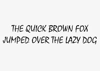
We were set the task of printing 'the quick brown fox jumps over the lazy dog' on A4 in uppercase and lowercase in block, gothic, roman and script.


 Block: Haettenschweiler

Gothic: Avenir

 Roman: Century

 Script: Mistral

In groups we had to find which one was the most readable, and which was the least readable. We chose somebody's gothic font for most readable, and the least readable was a block font. This was a common finding in the class, and we discussed how block fonts are mostly for headings and for show; they are there to catch attention, they aren't used for readability. However, gothic fonts are used as 'invisible' types. They are extremely simplistic and make you focus on the content rather than the type characteristics.
We experimented with distance, and found that the further you move away from the sentences the easier the block fonts were to read.

Factors that contribute to readability:
  • thin lettering
  • sans serif
  • lowercase
  • distinction between glyphs
  • alignment - justification
  • kerning - dependant of font
  • space between letters
  • border around page
  • uppercase and lowercase
  • usage
  • roman and gothic are easiest to read
  • script and block - harder
  • proximity of glyphs
  • stretched letterforms
  • lines of type
  • the 'x' height - blocking
  • speed of reading
  • readability
  • intricacy
  • contrast of anatomy

Studio Brief 5: Presentation of Final Crit


For the final crit I had to stand up in front of the year group and give a brief presentation of my three posters. I talked about how everybody is aware of the discriminations muslims can face on a day-to-day basis, but does anyone care enough or know enough about it?
My article was about a female British muslim convert who is apparently a terrorist threat, and sent a 'love letter' to the late Bin Laden. From this I turned my attention to terrorism and islam in the media, and how it has brainwashed so many people across the globe about what terrorism really is, and what islam promotes as a religion.
With these three posters, I am trying to convey a very simple message: Islam is not a hateful, terroristic religion. You may think that that is a very unpopular view in our country but it is so sneakily subtle that it doesn't seem like a huge problem anymore. But subtle racism and islamophobia is deeply problematic towards minorities in this country. Simple posters like this may open people's eyes a little bit more, whether it is a sub-conscious switch that is turned on in their heads, or if it sparks up discussions.
I chose the simple colours to give the idea of urgency and politics, this colour scheme screams IMPORTANCE. The white stock makes the text and images pop off the paper. 
Type: I used a simple, shocking statistic. I added "are you surprised?" to add a guilt effect. If someone looks at this poster and feels surprised by the statistic, then they should rethink everything they have learnt about terrorism in the past... nobody should be surprised.
Image: I used a very simple layout and design which I think is eye-catching as a final outcome. It is clear what it is conveying; if anything else was added I think it would take away from my original point.
Image and type: I included an illustration of an islamic headscarf and the phrase "Respect others." because everybody should respect people that are different from them.


Feedback:

  • The contrast of the illustration with the bold text and harsh, clean boxes works wonderfully
  • don't need "are you surprised?" because I AM very surprised.
  • maybe just "surprised?"
I disagree with the feedback about my type poster, so I am not going to change it, as I think it works well as a guilt trip.
If I had more time to work on this brief, I would possibly mono print these posters. I have recently done an induction in it and I think it can create really great, bold effects.

Saturday 9 November 2013

Studio Brief 5: developing the image poster

For my image poster I want to convey peace and religion together. I tried to draw my own peace gesture like below but I found it was taking too much time so I used a template. I like it because it is very simple and neat looking, and also modern and fresh.


I want to include symbols of popular religions, but not too many, so I picked the 3 main religions of the western world. Christianity, Judaism, and Islam. This is because many people connotate Christians with peacefulness, also Jewish people, so I wanted to place them next to an Islamic symbol to show they are all widely practiced religions with peacefulness behind them. I like the simplisticness of these images together, I think they look bold and very neat.


Friday 8 November 2013

Studio Brief 5: developing the image and type poster

I want to definitely use a islamic headscarf illustration, as I think it is very powerful and clear. I've tried to draw a new one from scratch on illustrator:


But I've soon realised that it looks like hair, and isn't as iconic as my drawing I did by hand. So what I have done is draw over the scan of my original drawing as below. I turned it white to experiment with it. Red and a very dark navy are my two colours I have chosen (with white stock).


I've found that the whiteness of the illustration is too vibrant against the dark background, I don't think it works too well. I'm also not happy with the arrangement of boxes, but I'm glad I've had the chance to play around and make mistakes.

Studio Brief 5: developing the type poster


Above is a brief idea I came up with, but I don't think I'm going to use it for my final poster. It is a different spin I've taken on the statistic, which if I had more time for this brief I may have worked with a little more. I was pushed for time so I stuck with my original sentence which is below.

 I have used helvetica for my posters, because it is simple and straightforward and described as an 'invisible typeface'. It does it's job and doesn't distract: I am trying to put across a bold and blunt message.
Here I have played around with different layouts of colour. I know that I can only have 2 colours and stock but I wanted to play around with red and blue first. If I could use another colour I would use blue, red and a dark colour similar to black, because blue and red have deep political connotations and I really want that to be conveyed with my posters. However, I don't want to use JUST blue and red for my two colours, as I think it would make my posters too colourful and too busy, I feel that a dark neutral colour is needed somewhere.
I also realised after these experimentations that the boxes around the words may be seen as image, so I have had to discontinue that part of my designs. I would use them if it was allowed.

Thursday 7 November 2013

Design Principles: The Font Family

This is a task following on from:
http://s-mcdonald1316-dp.blogspot.co.uk/2013/10/design-principles-task-3.html
http://s-mcdonald1316-dp.blogspot.co.uk/2013/11/design-principles-our-own-font.html


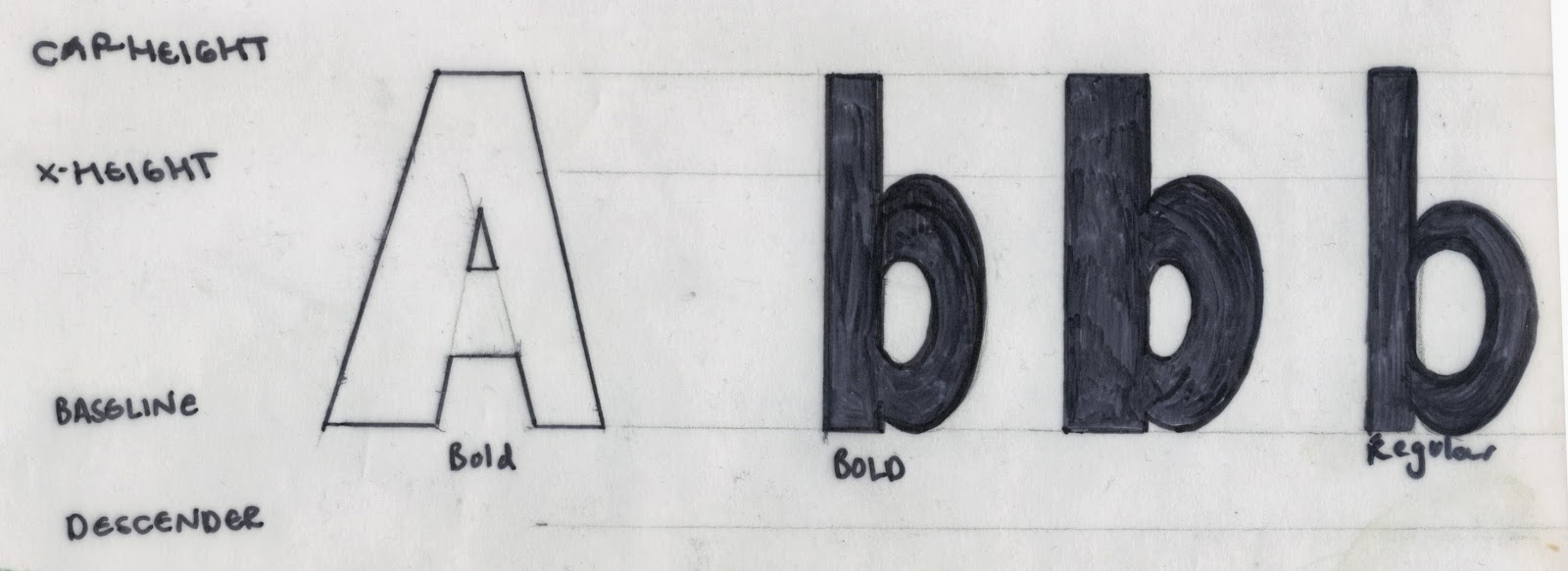
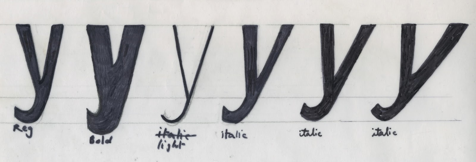
I experimented with the weight of the letters before making my final letters. I tried out the extremes of bold and light and italic, to see how far I could push the typeface. I found some were too extreme and weren't appropriate.


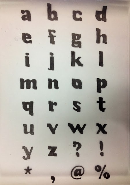
Above shows my final hand rendered font family.

I scanned in my font family and traced over it in illustrator. This took a long time to do, because I'm not too used to using illustrator. I made some of the edges neater and slightly altered some of the letters to make them more concise. However, I still feel like some of the fonts could be a little more consistent, eg light and italic. Some of the italic letters look like they are also bold.

Studio Brief 5: INTERIM CRIT


I was given plenty of feedback on my poster ideas at the interim crit. I decided to give no explanation or leave any research on the table so that the posters could speak for themselves, and nobody said that they were unclear which is good.

  • I was told that for the image posters it looks sometimes like I'm try to advertise islam, or sell it. Maybe because of the gimmicky illustration of the hand.
  • I was also told that the statistic is 'just a fact' so nobody will listen. I strongly disagree with this statement as it is straight to the point and by being a fact it is hard-hitting. I think it will shock a lot of people.
  • 'pie charts are boring' - reading this feedback made me realise that they are boring. I won't be using that idea.
  • Somebody suggested that the headscarf could spell out 'Respect others' - but I think that idea would be too time consuming for me considering I only have a day or two left to create these digitally. Maybe if I had more time I could experiment with that idea, as I do think it is interesting.
  • I was told I need to work on my layouts, which I haven't properly thought through yet. Layout is very important on posters like this.

I left everyone else feedback, such as which kind of colours to go for and I let many people know that their messages weren't as clear as they should be. I think that looking and criticising other people's work helps my work progress as it opens my mind to new ideas and viewpoints. It was also interesting to see the range of viewpoints and ideas everybody has taken forward.

Wednesday 6 November 2013

Type Journal: FLOWERCHILD


I have identified this typeface as Flowerchild, which is incredibly informal and has a scruffy, hand rendered effect but it is digital. It is used to appeal to a young audience, and all the letters are in uppercase.

Tuesday 5 November 2013

Studio Brief 5: Poster ideas

For my posters I want to reach out to the public and open their eyes to islamophobia and racism in our society, and how it effects minorities. I don't think enough people care about religious discrimination, whereas personally I feel it is hugely problematic to attack whole religions because of a tiny percent of individuals who harm others. I've been aware of other mainstream awareness campaigns but not many for Islam.

3 ideas for the type and image poster
I have used a statistic which is quite dramatic and extreme, I think it is a real eye-opener. The third idea is a very simple illustration of a woman wearing a headscarf, which is a symbol of islam to passers by if they saw her in the street. Women like this get judged every day; it is a hard task to where one and it takes courage. They should be able to wear whatever they want with no ignorant backlash.

3 ideas for the type poster
Here I've played around with the same statistic again, as I'm not sure which poster to use it in. I think it works quite well with no image at all. The two other posters aren't very strong at the moment, as I think they would need images to get peoples attention, whereas numbers and percentages always interest people.

2 ideas for the image poster
Creating posters that are solely image is always a struggle, so I've had to use the symbol of Islam to portray my message. Even when using the symbol, it is still quite difficult... this is something I can develop further. I prefer the first idea as the peace symbol is clear, but I think I will make it sufficiently smaller on the poster if I take this forward.

Design Principles: our own font


We reviewed the letterforms we had created for the task (above).
Is there a clear difference between regular, bold, light and italic? - I think that the bold isn't bold enough, and the italic needs to be more italicized.

General observations/issues/concerns

  • how to bolden without going above x-height or cap-height?
  • how to judge what ange to use for italic and how to angle certain areas of the letterform.
  • accuracy is difficult
  • distinction between types
  • hand rendering
Criteria for success or failure
  • consistency of modification
  • legibility of glyphs
  • distinction of 'character'
  • accuracy of construction
  • work across all glyphs
  • do the fonts work as a recognisable family?
Italics
  • how big the angle needs to be is based on legibility of the letter
  • the angle can't be any higher than 12 degrees, which is seen as the maximum in type.
The letterforms A, b, x and y are ideal for testing because of the range of characteristics they hold.
Things to bear in mind when experimenting:
  • how bold can bold be? and the same for light and italic?
  • what will you take off what will you add?
  • how am I going to modify it?
  • how sheer can an italic be?

Saturday 2 November 2013

Type Journal: John Williams - Cavatina vinyl cover


Extremely light and sans serif typeface, which is trying to reflect sleekness and sophistication because of the style of music. I find the 's' very frustrating as it is extremely subtle to the point of it being a wavy line.
'CAVATINA' in all capitals is very illegible because of how light the type is.

Studio Brief 3: Final crit


We did a crit in a group of around 25 people, where we all took turns to present our work. I talked about why I've manipulated Cooper Black in the ways that I chose, and how Matthew's personality is reflected by the letterforms.
Some feedback I got:
  • Cooper Black is a fun and informal font, so that was a good choosing
  • The comfort zone is definitely reflected by the boxes
  • the manipulations aren't very clear from far away
  • the letters work better when large and close up, they aren't as successful on a name tag.
I think I agree with these points. If I had more time to complete this brief, I would have maybe developed my ideas more and come up with better solutions. I definitely think that if I did the brief again, I would complete the final letters on illustrator and print them for the final crit. This way the boxes would look a lot neater and sharp, they were harder than I expected to draw by hand. I thought that drawing each letter by hand would be more straightforward than on illustrator, however it was very time-consuming in the end.

Friday 1 November 2013

Studio Brief 3: Final alphabet


Original version of Cooper Black

Manipulated typeface
Above is my finished final typeface that has been manipulated from Cooper Black. My partner for this brief was Matthew Brewer, whom I had not talked to prior to this project so I made sure I found out plenty about his personality and interests.

  • I slimmed down the letters so they weren't so loud and in your face, as Matthew isn't a loud or obnoxious person at all. However I kept the letters bold still to represent how he has some strong characteristics, such as his humour, which is a very big part of his personality.
  • I lengthened the ascenders, to make the font taller; this is to reflect Matt's physical exterior. I felt a short and wide font didn't fully match him.
  • I removed the serifs from the font, as the connotations of serif fonts are that they are traditional, roman, and formal. These descriptions are not what I would associate with Matt. I wanted to keep the font as simple and as modern as possible, I also wanted to keep it young looking; he is a teenager after all.
  • I made the closed negative space in the appropriate letters smaller, to show the letters are closed. This is to represent Matt's need for comfort and how he describes himself as close-minded.
  • The small boxes framing the letterforms are representing his comfort-zone; the letters are supposed to be boxed in. They are also representing his negative attitude to some things, and his pessimistic outlook. These details contrast with the bubbly and curvy letters, which show his fun side.