Saturday 25 January 2014

Colour Theory: Colour Contrast

We have previously learnt about the contrasts when handling and balancing colour:
Contrast of TONE
Contrast of HUE
Contrast of SATURATION
Contrast of EXTENSION
Contrast of TEMPERATURE
COMPLEMENTARY contrast
SIMULTANEOUS contrast


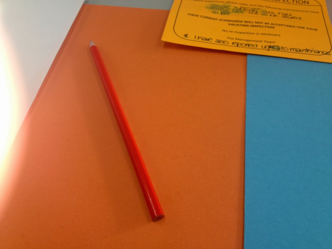
The 5 coloured pieces of paper are very low in saturation and are quite faded in colour. We placed a few different objects on top of each piece of paper and studied how the colours seemed to be perceived differently each time.


The green clip looked very vivid amongst the orange and red paper, because of the contrast in hue. The contrast of saturation was also a factor.


Orange pen
  • reflects the colours - a hint of yellow appears on the green, and turns red on red paper
  • looks yellow on the yellow paper
  • more saturated on orange


Red pencil

  • looks orange on orange paper
  • looks dark red on blue paper
  • looks bright red on yellow paper


We were set the task of choosing 5 more objects and pantone matching them, then recreating the colour on photoshop.

Thursday 23 January 2014

Studio Brief 4: Final Promotional Posters


Typefaces:
  • Helvetica neue regular - used this for the smaller text, because its perfectly legible. It also doesn't distract from the design overall, or the main heading font. It is unnoticeable as a typeface.
  • Cooper black regular - I used this as the heading font in brief 3, so I wanted to carry it through. It is retro feeling and friendly, and I used it in capitals to jump out at the viewer. It has character rather than helvetica, which for an eye catching heading, doesn't work as effectively.
Rewritten brief:
I think it has reached the points I made in the brief, and has effectively promoted an exhibition based on album artwork. The three posters work together as a set which is something I was very conscious of while designing them.

Record cover/CD/iPod:
I wanted to create a subtle timeline with the posters which mirrors the exhibition itself (a timeline of album artwork). It shows the decline of audio formats, from vinyl to digital. This effect would probably affect the older generation rather than the younger ones. It also helps to adhere to different ages, seeing as my age range is quite large (16-60). A lot of 16 year olds will know much more about an iPod than vinyl so they can relate to it, and a lot of 60 year olds will be the same with vinyl.

I was inspired by various art exhibition posters, and Ross Gunter's posters, which are very minimal but work with colour very closely. The text is always very small on them and they are pretty eye catching.

For printing, I chose a white textured stock rather than the regular printer paper. This is because it comes out a much better quality, which you would expect from promotional posters. After printing, I realised that I could have screen printed these designs, which would probably look a lot better. I might experiment with these designs in the future, or atleast learn to push the boat out a bit more with production methods.
I am happy with my designs, but if I had more time I would have liked to create a range of exhibition tickets or booklets to add to it more and make the overall finished products more appealing.

Wednesday 22 January 2014

Studio Brief 3: Final 5 spread layouts


Typefaces:

  • Cooper Black Italic - headings. I chose this typeface because it is especially retro when in italic, and comes across as friendly and soft. I wanted to keep the spreads very informal. Also, cooper black is very adaptable when it comes to different age ranges.
  • Avenir Book - body text. This font is easy to read and isn't so generic that it goes unnoticed - I wanted to use something fresh that hasn't been overused, seeing as the spreads are so minimal I wanted to add character.

Target audience: music lovers, between the ages of 18 and 60.

Spread 1 - 8 facts, 1 photograph
Spread 2 - 10 statistics, 4 photographs
Spread 3 - 8 words, 10 photographs
Spread 4 - 20 opinions
Spread 5 - 7 statistics

These spreads were created to represent my 100 research. I based my research on audio formats and album artwork, as album covers are really intriguing to me personally.
I wanted to create a booklet that informs the reader of different formats of audio and their decline, such as cassettes being nearly extinct and vinyls rising to the top again because of their distinct novelty. I included images of album covers that I think are exceptional in their aesthetics that make the reader realise how awesome vinyl covers used to be when they were much more important and recognised than they are now.
I included new and old album covers on the page with the opinions; this shows an interesting range of opinions and what is noticed in this day and age. A lot more new album covers were favoured than I thought they would be... personally, older covers come to my mind sooner than newer ones.
They are a collection of 5 lighthearted spreads that could be found in a zine or leaflet in a music shop of some sort.
I gained inspiration from free zines and booklets I came across in vinyl stores; such as Howard Assembly Room and The City Talking. These helped me figure out what layout is about when to do with music, as I had no clue before this brief.


For printing, I chose antique white paper to give a old, faded effect which is to reflect the vinyl album artwork I researched. I didn't go with bright white paper or normal printer paper because when printing for the crit, I thought the spreads looked tacky and cheap.
The faded colours blue and pink have added subtle vividness to the spreads, which are linked to common colours I've spotted in artwork on album covers.
The thin dark lines that I have used here and there on the spreads come together to subtly reflect the lines found on sheet music, that started off as a more bold part of my designs but I toned it down.

The images on the spreads came out quite grainy, which reflects my new abilities in inDesign; something went wrong there. However, I quite like the effect, as it suits the paper and the faded colours I used. An accidental success, that will help me learn for the future. I think if I had more time on this brief, I would make the content even more specific.

Tuesday 21 January 2014

Studio Brief 3: Layout development - spread 4

For this spread I want to have visual statistics on it. I've taken them from my survey on surveymonkey and made them colour co-ordinated with the other spreads on photoshop.


I am replacing the headings with my own in italic cooper black to fit the spreads. This page is going to be straightforward and to the point. Not sure whether to add photographs somewhere, but I don't think there will be much room.


I've resized and lined them up very neatly for effect. The lines at the bottom are like the sheet music type lines I got rid of, however they are less obvious here and just add a little something to the page.
I added a few more statistics at the bottom of the right page, to fill the space a little bit.

Studio Brief 3: Layout development - spread 3


This was what I put together for the final crit, which was obviously unfinished. The grey boxes show where the photogrpahs will be placed and the placeholder text is to show possible facts or statistics, although I'm not sure now that I even want to use any text at all on these pages.


I've started adding my photographs to the page, I've picked ones that reflect vinyl artwork solely.


I'm trying to make the layout more interesting here, but I'm not sure if it'll work with the text, I may need to add more photos. I have also adjusted the opaqueness of the colouring, which I got told in the crit to do to make it all look more faded. I like this effect and I want to use it through all the spreads.


I got rid of the text, as I don't need it on this page. I like it with just photographs and words from my 20 words. I removed the music note bars from the top and bottom of the spread; I think they look tacky and I've changed my mind. I just made the lines very minimal so add little touches to the spread. They are still slightly reminiscent of sheet music.
The photographs are in a similar layout but I have made them uneven across the two pages to add more of an interesting dimension.

Studio Brief 3: Layout development: spread 1


Above is what I finished for the final crit. I learnt from people that the text in pink isn't very legible and clashes with the photograph. I was also advised to stick to the same colours for text; which I understand, but I want to use both white and black throughout. I like this layout of the text, but I think that I want to make it even more simplistic. I've looked at my research again to help me with this, as one spread I looked at used a photograph over two pages like this.


This is the layout I settled on. I changed the body font to Avenir, which I think has a great retro and informal feel about it. I also took some text off the spread and lined up the text boxes very neatly. Changing the text colour from pink to white had definitely improved it overall and has made it more neat and classy.

Studio Brief 3: Layout development - spread 2

Below is what I created for the final crit.


  • I created this in inDesign, by adding four photographs of my own and some placeholder text (for now). I want this page to hold information about each audio format, using statistics/facts from my research. I have used cooper black through out because I feel it had a retro feel about it, and gives me an instinct feeling of the past. I want to instill a retro feel because a big focus of my research was vinyl and record album covers.
  • I've chosen to use blue and pink because they are common colours I found when looking through vinyl albums. They represent the vividness in old album artwork.
  • I added lines at the bottom to show a reading music bar, which runs through most of the spreads for a clear individual theme to do with music in general.
  • I want to keep all spreads simple and clean looking, as I don't want to overdo with the information and I want a big of the focus to be on photographs.
  • The crit said that the layout of the text with the images on this spread didn't look right, and that the bars at the bottom aren't very flattering.

From this I've decided to change it round...


Here I have made the photographs boxy in shape, which someone in the crit told me to work with in my layout to reflect album covers/etc... I thought this was a great idea to try out and I like it.


The boxes weren't too aesthetically pleasing, so I've narrowed them down to small thin rectangle/lines underneath them to give them a big of a highlight. From here, I'm trying to decide where to place the text so that everything will fit together nicely.


 From looking at my layout research, I have decided to have both pages very similar in their composition; photographs on right, text on left. I'm making the text boxes very square to reflect the box theme throughout which reflects albums.


I felt the pages were too simple so I've added thin outlines to the text boxes and two thin lines at the middle and bottom of the pages to give a finishing touch.

Studio Brief 3: Layout development - spread 5


Above is the layout I created for the crit which includes my 20 opinions from my research. The 20 opinions are the favourite albums of 20 people I asked. It is filled with placeholder text at this point.
The dark circle is to represent a vinyl record,which also fits in with the shape of a CD. The pink side shows a sort of sleeve effect. I like these add ons, as its unique, but it may be a bit overbearing, along with the pink. I don't know yet what text to put on this spread, maybe some information about which albums they are?


I want to develop this spread more. In doing this I have collected each individual album photo again from the internet and saved them as psd files to maintain quality.
Below I have changed "Popular album covers" to "20 Favourite Album Covers"to make the spread mroe precise. I have also experimented with moving the circle shape around the pages.


I like this placing, as it isn't too in your face like it was in the middle of the spreads. It gives the albums room to breathe, and it can give a nice backdrop for the text.


I've put the names of the 20 albums in the corner in white text to contrast with the dark circle/vinyl shape. I've spread out the albums compared to when I first made the layout, as I think they were too cramped before. I like the uneven overlapping on the two pages; it gives an interesting slant to it as a spread.

Monday 20 January 2014

Studio Brief 4: Poster further development

This is the development after the final crit.


I wanted to see how it would look without using Cooper Black (which I used for my spreads in the 3rd brief, which I want to be similar to this work).


I then erased the black background from the prism in photoshop, so that I can see how it will look on a white background.


It looks better this way, but The blackness of the triangle needs to be fixed. Here I got rid of the pink rectangle and replaced it with thin pink lines which are inspired by my Ross Gunter research. It breaks up the information in an interesting way, and a lot less harsh. More modern too.


Here I changed the header font back to Cooper Black, as I gives it much more of a personal identity.
I also made the prism grayscale, to make the poster more minimal and to give the information above more attention and the colours used there more focus. I incorporated blue into it, this way it fits my last brief in its style. The colours are also on 80% opaque for a faded effect. (helvetica neue used for smaller text)
I redid the Design Museum logo, as it was pretty pixellated.


This is my second poster, which focuses on a CD cover. I created the shape myself with lines in illustrator. I placed the information on it to reflect how its an album cover a bit more.


I used Cooper Black again for the same reason as the first poster. I added a second line on the side of the CD, to add a bit more dimension. Also, exhibition prices.


I created a drop shadow for the case by using simple thick lines. I also incorporated blue like the last poster. I want to leave the rest white as I want a very minimal effect. It is straight to the point and quite striking.


For the third poster, I created an iPod vector on illustrator, from the circle and rectangle tools. I again made a drop shadow to add depth to it, and to make it less basic looking.


I added the appropraite information, and added the lines I used inthe past posters.