Over the christmas break everybody collected between 15-20 items of a certain colour. All my items were green. Our task was to arrange our colours so that a colour wheel would be created around the studio.


This task was deemed pretty tricky, as each object had a different hue, saturation and tone. Some objects were transparent, which confused our perception of colour this early on in learning about colour theory. Transparency affects the tint of a colour, but not the hue, so it was tricky to know where to place objects with high transparency levels.
Some objects had a shiny surface which reflected light more than other objects, which affects the saturation.
I was working in a small group to order the greens, and we focused on a mixture of all the elements of colour, as we weren't aware of the complexity at this point. We had to order the colours so that they would subtly change from yellow to green to blue, so we worked with mostly hue but the darker greens were placed near the blue, which is relying on the tone.
Pantone matching 5 objects


Book cover:
with lights on - 381U (solid uncoated)
with lights off - DE302-3U (solid uncoated)

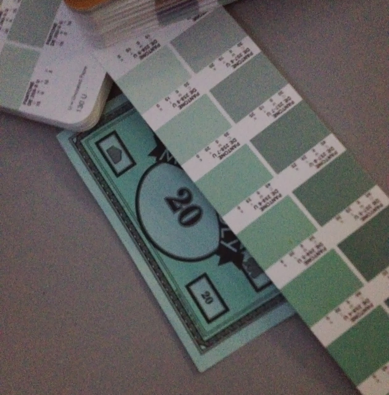
Monopoly money:
lights on - DE25-8U (uncoated)
lights off - 317U (solid uncoated)

After Eights box
lights on - 5533C (solid coated)
lights off - 5533C (solid coated)


Tupperware lid:
lights on - 361C (solid coated)
lights off - 361C (solid coated)

Aerosol lid:
lights on - 358C (solid coated)
lights off - 358C (solid coated)The task of pantone matching was relatively easy with some of the colours, for example the book cover and the After Eights box were the easiest because the colours have been printed on to card. The aerosol lid was very tricky because of it being plastic, which most of the time has a slight transparency; it would be impossible to find a printed pantone colour that had the same tone.
We got 2 out of 5 matchings right when we turned off the lights. Getting the same match for the aerosol lid was surprising, because of how much light passes through it. However, getting the book cover and the monopoly money wrong was expected because of the bright hue of the green (which catches the light) and the paleness of the blue (darkness would affect it easily).
No comments:
Post a Comment