Showing posts with label OUGD404 colour theory. Show all posts

Wednesday, 19 February 2014

Design Principles: Colour theory - 5 objects

 Below are 4 objects on 5 different background colours. I matched each object and piece of paper with pantone colours to the best of my ability.


These two colours are very similar as they are both the same hue, but the level of contrast is very low, as they both have very little saturation or brightness. The yellow paper looks very brown-like in this photograph.


The photoshop colours have changed after saving, which may be something to do with the similarities of the colours or just a problem with the file.


The cloth looks a lot more yellow when sat on top of the green paper. It looks brighter because of this.


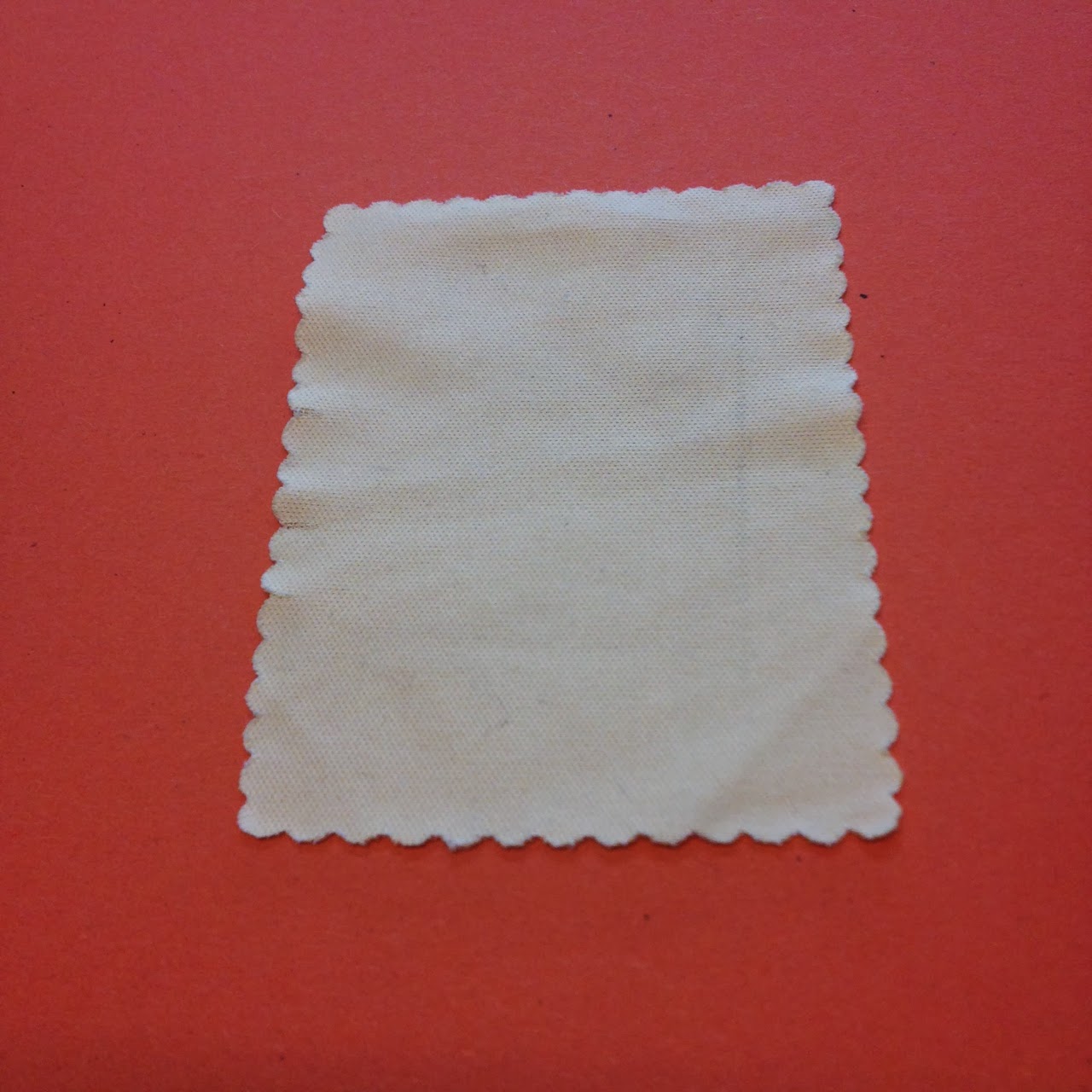
The cloth looks very washed out on top of the red, and the red looks very saturated.


The orange looks very saturated and deep in colour, making the cloth look very desaturated.


The two reds look quite similar but the original paper is lacking in saturation and is cold in temperature. It looks less red with the red object on top of it, but both have slight hints of pink when together.


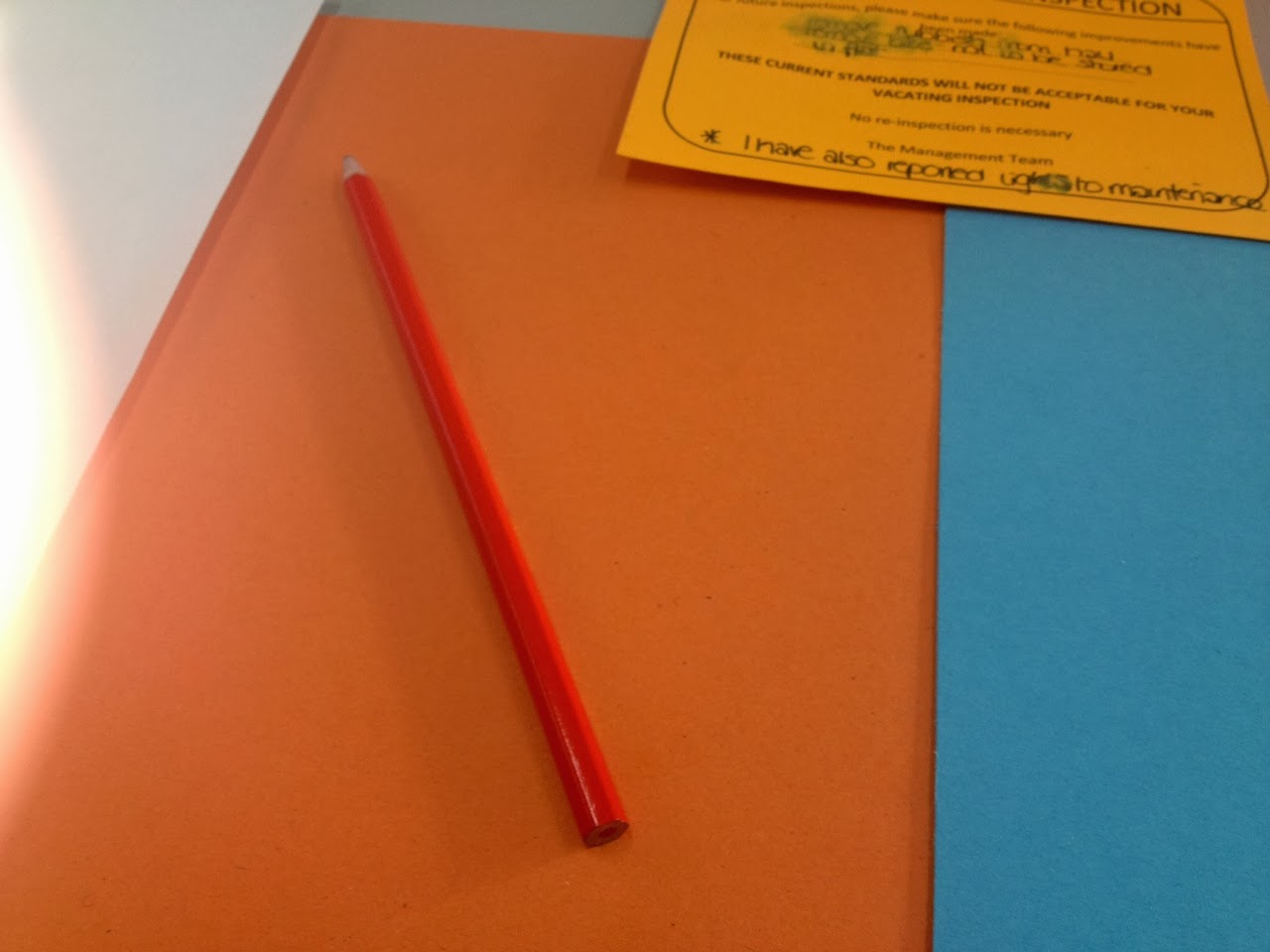
The red paper looks spot on red when placed on the orange paper, and in turn it makes the orange very vivid. Contrast of saturation and temperature are high in this photograph.


The blue paper looks incredibly desaturated here, even though it is in the same lighting as the other photographs. This probably means that the red drowned out the colour as it is very vivid and bright here.


The green paper looks very pale and desaturated while the red looks quite magenta.


The red paper makes the yellow look very beige-like, and the red itself looks a bit washed out compared to previous photos.


Both colours look quite vivid here, and the contrast is high because of how the colours are far apart on the colour wheel. The book cover is vibrant, which creates more of a brightness in the yellow.


The contrast in saturation makes the book stand out more as it's more vibrant, Also the tone is lighter. However the blue paper is brighter than it looked with other objects.


Even though green and blue are quite close on the colour wheel, the contrast is relatively high in this photograph. Both colours look extremely vibrant.


Orange and blue are contrasting colours on the colour wheel, so they are very bright and saturated. The blue colour has brought this out in the orange paper which normally looks desaturated.


The blue looks very pale and less saturated when on top of the red paper, because of the darkness of the red.


The green paper lacks in saturation when against the pen as its a lot darker in tone.


The shiny surface of the pen makes the background papers all look very desaturated and light, especially with the red paper.


Again, the dark tone and reflective surface of the pen makes the orange paper look very light.


The green colour has reflected on to the yellow paper here and made it seem slightly green itself.


The blue paper looks like a navy that is very light in tone. The pen looks very saturated.


When taking the photographs, I found that the colour of each paper would differ depending on the object on top of it, which is interesting because it shows that even cameras percept colour in a certain way depending on certain variables.
When recreating the colours in photoshop, I noticed that each one looked very different from the physical colour, which surprised me a little as I didn't think there would be such a difference.

Saturday, 25 January 2014

Colour Theory: Colour Contrast

We have previously learnt about the contrasts when handling and balancing colour:
Contrast of TONE
Contrast of HUE
Contrast of SATURATION
Contrast of EXTENSION
Contrast of TEMPERATURE
COMPLEMENTARY contrast
SIMULTANEOUS contrast


The 5 coloured pieces of paper are very low in saturation and are quite faded in colour. We placed a few different objects on top of each piece of paper and studied how the colours seemed to be perceived differently each time.


The green clip looked very vivid amongst the orange and red paper, because of the contrast in hue. The contrast of saturation was also a factor.


Orange pen
  • reflects the colours - a hint of yellow appears on the green, and turns red on red paper
  • looks yellow on the yellow paper
  • more saturated on orange


Red pencil

  • looks orange on orange paper
  • looks dark red on blue paper
  • looks bright red on yellow paper


We were set the task of choosing 5 more objects and pantone matching them, then recreating the colour on photoshop.

Wednesday, 15 January 2014

Design Principles: Colour Theory - part 2

CHROMATIC VALUE

HUE
+
TONE (LUMINANCE)
+
SATURATION

Chromatic value is describing a certain colour. Each colour is made up of different elements that make it look a certain way. Hue, tone and saturation all come together to make a certain colour.

The contrasts below are all elements of each colour, too.

Contrast of TONE
Contrast of HUE
Contrast of SATURATION
Contrast of EXTENSION
Contrast of TEMPERATURE
COMPLEMENTARY contrast
SIMULTANEOUS contrast

Contrast of TONE
It is formed by the juxtaposition of light and dark values. This could be monochromatic.


Tone deeply affects how type is perceived. The higher the contrast, the more readable the word is against the background.


Above, the word is too similar in tone to the background, so it isn't as clear. The black word is the most readable against the grey, because they are opposites on the colour wheel, so they compliment eachother with a nice balance of contrast that isn't too high or too low.


Coming back to colour, the same still applies.


Orange is too near red on the colour wheel, so they clash, making reading the word difficult and quite unpleasant.


The word definitely stands out, but too much, making the blue pop out in a very extreme, unpleasant way. The right balance for a red background would be a green colour.

Contrast of HUE
Formed by the juxtaposing of different hues. The greater the distance between hues on a colour wheel, the greater the contrast.

Its quite hard to distinguish between the colours when the bright white is in the background, as the contrast is so high.


The black makes the colours easier and more pleasant to look at as the darkness works well with the brightness of the blue, yellow and red.
Having no space in between the colours makes for a more pleasant experience, as the contrast has been toned down and there is less to focus on.

The yellow word is the hardest to read because it is too light in hue against the white. The blue reads best as the contrast is highest.


It is the opposite on the black background; yellow is the most readable.


Yellow is the most readable on a red background.


The blue word is the most readable, which is surprising because it is on a blue background but it shows that high contrast isn't always suitable.


Contrast of SATURATION

Formed by the juxtaposition of light and dark values and their relative saturations.


Contrast of EXTENSION

Formed by assigning proportional field sizes in relation to the visual weight of a colour. Also known as the contrast of proportion.
Lighter colours are usually used more than darker colours are when used together.


Contrast of TEMPERATURE

Formed by juxtaposing hues that can be considered 'warm' or 'cool'.
These colours are all extremely similar when put next to each other, but when separated are completely different. Our eyes adapt to the colours and changed how we see them; we create a gradient that helps us determine between different colours that are touching. It can be seen below with and without separators:


Complementary CONTRAST

Formed by juxtaposing complementary colours from a colour wheel or perceptual opposites


Simultaneous Contrast

Formed when boundaries between colours perceptually vibrate.