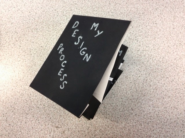
Thursday, 9 October 2014

OUGD504 // Studio Brief 02: Study Task 03

LOGO REQUIREMENTS


Specific requirements of the logo based on what I have learnt about the client...

Colour
These are the available colours for the hammock, so the colours I use in the logo should coincide with these designs.


I've researched some pet brands that already exist, and their colour choice. I've found that there is no clear colour that is often associated with pet/cat products. Green, blue and red seem like colours that are popular as they are common colours that don't have negative or gendered connotations. They are bright and enthusiastic.
I might want to challenge this and set my own rules, however I don't think using too bright colours would suit Woozy as I'm trying to aim for sleek and clean modern branding.

Typeface
Century Gothic seems to be the staple typeface for Woozy (seen above under the hammock colours). This font is playful and modern, but I don't think it is effective in any branding, so I want to get rid of it.
For 'Woozy' I think that the typeface should definitely be sans serif, as a serif font would be too serious and formal for such a product. It should also be hand rendered as this adds a personal and unique touch.

Reproducibility/Adaptability
The logo needs to be suitable for the Kickstarter page, but also for the packaging that the hammock bed comes in. It also needs to be flexible for other use, such as emails, videos, adverts and websites.

Client needs
The Woozy needs innovative, stylish and fun branding, as that is what the product is about. Simplicity would also suit as the product is very minimal.

Communication (audience/customer)
The logo needs to communicate pet-friendliness as the product is for cats (although can be suitable for other small animals). Positivity and comfort should also be communicated as pet owners care about the safety of their animals.


Wednesday, 8 October 2014

OUGD504 // Studio Brief 02: Kickstarter project 'Woozy'

BRAND NAME:
Woozy

WHAT IS IT?:
A hammock/bed for cats, which can hang on a radiator or place on the ground anywhere you like.


The following information is on the Kickstarter page:

54 backers
€4,169 pledged of €6,500 goal
23 days to go
The Woozy is an elegant, strong and multifunctional cat hammock/bed made for every interior and suits every cat. 
WOHOOD Dutch Design, made in Holland.We wanted to design an affordable cat bed that is a part of your interior. Something everyone wants to hang on their radiator for their cat. The quality, looks and opportunity’s of the bed were the most important aspects in the design. Our cat hammock design is more advanced than any before. 
Multifunctional?!We want to reach every cat owner with this design. No matter if your home has a different model radiator or no radiator. The woozy fits in every interior. That’s why we decided to make the woozy multifunctional. It’s easy to adjust to every radiator.
Other cat beds.We looked into other cat beds and hammocks. We noticed that there were no hammocks that could fit on every radiator. And the ones that could were, lets say 'not so pretty' Before the Woozy there was no hammock that could fit on the radiator and also could be placed on the ground. 
ColorsWe decided to offer the woozy in six different colors.
Fabric colors
Fabric colors
QualityThe quality is the most important aspect in the design. That’s why we chose for strength. We used high quality beech for the frame, coated steel for the hooks and strong recycled polyester for the fabric. The fabric is easy to replace and washable. 


Dimensions 52,5 x 36 x 17,5 cm. (Length x Width x Height)
 20,7 x 14,1 x 6,9 Inch (Length x Width x Height) 
How does it work?The Woozy is easy to install. In less than 5 minutes your Woozy is ready for use. The manual below shows you just in 6 steps how to install the Woozy.

Tuesday, 7 October 2014

OUGD504 // Studio Brief 02: Kickstarter research

For this brief we have to choose a Kickstarter project to rebrand. Some projects I found interesting are these:

Diabetic tracker app
https://www.kickstarter.com/projects/582344391/diabetictracker?ref=category_newest

This project has no branding and has a very poor and uninteresting video. This is why I was intrigued by it, as it drastically needs rebranding to gain a good amount of interest and support. However, the idea of the app isn't very appealing now that I've spotted other projects I like.

Vriliac: human powered generator
https://www.kickstarter.com/projects/852476234/vriliac-human-powered-generator?ref=category_newest
http://vriliac.com/

This invention is something that has a lot of potential in my eyes, but needs a stronger identity. Their personal website is very outdated looking and doesn't reflect something that should be fresh, exciting and good for the planet.

Moku: a wooden paper dispenser
https://www.kickstarter.com/projects/2040275847/moku?ref=category_newest

This is one of my favourite inventions I have come across on Kickstarter, and the branding is very simplistic and not so exciting. However, I think that the product speaks for itself enough, so maybe I should pick another to work on.

Art House: pay for your food with your art
https://www.kickstarter.com/projects/736040551/art-house?ref=category

An unusual and unique idea, with really awful graphics to support it... except I can't seem to be inspired by this kickstarter much further than how bad the branding is.

'Woozy' seems the most approachable -
https://www.kickstarter.com/projects/1045699505/woozy-the-hammock-bed-for-cats?ref=category

This project is to support the making of hammock beds for cats. They attach to radiators and things alike. They also stand upright on the floor.
It's a cute idea and to a cat lover like myself, seems like something that would be super successful. So I want to help it by giving it a substantial identity; all there is on the page is a video explaining the product, and the image below with the name on it.


Sunday, 5 October 2014

OUGD504 // Studio Brief 01: Final Design Process leaflet


I have watered down the paint for my final leaflet and used a soft gradient style. Because there is no information on the back, I've painted on to the paper to add colour and my own style.
The text on the white paper is the areas of development that don't fit in to a set order in my process, as I dip in and out of them throughout. The handwritten text supporting each of them explains a little about my take on things.
I think that the leaflet effectively portrays my style of working; hands on, which is signified by the scruffy informal type that I created in the leaflet. I didn't print anything, as I really like hand rendering and the idea of a piece of work that is irreplaceable. As I cannot usually use this method because mass production is out of the picture I thought I would take the opportunity now as the leaflet doesn't have a specific target market; it is my own design process so it is meant for myself.
The paint consists of white, blue and red which I blended together to show my love of paint and arty touches. This proved to be harder than I thought, I don't think I left enough time to experiment with this idea first before using it on my final leaflet. This proves an issue with making one off original work, as it is risky. The paint leaked slightly on to one piece of white paper because it was watered down and not easy to control, which was disappointing.
The paper is a little crinkled in places because of the paint, which I was not expecting to happen. Again, I should have thought of this in advance. However, I don't think a completely perfect leaflet would reflect me or my design process which is all over the place and unorganised.
The processes I have included are quite accurate, especially how research and feedback do not fit in to a certain order or stage as they are essential and used throughout.

OUGD504 // Studio Brief 01: Further development of leaflet


I want to incorporate my arty style with a touch of paint, so I have tried out the technique of thick paint on the leaflet. It doesn't work too well or look very good, as I think its too heavy for a small leaflet.
The white pen I am using for the text I need to be careful with, as it can smudge if it isn't dry, and also will show up any mistake quite clearly.

Friday, 3 October 2014

OUGD504 // Studio Brief 01: Crit

I presented:


Feedback I got:
- print it from illustrator inverted, so the black background is printed on white paper, for maximum neatness.
- interlink each stage with one another, as I say that I go very 'back and forth' with the stages of my process.
- white ink on black paper is always difficult in terms of clearness etc

I am going to take these points into consideration, however I think I'm going to stick with the white on black.

Thursday, 2 October 2014

OUGD504 // Studio Brief 01: Leaflet fold development

I have chosen to use black card for my leaflet, as I'm interested in using non-white stock in my work as I find white paper pretty dull. I also have the idea of using white ink on the paper, through hand rendering... something I have wanted to try for a while. I also feel it will reflect my style well, as I like to make hand rendered work a lot more than digital, as it is more personal and unique.

Measurements I have chosen to use are:
Full width: 32cm
Height when folded: 10cm
this means that each square is 8cm x 10cm, which seems like a good size for the amount of information I'm going to use.


I have experimented with white paper on black card, so that I can create a two tone effect which would add to the aesthetic. However I've found that when stuck together they are too thick to fold neatly and fully, so I've decided to insert squares of white paper inside the leaflet as so:


This works a lot better and has a very tidy effect. I used PVA glue, which has made the paper a little wrinkled, but it is not visible on the inside of the leaflet. Besides, I'm not looking for a completely perfect finished product, as it is all going to be hand rendered to reflect my imperfect way of working.

As seen in the photos above of the double sided fold, I have tried out the white pen on the black card using scribbled letters, to add a touch of scruffiness and erratic-ness. The letters are dotted about the page because when I work I generally follow a process but I can jump back and forth in between the stages.
I tried out paint in the form of arrows but they came out looking too messy. 

Wednesday, 1 October 2014

OUGD504 // Studio Brief 01: Folding leaflets

Today we carried on with leaflet experimentation. We each did some light research into folding techniques and applied them. I made a few leaflets completely out of my own head but I wasn't happy with the outcomes; I found I was trying too hard to be unique, without thinking of practicality.


I did some research and found a simplistic looking fold design that I wanted to implement. (http://www.pinterest.com/marioantoniou/fantastic-folding-formats/)

IN SITU, a collection of folding leaflets revolving around European architecture


I used thin scrap paper at first, so I could get the hang of it. It is straightforward but takes a lot of measuring to pull it off as the diagonally cut flaps have to fit perfectly with one another. Unlike what I found in my research, I cut through each fold on the inside where the diagonals meet, just to test it out. I don't think it adds anything to the leaflet and makes it seem quite messy.


I moved onto a thicker medium: thin blue card. I made it the same except I decided not to cut through anything this time.


The following images show the inside being used at the outside when folded up, which I think looks more enticing than the other way.