Wednesday 26 March 2014

Studio Brief 3: Screen printed final poster

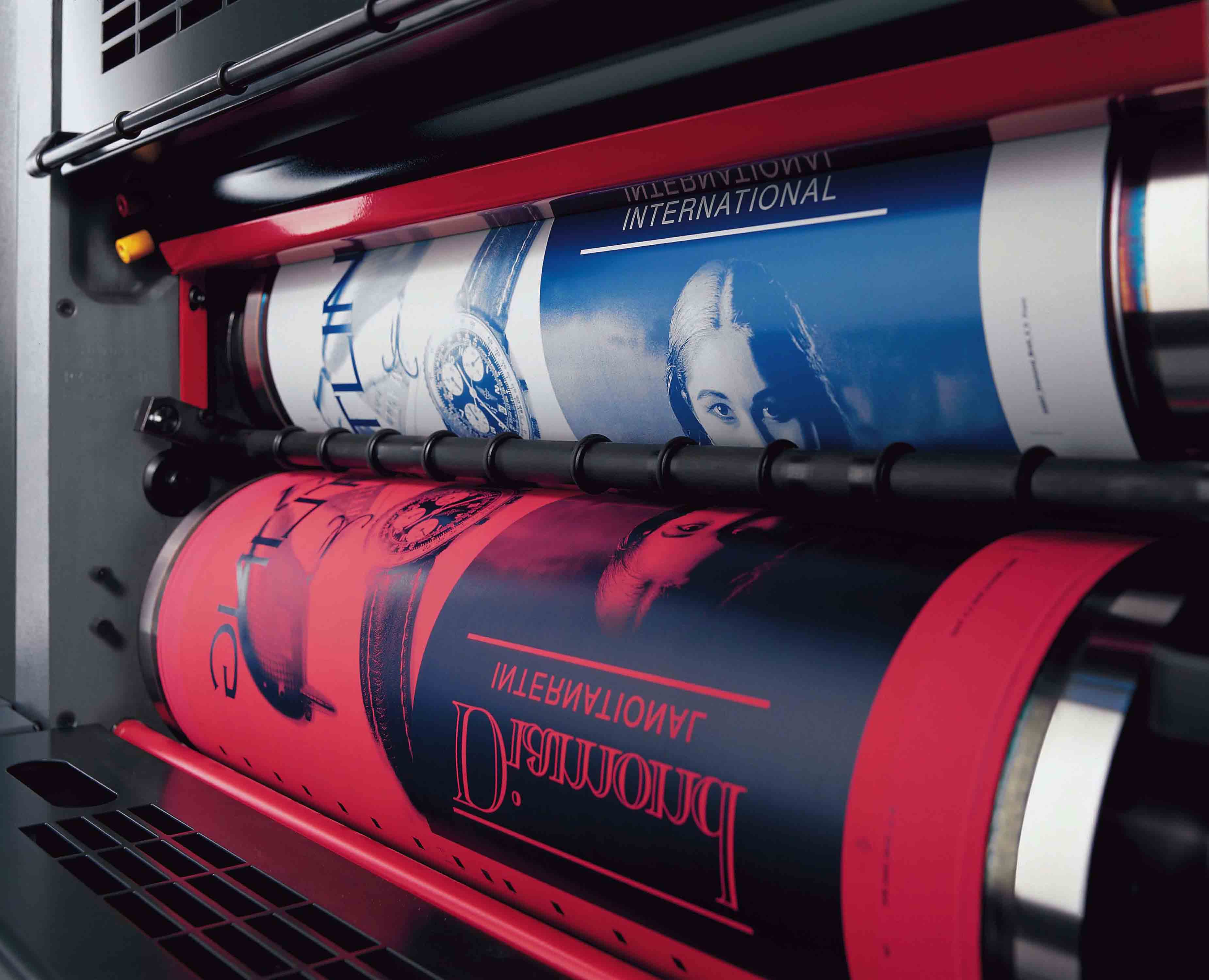
Screen printing process

I spent a whole day in the Rossington Street printing room. I never realised that it took so long to get it all done, so I'm glad I've had this experience to know for future big projects.


I found that I should have test printed using my chosen colours, because I made a turquoise colour and black, and the turquoise dried completely differently than what I expected or had hoped for. It dried as a rich green with a hint of blue in it, but not enough. However, I still like how the green turned out with the black against it, and isn't TOO far off turquoise. I see this as a good learning curve; a mistake to learn from. (the photographs actually make the colour look more blue than it is)


Above are some of the prints I did; I used different types of stock and found that I had some issues with the paint. Saying that, I think mistakes can make prints look quite authentic and more interesting. I especially like the prints on antique white paper, which I have used for the final chosen print. The texture created by the paper is really nice, and suits the retro feel of my design. The white card made for an extremely clear print but I feel that its too crisp and boring.

Final chosen poster


I chose an imperfect print on antique paper rather than a perfectly printed one, because I like the effect it has made. Matching up the positives was really hard but I like the outline.
I'm happy with how the poster has turned out, although some of the letter outlining has clumped together to make thick parts of the black colour. I think overall it is a successful film poster for the movie 'The Cold Light of Day'.

Studio Brief 4: Studio task

On monday we were set the new brief -creating some kind of guide to give to next year's first years in September. We formed small groups to make a start on it.

We brainstormed things that we didn't know at the start of the year, then narrowed it down to two issues in pairs:

  • Studios/blogs/the importance of being aware
  • Time management is key

Me and Elliot had a go at writing them as 'problems' that need to be solved, which would go in a brief:

  • First year students can struggle with managing their time efficiently and effectively.
  • First year students can have a limited scope on professional graphic design practice, such as creative blogs, events, studios and editorial content.


We then joined the whole group together to work on writing the brief further. This is what we came up with:

In the first year, students under-estimate the importance of keeping up-to-date with the creative industry outside of the studio. Being aware of the graphic design world is vital to broadening your creative input which therefore influences your output in a positive way.
How can you communicate the importance of engaging with graphic design outside of the studio?

  • What format would be most suitable?
  • How will the target market of students influence the outcome?
  • What resources would be most suitable to include?
  • Will it be local, national or international?


We got feedback off another group:

  • vague
  • is there a set requirement or is it up to you to produce the entire outcome?
  • nice and open provides a wide amount of potential visuals and outcomes.
Some suggestions:
  • summary publication
  • PDF with links
  • a selection of sources in a zine
  • website that links to design sources

This exercise helped me understand briefs a little better and how to tackle them when writing one from scratch. The next step is coming up with my own individual idea so I can make a proper start on this brief.

Monday 24 March 2014

Studio Brief 3: Poster development and finished design

Following on from the interim crit, I have decided to develop the briefcase poster. I was told to use a closed briefcase because of how in the film it never opens, but I tried this and aesthetically it ruined the poster. Regardless, I still think an open briefcase is relevant.

Below is my development and different variations.


  • I experimented a lot with the colour of the poster, because while blue, red or black are widely used and appropriate for American action films I wanted to try out lots of different colours. I ended up using turqoise and black, as black is bold and striking, and turquoise shows up a lot in the film (which I wrote about on my DC blog). I think its a good idea to keep to similar colours as the film, because that way you are connecting to it on a visual level.
  • I brought in the crack from my other idea, so that the poster would have more levels to it. I think it looks great and I like the concept of corruption behind it, as that is a key element of the movie. It definitely makes the briefcase imagery more exciting as it goes straight through it.
  • I found that using alternate colours on each side of the crack was quite cool looking but a bit too contrasting and imbalanced. 
  • I introduced a white border around it, which I think breaks it up well; the turquoise is better in a smaller amount. It also puts more focus on the actor's names at the bottom; they are qutite important to the poster as the film is awful and they will draw people to watch it more than anything else.
  • I kept the original hand rendered typeface for the film title because I think it was very successful; from my own opinion and others. I made it slightly italic because I saw on many action movie posters (particularly my film's original ones) that the text is bold, italic and in CAPS as if its moving. I tried to recreate that in my own way, with a scruffy hand drawn effect (which I think is normally a lot more effective than a boring sans serif font that has been seen thousands of times before).


Final design which I will turn into two positives for screen printing


Tuesday 18 March 2014

Studio Brief 3: Stage 1 Mock ups

These are the mock ups I created in preparation for the first crit. They are very early stages.


Briefcase design - I found a photograph of an open briefcase and I traced over it in Illustrator to make a very simplified silhouette. I hand rendered the type which I'm quite happy with, as it didn't take long to get right and it had the right style for an action movie. I like this mock up because it has a sense of retro design, much like the work of Saul Bass and designers alike. I like this contrast with the strong modern feel of the film; I don't think it needs to match. It is supposed to be an alternative movie poster after all.

Light beams - I'm not sure what direction I will take with this prototype, But I like the shapes of the light beams. It has a connection to the film title but also the beams resemble the lights from police helicopters which I think is quite fitting and dramatic.


These are my variations of using the corruption cracked idea. I think using such a dramatic crack through half of the poster is very bold and intense, but there is definitely something missing at this point.


Again this poster has a very 50s/60s retro style about it, because of the font used. The drawing is of a briefcase. I don't think I'm going to use this in the interim crit because I don't think it is very successful, even at mock up stage. I think I can do a lot better if I chose one of the others I have mocked up.

Type Journal: Scott Pilgrim DVD cover


I identified this font as Superfly on dafont. It has a Western style to it. The letters have unusual proportions with the serifs of the letters being huge. It is decorative and woodblock.

Monday 17 March 2014

Type Journal: Gold leaflet


The letters create the image of rooms within a building/house, yet is still very clear that it is typography. It is not that legible, but is a bit clearer when the letters are put together. 

Design Principles: Question 10 - Printing Techniques

http://www.designishistory.com/1450/printing-techniques/

There are a variety of printing techniques that designers can use to solve problems and create visual materials. Some are older than others, some are not as easily available as they used to be and others are much more expensive and often out of a clients budget. Regardless of the specifics or availability, all of these types of printing are still in practice today. It is important to know what you can do with printed materials in order to select the best possible materials and processes for the project.

Wood Block
A form of letterpress, Wood Block printing is one of the oldest techniques for printing and has a long history or development in both Europe and Asia. It is a relief process in which an image is carved in reverse into a piece of wood, inked up and paper is pressed down on top of it to transfer the ink and image. It is one of the rarest forms of printing in use today, due primarily to time consumption. However, there are many sets of type still in existence that were created from woodblocks and are often used in letterpress poster printing. For more information on wood type visit theHamilton Wood Type Museum.

Movable Type
Invented in the 15th century, movable type is the process of setting type by hand for printing on a letterpress machine. The type can be made of either wood or metal and letters were cut individually by craftsmen called punch cutters. This style of printing was the first developed that could rapidly, a relative term, produce multiple copies of lengthy printed materials and books. It remained the standard printing technique until photo typesetting came about in the 1950s.

Letterpress
Letterpress is still alive today, although it exists on a much smaller scale and usually only in specialty shops. The process often now involves photopolymer plates that can translate a digital design into a raised plate for use with vintage presses. It has seen a revival of success in recent years in the fine art, craft, and design worlds and is often used to create wedding invitations and posters. However, it remains a very flexible and reliable printing method that can be used for almost anything. 


Offset
Offset printing is still the most commonly used method of printing and is often called offset lithography. Offset printing is created using plates generated for each color used in the printing process. Some projects may call for 2 colors, some may use a standard 4 color CMYK process and others can require even more than that with specialty spot colors, varnishes and a variety of coatings also available. There are two kinds of offset printing called Sheetfed, in which individual sheets are fed into the printer, and Web, which prints from large rolls and can be used to quickly produce very large quantities of printed materials such as newspapers.
Screen Printing
Silkscreen printing, or screen printing for short offers a wide range of brightly colored inks and is often used for printing t-shirts, posters and other promotional materials. The process involves a design being laid on top of a screen (originally made of silk although a variety of materials are now used) which is coated with photo emulsion and exposed to light. The emulsion that is exposed hardens and the rest can be washed away leaving a stencil of sorts that ink can be pulled through using a squeegee. 

Digital
Digital printing is a process that uses toner, rather than ink, which sits on top of the piece of paper instead of being absorbed by it. While the quality has increased dramatically since its inception, it still can not match the quality of offset lithography, especially in small details, typography and color-matching. The fact that they do not require unique plates means that they can create individual designs that may have varying details quickly and at a lower cost.

http://www.turquoisebranding.com/2013/blogs/inspiration/09/19/whittington-press-presstival-open-day/
http://foliobespoke.com/2011/03/letterpress-wedding-invite/
http://www.creativeedgechicago.com/services.html


http://madebytim.com/news-blog/thinking-out-loud-screen-print/
http://www.acesignsshop.co.uk/digital-printing.php


Sunday 16 March 2014

Studio Brief 2: Selftea - Final Presentation


The presentation went well, as a group we divided the slides between us to talk about. I talked about the social media, as thats what I led. We had the poster files separate but showed them while we presented.

Feedback:

  • Try and mix selfteas with varieties of teas to make it more focused, tea of the month?
  • How is it making non-tea drinkers drink tea?
Hopefully it made people want to drink tea, or they made a cup of tea just for the purpose of a selftea (like I did numerous times - so it did work on me, I don't normally drink tea often). However, this is a good point, because it is mostly current tea drinkers who participated. But that doesn't have to be a negative thing; the goal was "drink more tea" which doesn't have to be about converting non-tea drinkers.
  • People have to make a cup of tea to make a selftea so it does make people drink more tea
  • Try to collaborate with tearooms

Saturday 15 March 2014

Design Principles: Question 9 - What is the golden ratio?

http://www.creativebloq.com/design/designers-guide-golden-ratio-12121546

There's a common mathematical ratio found in nature that can be used to create pleasing, natural looking compositions in your design work. We call it the Golden Ratio, although it's also known as the Golden Mean, The Golden Section, or the Greek letter Phi.

What is the Golden Ratio?

Based on the Fibonacci Sequence (which you may remember from either your school mathematics lessons or Dan Brown's novel The Da Vinci Code), the Golden Ratio describes the relationship between two proportions.
Fibonacci numbers, like many elements found in nature, follow a 1:1.61 ratio - this is what we refer to as the Golden Ratio, and as it forms such a common sight in nature, it feels pleasing to the eye when we use this same ratio in our design work.

 diagram
The Golden Ratio is the relationship between two numbers on the Fibonacci Sequence...
Golden Ratio
...and plotting the relationships in scale provides us with a spiral that can be seen in nature all around us

It's believed that the Golden Ratio has been in use for at least 4,000 years in human art and design, but it may be even longer than that - some people argue that the Ancient Egyptians used the principle to build the pyramids. In more contemporary times, the Golden Ratio can be observed in music, art, and design all around you.

Examples

Use of the Golden Ratio is well documented in art and design throughout history, and can be seen in everything from architecture to the grand masters. By applying a similar working methodology you can bring the same design sensibilities to your own work. Here are just a couple of examples to inspire you:

The Parthenon


Golden Ratio

Ancient Greek architecture used the Golden Ratio to determine pleasing dimensional relationships between the width of a building and its height, the size of the portico and even the position of the columns supporting the structure. The final result is a building that feels entirely in proportion. The neo-classical architecure movement reused these principles too.

The Last Supper


Golden Ratio

Leonardo da Vinci, like many other artists throughout the ages, made extensive use of the Golden Ratio to create pleasing compositions. In the last supper, the figures are arranged in the lower two thirds (the larger of the two parts of the Golden Ratio), and the position of Jesus is perfectly plotted by arranging golden rectangles across the canvas.

Thursday 13 March 2014

Studio Brief 3: Initial ideas


I brainstormed some of the main themes of the film, so that I can form a conceptual poster that is fitting to the plot. What I am trying to avoid the most is creating a poster that is as generic as the film... and the current posters for it.


The theme is incredibly boring and predictable; undercover CIA, kidnapping, shootouts. The things that stand out to me as maybe doable are the family issues; the main character has an estranged half sister, and his father (Bruce Willis) dies, and the rest of the family gets kidnapped.


Cracking - represents the corrupt CIA agents in the movie. I like this idea; something subtle with meaning.
Using 'shhh' - a play on the secrecy in the movie. The father (Bruce Willis) is a secret CIA agent, and also he has kept his other family quiet from his main family.
Light beams - Going with the theme of the film name - 'The Cold Light of Day'.
Snowflakes - Again, about the film name, because snowflakes are cold. I think this is a weak idea and wouldn't work that well.
Briefcase - the thing that the bad guys in the movie want is a very important briefcase. This seems very obvious, but I like the simplicity and the curiosity it could start in people who see the poster. I think a line drawing or simple illustration of a briefcase could be effective.


Icicles and sun - A literal image representation of the film name 'The Cold Light of Day'. I don't think much of this idea really. It has no reference to the plot and wouldn't really reflect the content.
Briefcase code - a close up of the lock on a briefcase, which shows the secretiveness of what is in the briefcase... we never find out it's contents. This could be quite hard to create but interesting.
Thermometer - Literal concept of the name of the film... boring idea that isn't that creative, its also confusing as a simple poster.
Bars - One bar coloured a dark colour to represent the death of the father in the family, or it could represent the half-sister who gets introduced to the whole family at the end of the movie. The second thumbnail shows the fading out of one bar - to represent Bruce Willis' death, and the added on bar to show the half-sister. I like these subtle concepts but aesthetically I don't think much of it.

I am going to work on the light beam and the briefcase ideas, as they are simple (so can work well with 2 colour printing) and aesthetically I could do interesting things with them. I also like the subtle concepts.