Thursday 27 February 2014

Studio Brief 2: Selftea - idea development


Selftea idea
  • The Selftea idea would be to spread a hashtag called #selftea across Twitter and Instagram.
  • A 'selfie' is a photograph someone takes of themself, which has recently, in the past few years, become a word that is widely used because of social media, and has made the act of taking a selfie a lot less shameful.
  • We have decided to exploit this as selfies are so popular on the internet, selftea is bound to catch on atleast a little.
  • 'Selftea' is a clever mix of selfie and tea, that means someone taking a photo of themself drinking a cup of tea, or just holding a cup of tea.
  • We will encourage people to take the pictures and hashtag them #selftea so that we can monitor it, and so that other people are exposed to the trend.
  • We want to create a Twitter and Instagram for the cause; Twitter can be used to spread the word and post tea related tweets whereas the Instagram can be based around actual #selftea's because it is an image-only app that makes it very easy to post selfies. Both social networks have easy to follow hashtag databases.
  • We might, if possible, #selftea on mugs to make some funny merchandise and maybe give away in a competition.

Studio Brief 2: Varieteas - idea development


Varieteas idea
We had the idea of collecting different types of tea to give out to the public, so that people will drink a bigger variety of tea, thus making people 'drink more tea'. We think that this idea makes it a bit more interesting and will hopefully make people want to try unusual teas that they haven't had before.

Promotion

  • engraved tea stirrers
  • posters
  • cups
  • cup holders
  • #varieteas


Above is a sketch of what we are thinking of making if we go ahead with this idea. It will be a box we will assemble, with little compartments for teabags. People can reach in without knowing what flavour the tea will be, and they can right in the blank space what they think it is. We could put this on show in the studio or somewhere in the college.
Something else we could make is envelopes with random teabags in, which we give away for free. Inside it would include assorted teabags, a tea stirrer with an engraved message on it, and there would be a competition for who ever guesses all the teas right.
the hashtag #varieteas will be used to keep track on Twitter or Instagram and make people interact and advertise it themselves.

Wednesday 26 February 2014

Studio Brief 2: Group brainstorm - tea ideas


  • tea party
  • tea > water
  • 'fancy a brew?'
  • neknomination
  • promoting caffeine
  • social benefits
  • engraving onto stirrers
  • drink more teas - 'varieteas'
  • Tetley tea scandal
  • kettle in studio, encourage tea being made in the studio
  • new tea flavour
  • biscuits > dunking > top dunks (top trumps style)
  • drink more Fairtrade tea
  • tea advent calendar
  • tea vs coffee
  • work with nearby tea shop

We are enthusiastic about a number of these ideas which are bolded above. The others seem difficult, time consuming or not effective enough. We need to take into account what is doable in our time frame and our budgets.

Tuesday 25 February 2014

Studio Brief 2: Drink more water - further ideas


These are some water ideas I came up with individually.

Make an animation showing shocking over the top effects dehydration will have on your body:
  • Could show a body wasting away.
  • show imagery/animation that depends on individuals water intake.
  • 'we are 55-75% water'
  • if they have drank enough water, at the end say something like 'congrats! you are an ocean with a brain'
No Bullshit

  • Make a menu with different 'water' meals or 'water' recipes
  • 'tough - you just need to drink water'.
Water bottles
  • make water bottles that have a meter on it that measures how long the water should last the drinker, or how long it should be in the bottle for. Or some sort of guide.


I don't feel very confident about these ideas, but I will feed them back to the group.

Monday 24 February 2014

Type Journal: Converse


It is hand rendered and has been created by a white marker. It is uppercase, sans serif. It is informal and trying to appeal to a young audience which I think works.

Friday 21 February 2014

Studio Brief 2: Drink more water/tea/milkshake

For our group viral project, we got given "Drink more water/tea/milkshake". This means that we have to make people drink more of one of these things. As a group we decided we definitely don't want to go down the route of milkshakes, but tea and water because they are very widely drank.


Some ideas we brainstormed for water:

Awareness

  • concentration
  • health
  • well being
  • show affects of unhealthy drinks
  • 1.6 litres a day for women, 2 litres a day for men
Against paying for water
  • fill up your own water instead of buying it
Charity
  • Water aid
Ice lollies
  • make ice lollies which will make people consume water
Ice
  • could make something out of ice, such as a piece of design or art.
Going to the toilet
  • using humour, make a checklist for people and ask them how much they go to the toilet in a day. The more they go, the more water they are drinking. 
Shock video
  • Pour water over people's heads


Some ideas we brainstormed for tea:

Tea party
  • have an interactive tea party in the college
Tea vs coffee
  • make a competition between tea and coffee and find out which people like more, and promote tea this way.
Competition
  • Make a competition for tea drinkers to create a new flavour of tea and send it to us.
How do you like your tea?
  • Make a campaign about how people take their tea differently. milk, sugar etc
Combine water and tea
  • Make people drink more water by drinking tea - tie them both together with health benefits of water.
'How British are you?'
  • Tea is seen as very British, so play on that.
Social
  • People go for tea or coffee as a social event, so encourage social drinking of tea.
Health benefits
  • Many different types of tea have a range of interesting health benefits which could encourage people to drink it. eg green tea has many good effects.

Wednesday 19 February 2014

Design Principles: Colour theory - 5 objects

 Below are 4 objects on 5 different background colours. I matched each object and piece of paper with pantone colours to the best of my ability.


These two colours are very similar as they are both the same hue, but the level of contrast is very low, as they both have very little saturation or brightness. The yellow paper looks very brown-like in this photograph.


The photoshop colours have changed after saving, which may be something to do with the similarities of the colours or just a problem with the file.


The cloth looks a lot more yellow when sat on top of the green paper. It looks brighter because of this.


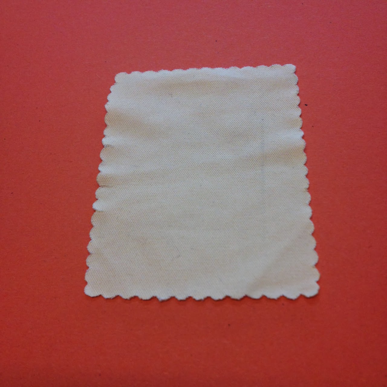
The cloth looks very washed out on top of the red, and the red looks very saturated.


The orange looks very saturated and deep in colour, making the cloth look very desaturated.


The two reds look quite similar but the original paper is lacking in saturation and is cold in temperature. It looks less red with the red object on top of it, but both have slight hints of pink when together.


The red paper looks spot on red when placed on the orange paper, and in turn it makes the orange very vivid. Contrast of saturation and temperature are high in this photograph.


The blue paper looks incredibly desaturated here, even though it is in the same lighting as the other photographs. This probably means that the red drowned out the colour as it is very vivid and bright here.


The green paper looks very pale and desaturated while the red looks quite magenta.


The red paper makes the yellow look very beige-like, and the red itself looks a bit washed out compared to previous photos.


Both colours look quite vivid here, and the contrast is high because of how the colours are far apart on the colour wheel. The book cover is vibrant, which creates more of a brightness in the yellow.


The contrast in saturation makes the book stand out more as it's more vibrant, Also the tone is lighter. However the blue paper is brighter than it looked with other objects.


Even though green and blue are quite close on the colour wheel, the contrast is relatively high in this photograph. Both colours look extremely vibrant.


Orange and blue are contrasting colours on the colour wheel, so they are very bright and saturated. The blue colour has brought this out in the orange paper which normally looks desaturated.


The blue looks very pale and less saturated when on top of the red paper, because of the darkness of the red.


The green paper lacks in saturation when against the pen as its a lot darker in tone.


The shiny surface of the pen makes the background papers all look very desaturated and light, especially with the red paper.


Again, the dark tone and reflective surface of the pen makes the orange paper look very light.


The green colour has reflected on to the yellow paper here and made it seem slightly green itself.


The blue paper looks like a navy that is very light in tone. The pen looks very saturated.


When taking the photographs, I found that the colour of each paper would differ depending on the object on top of it, which is interesting because it shows that even cameras percept colour in a certain way depending on certain variables.
When recreating the colours in photoshop, I noticed that each one looked very different from the physical colour, which surprised me a little as I didn't think there would be such a difference.

Tuesday 18 February 2014

Type Journal: 'Hiroshima' book


This was on the cover of a book, and what stuck out to me is how it is a sans serif typeface but the 's' has almost serif characteristics. It doesn't match the other letters especially the 'H'. It has a feeling of formality but not too informal, like it is trying to be the best of both worlds (sans and serif)

Monday 17 February 2014

Studio Brief 1: Final Secret 7" Designs


 Above are my 5 final designs for Secret 7". I have submitted them all to the competition:


I am hoping that at least one will be accepted, but I'm not getting my hopes up.


Larger versions of the designs: