WHAT ARE THE DIFFERENT
PRODUCTION METHODS OF FONTS?

STONE
- has
been carved into through history, and the serifs give curved edges so the stone
does not crack.
- Chisel, serifs existed due to quality of line
chisel created.
- chipping
Square
capitals were used to write inscriptions,
and less often to supplement everyday handwriting. When written in documents
this style is known as Latin
book hand.[1] For everyday writing the Romans used a
current cursive hand known as Latin cursive.[2] Notable examples of square capitals
used for inscriptions are found on the Pantheon, Trajan's
Column, and the Arch of Titus,
all in Rome. Square capitals are characterized by sharp, straight lines, supple
curves, thick and thin strokes, angled stressing and incised serifs. These Roman
capitals are also called majuscules,
as a counterpart to minuscule letters such as Merovingian and Carolingian.
Before
the 4th century, square capitals were used to write de luxe copies of the works of authors
categorized as "pagan" by Christians, especially those of Virgil; the
only three surviving manuscripts using this letter,
among them the Vergilius Augusteus, contain works by Virgil.
After the 5th century the square capitals fell out of use, except as a display
lettering for titles and chapter headings in conjunction with various script
hands for body text: for example, uncials.
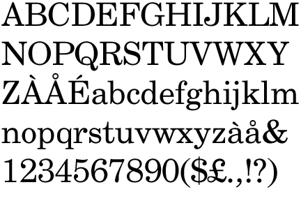
Modern day stone font, Century:
In Italy the heavy gothic
styles were soon displaced by Venetian or "old
style" Latin types, also called antiqua. The inscriptional capitals on Roman buildings
and monuments were structured
on a euclidean geometric scheme and
the discrete
component-based model of classical architecture. Their structurally
perfect design, near-perfect execution in stone, balanced angled stressing,
contrasting thick and thin strokes, and incised serifs became the typographic
ideal for western
civilization. The best-known example of Roman inscriptional capitals exists on the
base of Trajan's Column, inscribed c. 113.
Roman
square capitals, also called capitalis monumentalis, inscriptional capitals, elegant capitals and quadrata,
are an ancient Roman form of writing, and the basis for
modern capital
letters.
Square
capitals were used to write inscriptions,
and less often to supplement everyday handwriting. When written in documents
this style is known as Latin
book hand.[1] For everyday writing the Romans used a
current cursive hand known as Latin cursive.[2] Notable examples of square capitals
used for inscriptions are found on the Pantheon, Trajan's
Column, and the Arch of Titus,
all in Rome. Square capitals are
characterized by sharp, straight lines, supple curves, thick and thin strokes,
angled stressing and incised serifs. These Roman
capitals are also calledmajuscules, as a counterpart to minuscule letters such as Merovingian and Carolingian.
Before
the 4th century, square capitals were used to write de luxe copies of the works of authors
categorized as "pagan" by Christians, especially those of Virgil; the
only three surviving manuscripts using this letter,
among them the Vergilius Augusteus, contain works by Virgil.
After the 5th century the square capitals fell out of use, except as a display
lettering for titles and chapter headings in conjunction with various script
hands for body text: for example, uncials.
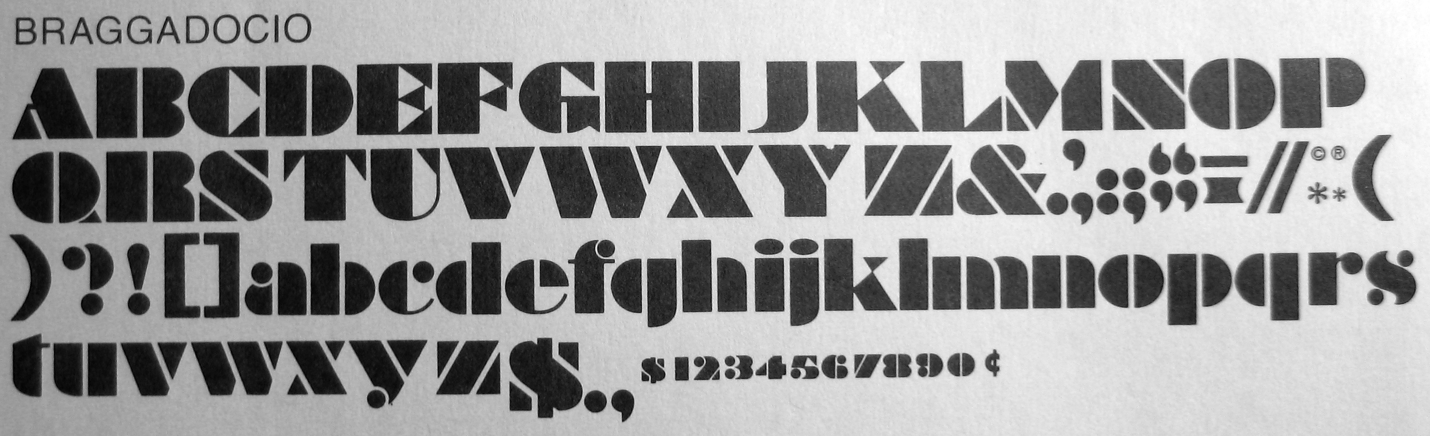
Monotype's Felix Titling (1934) is based on a 1463 alphabet of Feliciano based on Roman inscriptions.

SABLE
- the
use of a brush that originated in the far east. Curved lines are used.
More fluid and created unique and interesting marks.
- brush
Traditional East Asian writing uses the Four Treasures of the Study (文房四寶/文房四宝): the ink brushes to write Chinese
characters, Chinese ink, paper, and inkstone, known as the Four Friends of the Study (Korean: 문방사우) in Korea. In addition to these four tools, desk pads and
paperweights are also used.
The
shape, size, stretch, and hair type of the ink brush, the color, color
density and water density of the ink, as well as the paper's water absorption
speed and surface texture are the main physical parameters influencing the
final result. The calligrapher also influences the result by the quantity of
ink and water he lets the brush take, then by the pressure, inclination, and
direction he gives to the brush, producing thinner or bolder strokes, and
smooth or toothed borders. Eventually, the speed, accelerations, decelerations
of the writer's moves, turns, and crochets, and the stroke order give the "spirit" to the
characters, by influencing greatly their final shapes.
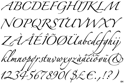
Modern
day sable font, Brush Script MT Italic:


BONE
-
a quill or nib, which originated in the middle east. There is a
clear contrast in line weights. Ink.
- Feminine,
elegant, posh
A quill pen is a writing
implement made from a
moulted flight
feather (preferably a
primary wing-feather) of a large bird. Quills were used for writing with ink before the invention of the dip pen,
the metal-nibbed pen, the fountain pen,
and, eventually, the ballpoint pen.
The hand-cut goose quill is rarely used as a calligraphy tool,
because many papers are now derived from wood pulp and wear down the quill very quickly.
However, it is still the tool of choice for a few professionals and provides an
unmatched sharp stroke as well as greater flexibility than a steel pen.
In
a carefully prepared quill the slit does not widen through wetting and drying
with ink. It will retain its shape adequately and only requires infrequent
sharpening and can be used time and time again until there is little left of
it. The hollow shaft of the feather (thecalamus) acts as an ink
reservoir and ink flows to the tip by capillary
action.
Modern day bone font, Zapfino:

WOOD
-
originated in Europe in the 1400's. Thick and simple letterforms worked best in
wood, and allowed type to be mass produced.
- Soft, malleable but
rigid enough to hold its form.
Woodblock printing is a technique for printing text, images or patterns used widely throughout East Asia and
originating in China in antiquity as a method of printing on textiles and
later paper. As a method of printing
on cloth, the earliest surviving
examples fromChina date to before 220,
and woodblock printing remained the most common East Asian method of printing
books and other texts, as well as images, until the 19th century. Ukiyo-e is the best known type of Japanese woodblock art print. Most European uses of the
technique for printing images on paper are covered by the art term woodcut, except for the block-books produced
mainly in the 15th century.
Modern day wood font, Abadi MT:


LEAD
- a durable metal which
can develop a whole range of possibilities, including thin lines.
- castable, pourable
type. Letterpress, lead type.
- bold, minimal, modern
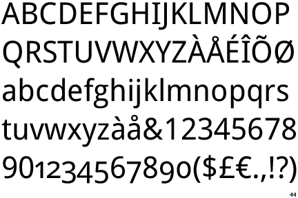
Modern day lead font, Droid Sans:
SILICONE
- developed
digitally, with the ability to 'undo' and endless possibilities. Type that
isn't able to be created any other way.
- the
digital age
Contemporary typographers view typography as craft with a very long history tracing its origins back to the first punches and dies used to make seals and currency in ancient times. The basic elements of typography are at least as old as civilization and the earliest writing systems—a series of key developments that were eventually drawn together as a systematic craft.
Typography, type-founding and typeface design began as closely related crafts in mid-15th-century Europe with the introduction of movable type printing at the junction of the medieval era and the Renaissance. Handwritten letterforms of the mid-15th century embodied 3000 years of evolved letter design, and were the natural models for letterforms in systematized typography. The scribal letter known as textur ortextualis, produced by the strong gothic spirit of blackletter from the hands of German area scribes, served as the model for the first text types.
Johannes Gutenberg employed the scribe Peter Schöffer to help design and cut the letterpunches for the first typeface—the D-K type of 202 characters used to print the first books in Europe. A second typeface of about 300 characters designed for the 42-line Bible c. 1455 was probably cut by the goldsmith Hans Dunne with the help of two others—Götz von Shlettstadt and Hans von Speyer.
Cultural tradition ensured that German typography and type design remained true to the gothic/blackletter spirit; but the parallel influence of the humanist and neo-classical typography in Italy catalyzed textur into four additional sub-styles that were distinct, structurally rich and highly disciplined: Bastarda, fraktur, rotunda, and Schwabacher.
The rapid spread of movable type printing across Europe produced additional Gothic, half-Gothic and Gothic-to-roman transitional types.Johann Bämler's Schwabacher, Augsburg appeared in 1474. The half-Gothic Rotunda type of Erhard Ratdolt c. 1486 was cut to suit Venetian taste. In 1476 William Caxton printed the first books in England with a so-called Bâtarde type (an early Schwabacher design), but soon abandoned it.
LETTERPRESS PRINTING
Letterpress printing is a technique of relief printing using a printing press. A worker composes and locksmovable type into the bed of a press, inks it, and presses paper against it to transfer the ink from the type which creates an impression on the paper.
In practice, letterpress also includes other forms of relief printing with printing presses, such as wood engravings, photo-etched zinc "cuts" (plates), and linoleum blocks, which can be used alongside metal type in a single operation, as well as stereotypes and electrotypes of type and blocks.[1] With certain letterpress units it is also possible to join movable type with slugs cast using hot metal typesetting.
Letterpress printing was the normal form of printing text from its invention by Johannes Gutenberg in the mid-15th century until the 19th century and remained in wide use for books and other uses until the second half of the 20th century. Letterpress printing remained the primary way to print and distribute information until the twentieth century, when offset printing was developed, which largely supplanted its role in printing books and newspapers. More recently, letterpress printing has seen a revival in an artisanal form.
Hot type and phototypesetting in the 20th century
The 90 years between 1890 and 1980 coined typography until now. The craft of printing became an industry, and the typography became a part of it as well. Both stylistically and technologically this epoch was really tumultuous.
No comments:
Post a Comment