Saturday, 18 January 2014

Studio Brief 4: Final crit


This is the one finished design that I showed at the final crit on friday. Because it was such a final crit that we couldn't give proper criticism, I didn't get any feedback except "listen to the albums while you design".
However, this is some criticism I am giving myself on this design, as I am not done with it at all and want to change it quite a lot, along with create the other 2 posters I am unsure of at the moment.
  • the black is too much, it kills the poster as it overrides the white at the top which is the most important part as it holds the key information of what the exhibition is.
  • I tried to create my own style by changing the prism colours, but I don't think it has worked like I thought it would. I want to still use it, but a lot more subtly and maybe in monochrome. 
  • Also, the black area printed out pretty badly on the studio printers (which I will be using again for my finalised designs), the black wasn't solid and it ruined the intensity of it.
  • I want the colours to be a lot more subtle. I chose them for a retro effect, but I don't like them as they are too bold. I'd like to be more minimal.

Thursday, 16 January 2014

Studio Brief 4: Poster development


I've began by creating in illustrator the shape of the edge of a record cover when it had things inside to be pulled out. 


With this David Bowie album, I tried to draw over the lightning bolt to create a line drawing. However, it was taking me too long and I realised it wouldn't work very well.


Studio Brief 4: Design idea development

I want to create a set of three posters that promote an album artwork exhibition.


I have the idea to incorporate an already existing album design, so that instantly people can know the obvious about exhibition, that it's about music. Music enthusiasts would be instantly interested. Also, covers like DSOTM are very well known and iconic.
The text could be tied in with the rainbow coming from the triangle?


Various album covers fading off the poster?


Furthermore, I have thought of the idea of making the poster a record sleeve, which would look like it has been opened by pulling out the contents of it at the top. The cover could have a well known image on it, and the sleeve that has been pulled out can have the exhibition information on it. This creates a concept for the design and its a little more interesting than your usual art gallery poster.
The posters could also be literal size of what they are designed to look like.


If I used the 'Guilty Pleasures' artwork, I could use the mountains in the design as type? But I think I may not have enough time to recreate this, but it is a nice concept.

I thought that maybe one poster could be a CD - then the third could be another audio form. This gives a range of different styled posters and plays on the idea of vinyl really being a dying art, as its turned into a CD, then an mp3.
I want to do either that or each poster being for a different target audience, but its harder with the younger people to choose one album that could entice them all so maybe I won't use that idea.

Wednesday, 15 January 2014

Design Principles: Colour Theory - part 2

CHROMATIC VALUE

HUE
+
TONE (LUMINANCE)
+
SATURATION

Chromatic value is describing a certain colour. Each colour is made up of different elements that make it look a certain way. Hue, tone and saturation all come together to make a certain colour.

The contrasts below are all elements of each colour, too.

Contrast of TONE
Contrast of HUE
Contrast of SATURATION
Contrast of EXTENSION
Contrast of TEMPERATURE
COMPLEMENTARY contrast
SIMULTANEOUS contrast

Contrast of TONE
It is formed by the juxtaposition of light and dark values. This could be monochromatic.


Tone deeply affects how type is perceived. The higher the contrast, the more readable the word is against the background.


Above, the word is too similar in tone to the background, so it isn't as clear. The black word is the most readable against the grey, because they are opposites on the colour wheel, so they compliment eachother with a nice balance of contrast that isn't too high or too low.


Coming back to colour, the same still applies.


Orange is too near red on the colour wheel, so they clash, making reading the word difficult and quite unpleasant.


The word definitely stands out, but too much, making the blue pop out in a very extreme, unpleasant way. The right balance for a red background would be a green colour.

Contrast of HUE
Formed by the juxtaposing of different hues. The greater the distance between hues on a colour wheel, the greater the contrast.

Its quite hard to distinguish between the colours when the bright white is in the background, as the contrast is so high.


The black makes the colours easier and more pleasant to look at as the darkness works well with the brightness of the blue, yellow and red.
Having no space in between the colours makes for a more pleasant experience, as the contrast has been toned down and there is less to focus on.

The yellow word is the hardest to read because it is too light in hue against the white. The blue reads best as the contrast is highest.


It is the opposite on the black background; yellow is the most readable.


Yellow is the most readable on a red background.


The blue word is the most readable, which is surprising because it is on a blue background but it shows that high contrast isn't always suitable.


Contrast of SATURATION

Formed by the juxtaposition of light and dark values and their relative saturations.


Contrast of EXTENSION

Formed by assigning proportional field sizes in relation to the visual weight of a colour. Also known as the contrast of proportion.
Lighter colours are usually used more than darker colours are when used together.


Contrast of TEMPERATURE

Formed by juxtaposing hues that can be considered 'warm' or 'cool'.
These colours are all extremely similar when put next to each other, but when separated are completely different. Our eyes adapt to the colours and changed how we see them; we create a gradient that helps us determine between different colours that are touching. It can be seen below with and without separators:


Complementary CONTRAST

Formed by juxtaposing complementary colours from a colour wheel or perceptual opposites


Simultaneous Contrast

Formed when boundaries between colours perceptually vibrate.


Tuesday, 14 January 2014

Studio Brief 4: Ideas


I quite like the idea of promoting an exhibition of album artwork.
  • specific era/decade
  • seperate decades
  • 60s - present time
  • illustrations of famous covers on promo posters
  • different posters for different target audiences - old albums and new ones

Monday, 13 January 2014

Studio Brief 4: concept ideas

For this brief, I need to rewrite the brief and make something that solves a problem based around my research. What I create needs to be something that is missing.


Research: audio formats and album artwork.

Possible ideas:
  • promotion material for an art exhibition of album artwork through the ages, to rekindle the passion for them as works of art.
  • redesign bad album covers that have recently been released, to show the decline in thought and love put into them.
  • booklet explaining why vinyls are a novelty and why more people should appreciate them and keep them going.

Wednesday, 8 January 2014

Design principles: Colour Theory - colour task


Over the christmas break everybody collected between 15-20 items of a certain colour. All my items were green. Our task was to arrange our colours so that a colour wheel would be created around the studio.


This task was deemed pretty tricky, as each object had a different hue, saturation and tone. Some objects were transparent, which confused our perception of colour this early on in learning about colour theory. Transparency affects the tint of a colour, but not the hue, so it was tricky to know where to place objects with high transparency levels. 
Some objects had a shiny surface which reflected light more than other objects, which affects the saturation.
I was working in a small group to order the greens, and we focused on a mixture of all the elements of colour, as we weren't aware of the complexity at this point. We had to order the colours so that they would subtly change from yellow to green to blue, so we worked with mostly hue but the darker greens were placed near the blue, which is relying on the tone.


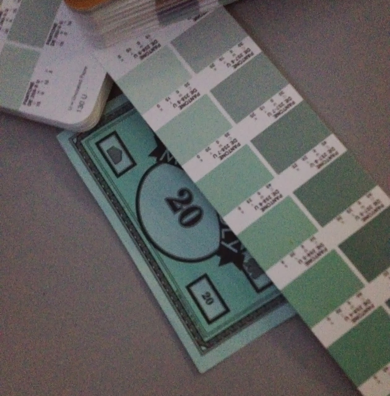
Pantone matching 5 objects


Book cover:
with lights on - 381U (solid uncoated)
with lights off - DE302-3U (solid uncoated)


Monopoly money:
lights on - DE25-8U (uncoated)
lights off - 317U (solid uncoated)


After Eights box
lights on - 5533C (solid coated)
lights off - 5533C (solid coated)


Tupperware lid:
lights on - 361C (solid coated)
lights off - 361C (solid coated)


Aerosol lid:
lights on - 358C (solid coated)
lights off - 358C (solid coated)

The task of pantone matching was relatively easy with some of the colours, for example the book cover and the After Eights box were the easiest because the colours have been printed on to card. The aerosol lid was very tricky because of it being plastic, which most of the time has a slight transparency; it would be impossible to find a printed pantone colour that had the same tone.
We got 2 out of 5 matchings right when we turned off the lights. Getting the same match for the aerosol lid was surprising, because of how much light passes through it. However, getting the book cover and the monopoly money wrong was expected because of the bright hue of the green (which catches the light) and the paleness of the blue (darkness would affect it easily).