These are some vintage Penguin covers of psychology books.
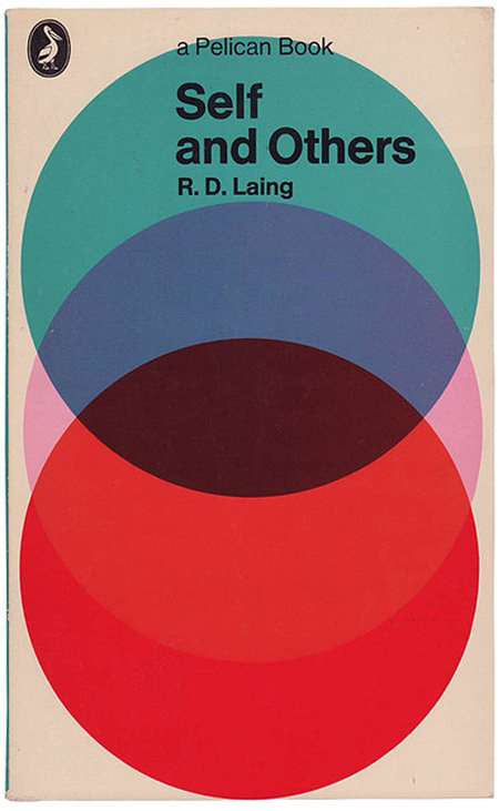
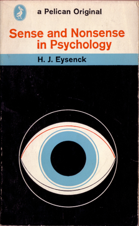


The subtle concepts are effective in portraying the contents of the book through simple, pleasing imagery.
I'm particularly intrigued by the last design in which the teapot morphs into a lobster, giving off a sense of how behaviour can change on drugs. It has a creative flair that is intriguing and unusual.
The rest of the designs have geometric shapes and bright colours that are paired with Helvetica - something that can get quite old, but I think it works well for psychology books.


by Helen Yentus
I think Helen Yentus' work is particularly appropriate because I have to stick to only two colours (plus stock) in my design. Her colour schemes are usually very minimal, making the concepts clear and concise.


by Katrin Grimm
His novel ›Species of Spaces and Other Pieces‹ deals with character of space. The design of the book reflects Perecs journey through the spaces.This book design is very striking, as the white on black type creates an atmosphere of the universe. The split letters are an interesting concept that gives the design layers.
The serif font in capitals is iconic and traditional, yet timeless.


The imagery is effective in portraying the erotic nature of the novel, and is given a clear colour scheme with the pink filter. The serif type beautifully stands out against the whites and pinks.
No comments:
Post a Comment