This module has been very challenging and stimulating, as I've cared about each brief more than any previous ones I have worked on. I put a lot of effort into each project, no matter how small (and even when 'small', they didn't feel it), and I got to experience new contexts and design formats that I hadn't worked with previously.
Each brief was live and I was working towards a deadline, so for the first time in my life I had to manage my time effectively without the constraints of college hand-ins. This taught me a lot in terms of working at a manageable pace, and trying to plan a workload for each day while balancing the other modules. I found it difficult at times, for example when I was working on my Feathr designs, I started them 4 weeks before the deadline as I knew I had to fit in other work. This made me work slower than I could have, because I knew the deadline was far away. However since that incident I have improved vastly at managing my time and getting responsive briefs done at a good pace and in advance for deadlines, which makes things a lot calmer.
Responsive gave me the opportunity to get a very clear idea of who I was designing for, as each brief essentially had a client, which has never been apart of past modules (except for Secret 7" last year). In other modules it often feels as if you're designing for yourself as nobody is actually going to buy it or make use of it, unlike competition/live briefs. This challenged me to look outside of what I like, especially when working with huge brands like Gap. I found creating the student campaign for Gap the hardest as I never really knew much about the brand before this module. It was difficult to get the tone of voice right, while also creating content that fit in with their already existing identity. This also applied when I had to send colour variations of my Feathr wallpaper, which was new to me, as I've never communicated back and forth about my designs. I had to put myself in the position of someone wanting to buy an exciting wallpaper pattern, and think of how the interior of their homes may look.
I learnt about designing for different formats, such as wallpaper and book covers. When creating my designs for Feathr I had to teach myself to create a seamless pattern in photoshop, which was a huge struggle and very time consuming. I also have never designed patterns before... so at first I felt a little lost, because it was very open to anything. However I found my way and enjoyed the change from having to include certain information and deliverables like most graphic design.
Another format I have never designed for is stickers - the small project of creating one for the blog Booooooom was interesting and different. When I printed them out and used them, I felt a satisfaction and confidence, that made me really keen to try stickers in future modules and projects.
A particular skill I have seen grow throughout this module is illustration - I am beginning to use it more and more in my work as it feels natural to me. However, I would not yet refer to myself as an illustrator, as I think of it more as using hand rendered imagery in my design work. Whether it was a graphics tablet or acrylic paint, I have definitely used a loose and expressive style in a lot of my responsive projects. This is important to me as I find it more personal to me and my peers say I am developing an individuality to my work. I'm happy with this as I'm still finding my path in graphic design, and still struggle to identify myself as a designer.
I found designing a movie poster for Her was my most enjoyable project - I gave myself a couple of days to do it, meaning I had to make it simple. However this worked really well for me as sometimes I give myself too much time to work on something so I start to dislike what I've done. Her has such an individual style that I had to create visuals that mirrored just that, which was an enjoyable challenge.
I still need to improve on time management for module deadlines, as I let myself down by not having design boards for every project, and some I didn't print out (Penguin design competition) as I had trouble finding the files at last minute before hand-in, which isn't good organisation and is a waste of my own time.
This module has been my favourite so far as it has gotten me very excited about my practice. It made me feel like a designer rather than a student, as each brief was part of the real world and not just hypothetical. The fact that each had a possible prize or some sort of recognition was amazing motivation. It gave me a lot of confidence in my work, especially when I won a place for my wallpaper design to be sold on the Feathr website... a few months ago I would have never expected my work to be good enough for anything like that.
Thursday, 26 March 2015


Wednesday, 25 March 2015
Responsive // Filmdoo: final Her movie poster

I am really happy with the final outcome for this film poster, as I was able to create what I set out to do - a very simple, subtle portrayal of the film's concept without giving too much away. I think this can be a hard thing to accomplish, but my design is quite effective.
I used minimal details about the film ie I only included the two main actors, as a way of linking in with the imagery quite intimately. I used Helvetica Medium because it is simple and doesn't distract from any other part of the poster, or more importantly 'her'. Although I wanted the names to blend in to the poster I also wanted them to be clear and readable, because they are very popular actors... something you can't really ignore when advertising a Hollywood film.
I would say that if this were a professional poster then it would need a couple more of the big actors' names and the director (Spike Jonze), but I have the chance to create something thats a breath of fresh air compared to what is already out there.
In terms of meeting Filmdoo competition brief, it wasn't really a brief. It was very open and the only deliverables were the precise measurements. It was also accepting of posters that have already been designed, and aren't exclusive to the contest. I just hope that my poster is considered as its minimalism is quite captivating and mysterious.
I printed this poster using the college's digital print facilities - I chose around 200gsm matte paper, but the outcome was a big letdown. The detail has been comprised by the printer and the colours and grainy, while digitally it looks really crystal clear and effective. I printed it again on the highest gsm of matte, hoping it would improve, but the outcome was the same. (The print room was so busy that I had to accept it and move on).
This was hugely disappointing as it affected my confidence in my work, and I thought I could trust the resources. This has taught me a lesson: leave a little more time before a deadline to test things out, and to also make sure to not put up with a poor quality of printing...
For this reason I have mocked up the poster to make up for the poor quality.

Tuesday, 24 March 2015
Responsive // Developing ideas
I took to illustrator with a few ideas and experimented, using the colour palette I created from the film.

First off, I want to see how using buildings and lit up windows would look - this is symbolising Theodore's home in his tall concrete jungle of a city, and how his life lights up when he meets Samantha. It is also an effective way to identify Theodore, without actually including him on the poster.
These images don't reflect the romanticism of the film, and seem more gritty, which has lead me on to downsize them and play with using the sky as a larger part - the architecture is not the whole film.
I hand rendered the name 'her', to create a natural and elegant feel. It seems more personal this way; to show the connection between these two beings.
I drew a small huddle of clouds to signify how Samantha is metaphorically in the clouds - she is artificially intelligent, and does not exist on earth, yet seems so real - so it seems as if she is some place else. It also adds a dreamy touch, in that she is above and watching, and is more developed than human intelligence.

I found the colours brash and too heavy for the calm and dream like nature of the film, so I've moved on and am focusing on lighter and more simplistic colours (and fewer).
The grey colour is one taken from the film, that is noticeable in a few scenes. I think its a nice subtle colour to use as a background. Red is very iconic in the film but it seems harsh when I put it into practice..
I have developed the buildings to give them more detail so a skyline is created, and to reflect the cityscape. I have looked back at the panoramic scenes and also studied skyline images I've come across online. Parts of the movie were filmed in Shanghai to get the futuristic feel as the buildings are incredibly tall.


In trying a sans serif font I have found it to be too like the already existing movie posters for Her. I want to move away from that and create something fresh.
I've experimented with the composition and tried removing the clouds (I got feedback that they are too cartoon like), so I have researched the OS system to try to create more relevant imagery.

When the OS is being created for Theodore, this loading screen comes up. I love the smooth and elegance of it, so I have tried to recreate it subtly on the poster, to signify the connection between Theodore and Samantha.
I have placed it connecting 'her' and the buildings together, which is a nice concept in that the two are joined.

These are the final three designs that I prefer the most, and that recreate the atmosphere from the film as best as possible.
I'm having a hard time deciding, as I like them all and they are too alike, so I have asked opinions and learnt that 'it may be better without the love heart, or if it is moved further up'. Also that the clouds are quite 'unclear at first', and they distract from the type, which is strong on its own.
Some more feedback I got was:
- The loveheart is quite distracting from the less obvious, conceptual elements - it isn't really needed. Possibly one feature too many?
I decided to go with the middle design, as the composition of the buildings is more natural and balanced. Although I feel that the heart is unnecessary, I am going to place is very small in the middle building as a subtle feature hinting at Theodore in his home, falling in love with Samantha who is reaching down to him.
Sunday, 22 March 2015
Responsive // Movie poster research
Alternative Movie Posters
 |
| Black Swan by La Boca |
This poster is massively effective as it's so dramatic. The negative space makes for a really clever mix of a swan and a dancer, merging the film name and the plot.
The typeface fits the content of the film, as it is elegant and and very stylised.
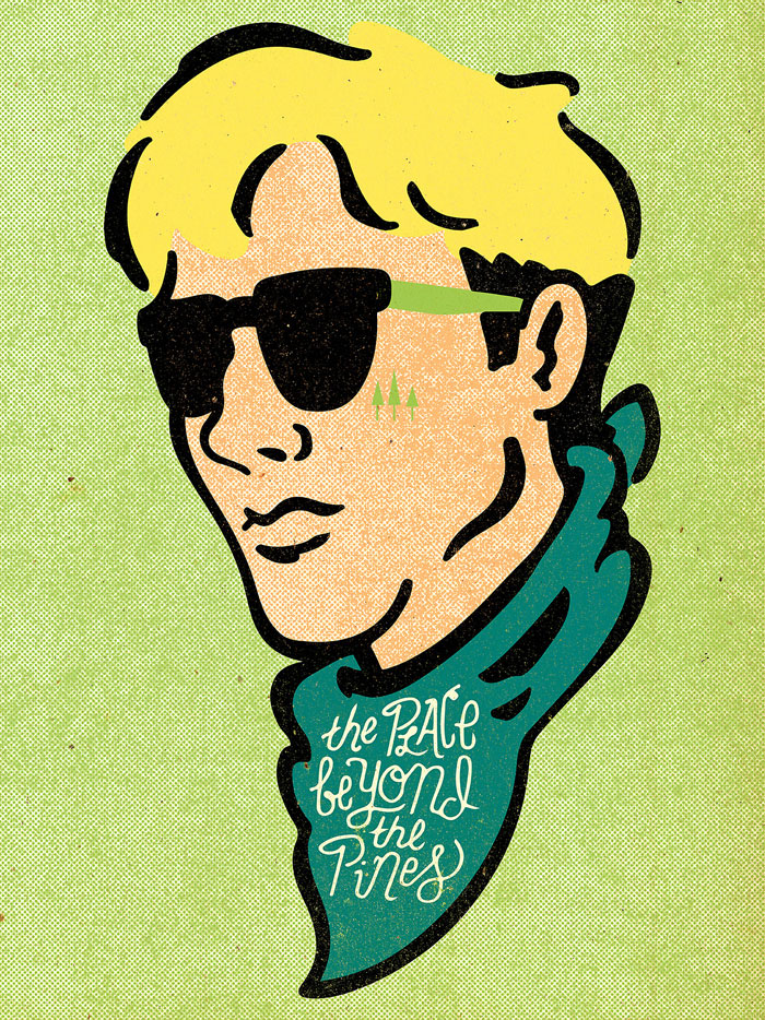 |
| The Place Beyond the Pines by Derek Eads |
 |
| The Deer Hunter by Adam Juresko |
 |
| The Great Escape by Maxime Chillemi |
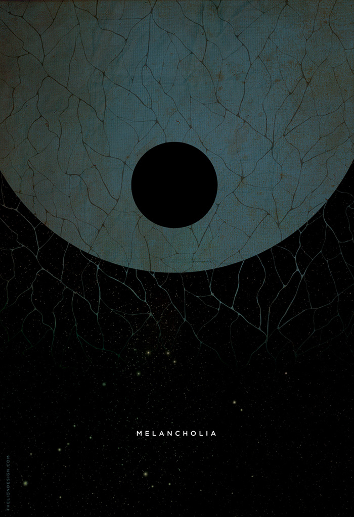 |
| Melancholia by Jason Heatherly |
The type being small puts focus on the imagery, and perhaps is trying to show the large and overwhelming size of the imagery.
This poster is beautifully illustrated, and without seeing the film name I instantly knew which it is. The shadow of Stephen Hawking in a wheelchair is very hard-hitting, as its not obvious as first but once seen it represents the story so well.
These very stylised posters suit the movie and it's atmosphere. They second is not particularly conceptual, which works well as it still represents a vital part of the film. (Plus, The Grand Budapest Hotel is largely known for the set design and general style, so it suits well).
From looking at movie posters, I've concluded that I want to use very simple and subtle imagery to convey Her.
Creating imagery that doesn't include the main character is a challenge I enjoy, as it lets the concept behind the film take over, and doesn't rely on the actors.
Keeping the colours and style of the movie is very important.
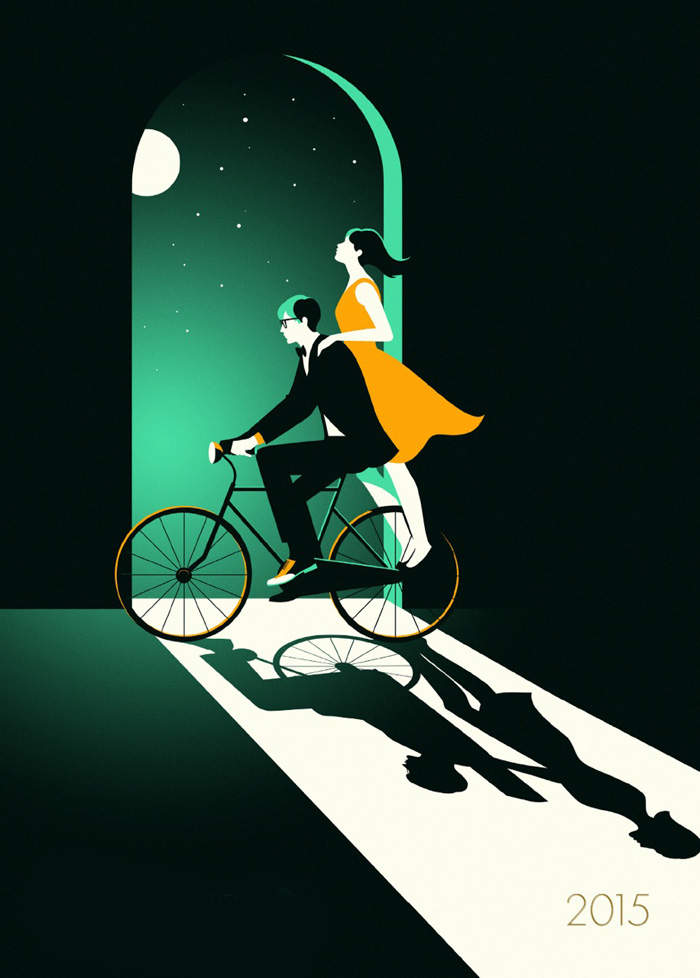 |
| The Theory of Everything by Malika Favre |
 |
| The Grand Budapest Hotel by Thomas Walker |
 |
| The Grand Budapest Hotel by Gian Bautista |
From looking at movie posters, I've concluded that I want to use very simple and subtle imagery to convey Her.
Creating imagery that doesn't include the main character is a challenge I enjoy, as it lets the concept behind the film take over, and doesn't rely on the actors.
Keeping the colours and style of the movie is very important.
Saturday, 21 March 2015
Responsive // Filmdoo: Initial Ideas
I decided to design a film poster for 'Her' as I really enjoyed this film, and it has developed characters and an interesting, unique plot.

Her is about Theodore, a soon-to-be divorcee who lives alone and is still struggling with the end of his long-term relationship. He purchases a new operating system that has artificial intelligence, called Samantha, who acts and talks like a real human. Theodore sparks an unlikely relationship with her.
Only certain things can be included in a film poster that do not spoil the story for potential viewers, so I will only be including possible imagery that reflects:
- reflects Theodores past relationship
- Theodores romance with Samantha
OR imagery that subtley hints at the plots twists in the film (such as the pitfalls of being so involved in technology). This can create curiosity in people, which makes them want to watch it.
Themes:
- heartbreak
- love
- technology
- loneliness

The first two thumbnails show the camera from the OS, first as the equivalent to a human eye and second to seem like a faraway planet (as Samantha isn't real, and is just technlogy. She gets more intelligent throughout the film so by the end it seems as though she is real, but just somewhere far away.)


Responsive // Her cinematography and set design
I took it upon myself to watch the film again, and take screenshots along the way to document the atmosphere that is created.
This is to create a colour palette for my poster design that perfectly captures the film, and to also represent the cinematography, scenery and set design. I think this is important when trying to create an identity of a production; you have to embody it's features which all have their reasons as to why they are important to the plot.


The colours in this film are brilliantly executed, and aren't something you can ignore. Soft hues and warm tones are prominent throughout, complementing one another with elegance. There is very little use of blue, which was intentional; the filmmakers wanted blue to be left out, but not for any important reason.
To use blue in a film poster for Her would be pretty inappropriate, when I think of the movie I think of soft pinks and reds.
The filmmakers made sure to use red in almost every frame, most of the time being Theodore's shirt, making it quite an iconic look throughout the movie. It even matches the colour scheme of the iOS system It also reflects love, which is the main theme in this movie, and something Theodore struggles with.
The film is 'futuristic', which makes the perfect colour palette seem something embedded in future society; all of the extras are dressed very smart and elegantly, with a very carefully put together colour scheme.
All of these fresh, colourful scenes are often contrasted with panoramic views of the city at night, which are pretty magical. They strongly signify a big, urban environment that will exist in the future with no escape. To use this imagery as inspiration for the poster would definitely clearly portray the films scenery.
Colour palette:

I think they reasonably represent the film - the first row is the film overall, and the second row is the night time colours seen in the amazing views of the city.
I will keep these colours in mind when designing my poster.
Friday, 20 March 2015
Collaborative // GAP: Final campaign
Shopfront display
 |
| text on the window reads '#DressNormal this term.' |

Alex created this minimal poster, which we all agreed was appropriate and representative of Gap.
However, we seemed to gradually steer away from the original idea of a busy composition of shapes overlapping each other, which I think we should have used more. Saying that, this composition is effective too, as sometimes less is more. The white space is quite captivating paired with the simple imagery.
Flyers


I came up with the idea to design small flyers that would be handed out to students at fresher fairs or on the highstreets. Fresher fairs would be a highly effective way to communicate Gap to a student audience, as students do actually pay attention to things they get handed in these places, as its an exciting time for first years and they aren't in a situation where handouts are a chore.
I used enlarged shapes from our original composition of shapes and segments, so that they stand out clearly on a small leaflet. The straightforwardness and simplicity grabs attention quickly. I made sure to use an appropriate balance of colours and make sure the vibrant pink was always present, which is a colour that is youthful and bold.
Mockups
 |
| Bus advertisement, Magazine/newspaper advertisement, Student poster advertisement |
Alex and me worked on these mockups. We decided to go beyond the brief and create bus and magazine advertisements because we wanted to make it seem as realistic as possible, and to illustrate how this campaign could work in the real world.
It also gave us the opportunity to design in different formats that we haven't explored before... designing for the side of a bus is a challenge but something that is worth experimenting with.
- - - - - - - - - - - - - - - - - - - - - - - - - - - - - - - - - - - - - - - - - - - - - - - - - - - - - - -
As I group, we listened to each others ideas and no one took full charge so I felt quite equal to others in the project. However, by having a leader in the group we could have been more efficient and created stronger work.
One of our downfalls was that as a group we weren't very inspired by the project - as I read more about it and started to research it, it became more unappealing and dull, and Alex and Johnny felt the same. This was mostly due to quite strict guidelines on the YCN brief, such as Helvetica being the only font allowed and then going on to learn more about their 'Dress Normal' campaign, which isn't very imaginative. By this time, we had already agreed on designing for Gap, so we powered through and came up with an outcome that is clear and communicative - something that fits in pretty well with Gap.
I felt quite trapped by Helvetica, as its quite often considered an invisible font - it is so normal and readable that it doesn't have any personality in a lot of situations. Typography is a massive part of any graphic design so the way its used can be very creative and communicative.
This put pressure on us to create imagery that got the message of '25% off' across - a concept we struggled with at first, because Gap is a very simple and clean brand. This meant that there were a lot of boundaries to be aware of when designing for students: boundaries that don't exist in other stores, such as River Island or Topshop.
Responsive // Filmdoo movie poster competition
Brief:
Enter a Poster Design you've created for any existing film. The size must be one sheet
(686 x 1020mm) or Quad (762 x 1020mm) in a High Res jpeg file
Three winners will have the amazing opportunity to design artwork
for a film release this year with an established film distributor,
Enter a Poster Design you've created for any existing film. The size must be one sheet
(686 x 1020mm) or Quad (762 x 1020mm) in a High Res jpeg file
Three winners will have the amazing opportunity to design artwork
for a film release this year with an established film distributor,
plus many other fantastic prizes! Enter a Poster Design you've created.
- Entries accepted from 28th January - 30th April 2015
- Winners announced during Cannes Film Festival in May 2015
- The Top Five posters will be printed and promoted during Cannes Film Festival
https://www.filmdoo.com/creativity
I have chosen this as my final responsive brief as I love films! Being passionate about movies will make this project enjoyable and hopefully great results.
It seems an exciting project to be a part of, as the prizes are impressive.
Initial film ideas:
- Lost in Translation
- Whiplash
- Her
- Kill Bill
- The Place Beyond the Pines
I thought of these because they all have quite deep and developed storylines, which would help with coming up with conceptual ideas. They are also obviously films I love.
I want to pick a relatively recent film, because I think it's more exciting to people than films that have long gone by. Because of this I'm swaying towards Her or Whiplash.
Thursday, 19 March 2015
Collaborative // GAP: Initial and developed ideas
Initial ideas we came up with:
- illustrated clothing or shapes
- geometric shapes
- expressive contrasting with the clean cut helvetica
- use the '25%' feature and create imagery with segments cut out of it
We have decided that the idea of segments to represent a quarter/25% would be quite effective. Because this campaign will be running during Freshers week, we thought of the idea of being Fresh, which fits in well with Gaps identity as simple, clean, and casual.
- Fresh = fresh fruit
- cut a quarter out of pieces of fruit and photoshoot them.
We liked this idea (that Alex came up with, which I then suggested relates to freshers), but when we came back to it later we thought using fruit to sell clothes might not fit and might not be obvious. We discussed it the day after the idea came about, and Johnny was quite against it and we discussed the ways in which it may not reflect a clothing brand. I was initially unhappy with this decision as we don't have much time left, but decided to go with it.
Following on from this we created some vector images of geometric shapes with segments cut out. Alex created these shapes quickly on illustrator to start off, which stems from a suggestion we got from a peer about playing with the segment idea.

The first stage is promising with exciting colours, but there are too many - it reminds me of things aimed at children. Also, Gap isn't known for being colourful at all.
At the next stage we toned down the colours and made the imagery more subtle with darker colours and small pops of colour.
The linear segments add more detail and layers to the design, but we thought that it could possibly look like images from a maths textbook...
On my own I have tried out some images made up of small circles, again showing the 25% off. It ended up looking like the American flag, however that would relate to Gap as they say their attitude is "American optimism". That still doesn't justify it enough, and the images aren't strong enough and lack colour.

Me and Alex sat together and experimented with different combinations of colours on illustrator as seen above, taking away some shapes and spreading them out a little bit.
I suggested that the mustard and yellow colours clash horribly with the other colours, especially the pink. An effective combination is an array of grays, pink and the dark turquoise, because more than one bright colour wouldn't reflect Gap at all. We agreed on this.
Their colour palette is mostly creams, greys, and blues, with a little pink. However, one bright colour sets off the design, giving it character and making it bold.
We agreed to use the shapes seen in the last two designs in different mediums such as billboards, leaflets and posters.
Slogans
The phrase 'Make An Understatement This Term' is an initial idea to reflect Gap's identity a bit more. It derives from a caption I saw on their instagram that read "Make an understatement"... which is something I haven't heard before, as normally making a statement is something that people desire.
We thought that this makes Gap different from other brands, as they are saying their clothes are beautifully simple.
In discussing this phrase as a group, we came to the conclusion that understatement has negative connotations, especially amongst students who want to stand out and attract attention. It would be best to use something that suits Gap's "Dress Normal" campaign.
I individually brainstormed some possible alternatives, taking from their website and social media presence, picking up on adjectives they use.
- Normal is the new black (Alex's suggestion)
- Be confident in your style
- Be comfortable with yourself
- Casual confidence
- Classic. Clean. Confident.
- #DressNormal this term.
- Be classic, clean and confident this term.
- Simplicity wins.
- Be classic. Be timeless.
- Shop casual this term.
Me and Alex discussed which of these would be appropriate, and decided to go with '#DressNormal this term'. mentioning the university 'term' makes it more clearly targeted towards students, and hopefully would make them consider renewing their wardrobe for their fresh start in a new place.
When sharing this idea with Johnny, he thought that it would benefit without the hashtag -
Dress normal this term.
Sometimes an overuse of hashtags comes across as irritating to a lot of people and trying too hard.
Tuesday, 17 March 2015
Collaborative // GAP: Clothing brands on social media
To get an idea of tone of voice and content I have looked at high street clothing brands that are popular with students - Topshop, ASOS and ZARA.
Topshop

Topshop have 4.1 million likes on their page, so they are clearly successful on social media. The cover photo is details of their clothing in a very fashion-show style, which is reflecting their effort to be seen as similar to high end brands.


Frequent photoshoots are posted on their facebook page that include young looking models, in ensembles that are very appealing to young people as they hit all the current trends.


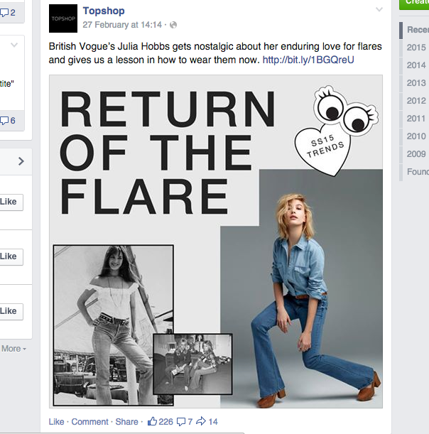
'Retro' seems to be a big trend amongst social media where old photographs of celebrities from the 70s/80s/90s are posted as 'style inspiration'. I see this a lot from brands like Topshop.


Overall, Topshop seems to keep some sophistication with its simplistic designs on posts, while using teen-type trends such as lovehearts and cartoon eyes.
Fonts used are very simple and sans-serif.
ASOS

The header image on the facebook page for ASOS is instagram photos taken by consumers, which is obviously trying to prove that their clothes are wearable and attainable. It also encourages people to get involved via social media, which is what spreads a brand quite well amongst students.

Here an effective use of instagram as a marketing strategy is clear: #AsSeenOnMe, which is a play on the name of ASOS: 'As Seen on Stars'. It allows people to get exposure through ASOS posting their photo, while promoting their clothing for free.

ASOS post fashion-orientated articles to keep people interested in their website.


ZARA

Zara are a lot more understated than Topshop and ASOS, as they cater to all ages. Their style is simplicity and quality, which is reflected through their social media. Their logo is very minimal.


#zaradaily is a hashtag for a new outfit posted by Zara every day. This is an effective way of causing interest and making people check back each day to see what they've posted.


From this research I've found that a heavy presence on social media is vital when trying to attract students. Also, design trends are popular as young people follow them more than anyone else.
Hashtags are a way to draw students in as they have a chance of winning something or getting their picture posted.
Subscribe to:
Comments (Atom)