Showing posts with label responsive collab. Show all posts

Friday, 20 March 2015

Collaborative // GAP: Final campaign

Shopfront display

text on the window reads '#DressNormal this term.'


Alex created this minimal poster, which we all agreed was appropriate and representative of Gap.
However, we seemed to gradually steer away from the original idea of a busy composition of shapes overlapping each other, which I think we should have used more. Saying that, this composition is effective too, as sometimes less is more. The white space is quite captivating paired with the simple imagery.

Flyers


I came up with the idea to design small flyers that would be handed out to students at fresher fairs or on the highstreets. Fresher fairs would be a highly effective way to communicate Gap to a student audience, as students do actually pay attention to things they get handed in these places, as its an exciting time for first years and they aren't in a situation where handouts are a chore.

I used enlarged shapes from our original composition of shapes and segments, so that they stand out clearly on a small leaflet. The straightforwardness and simplicity grabs attention quickly. I made sure to use an appropriate balance of colours and make sure the vibrant pink was always present, which is a colour that is youthful and bold.


Mockups
Bus advertisement, Magazine/newspaper advertisement, Student poster advertisement

Alex and me worked on these mockups. We decided to go beyond the brief and create bus and magazine advertisements because we wanted to make it seem as realistic as possible, and to illustrate how this campaign could work in the real world.
It also gave us the opportunity to design in different formats that we haven't explored before... designing for the side of a bus is a challenge but something that is worth experimenting with.


- - - - - - - - - - - - - - - - - - - - - - - - - - - - - - - - - - - - - - - - - - - - - - - - - - - - - - - 


As I group, we listened to each others ideas and no one took full charge so I felt quite equal to others in the project. However, by having a leader in the group we could have been more efficient and created stronger work.

One of our downfalls was that as a group we weren't very inspired by the project - as I read more about it and started to research it, it became more unappealing and dull, and Alex and Johnny felt the same. This was mostly due to quite strict guidelines on the YCN brief, such as Helvetica being the only font allowed and then going on to learn more about their 'Dress Normal' campaign, which isn't very imaginative. By this time, we had already agreed on designing for Gap, so we powered through and came up with an outcome that is clear and communicative - something that fits in pretty well with Gap.

I felt quite trapped by Helvetica, as its quite often considered an invisible font - it is so normal and readable that it doesn't have any personality in a lot of situations. Typography is a massive part of any graphic design so the way its used can be very creative and communicative.

This put pressure on us to create imagery that got the message of '25% off' across - a concept we struggled with at first, because Gap is a very simple and clean brand. This meant that there were a lot of boundaries to be aware of when designing for students: boundaries that don't exist in other stores, such as River Island or Topshop.

Thursday, 19 March 2015

Collaborative // GAP: Initial and developed ideas

Initial ideas we came up with:
  • illustrated clothing or shapes
  • geometric shapes
  • expressive contrasting with the clean cut helvetica
  • use the '25%' feature and create imagery with segments cut out of it
We have decided that the idea of segments to represent a quarter/25% would be quite effective. Because this campaign will be running during Freshers week, we thought of the idea of being Fresh, which fits in well with Gaps identity as simple, clean, and casual
  • Fresh = fresh fruit
  • cut a quarter out of pieces of fruit and photoshoot them.
We liked this idea (that Alex came up with, which I then suggested relates to freshers), but when we came back to it later we thought using fruit to sell clothes might not fit and might not be obvious. We discussed it the day after the idea came about, and Johnny was quite against it and we discussed the ways in which it may not reflect a clothing brand. I was initially unhappy with this decision as we don't have much time left, but decided to go with it.


Following on from this we created some vector images of geometric shapes with segments cut out. Alex created these shapes quickly on illustrator to start off, which stems from a suggestion we got from a peer about playing with the segment idea.


The first stage is promising with exciting colours, but there are too many - it reminds me of things aimed at children. Also, Gap isn't known for being colourful at all.
At the next stage we toned down the colours and made the imagery more subtle with darker colours and small pops of colour. 
The linear segments add more detail and layers to the design, but we thought that it could possibly look like images from a maths textbook...

On my own I have tried out some images made up of small circles, again showing the 25% off. It ended up looking like the American flag, however that would relate to Gap as they say their attitude is "American optimism". That still doesn't justify it enough, and the images aren't strong enough and lack colour.


Me and Alex sat together and experimented with different combinations of colours on illustrator as seen above, taking away some shapes and spreading them out a little bit.

I suggested that the mustard and yellow colours clash horribly with the other colours, especially the pink. An effective combination is an array of grays, pink and the dark turquoise, because more than one bright colour wouldn't reflect Gap at all. We agreed on this.
Their colour palette is mostly creams, greys, and blues, with a little pink. However, one bright colour sets off the design, giving it character and making it bold.

We agreed to use the shapes seen in the last two designs in different mediums such as billboards, leaflets and posters.


Slogans

The phrase 'Make An Understatement This Term' is an initial idea to reflect Gap's identity a bit more. It derives from a caption I saw on their instagram that read "Make an understatement"... which is something I haven't heard before, as normally making a statement is something that people desire.
We thought that this makes Gap different from other brands, as they are saying their clothes are beautifully simple.

In discussing this phrase as a group, we came to the conclusion that understatement has negative connotations, especially amongst students who want to stand out and attract attention. It would be best to use something that suits Gap's "Dress Normal" campaign.

I individually brainstormed some possible alternatives, taking from their website and social media presence, picking up on adjectives they use.


  • Normal is the new black (Alex's suggestion)
  • Be confident in your style
  • Be comfortable with yourself
  • Casual confidence
  • Classic. Clean. Confident.
  • #DressNormal this term.
  • Be classic, clean and confident this term.
  • Simplicity wins.
  • Be classic. Be timeless.
  • Shop casual this term.

Me and Alex discussed which of these would be appropriate, and decided to go with '#DressNormal this term'.  mentioning the university 'term' makes it more clearly targeted towards students, and hopefully would make them consider renewing their wardrobe for their fresh start in a new place.

When sharing this idea with Johnny, he thought that it would benefit without the hashtag -
Dress normal this term.
Sometimes an overuse of hashtags comes across as irritating to a lot of people and trying too hard.

Tuesday, 17 March 2015

Collaborative // GAP: Clothing brands on social media

To get an idea of tone of voice and content I have looked at high street clothing brands that are popular with students - Topshop, ASOS and ZARA.

Topshop


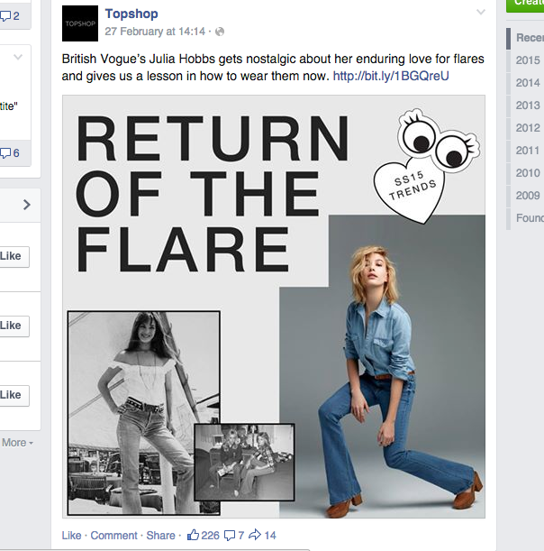
Topshop have 4.1 million likes on their page, so they are clearly successful on social media. The cover photo is details of their clothing in a very fashion-show style, which is reflecting their effort to be seen as similar to high end brands. 


Frequent photoshoots are posted on their facebook page that include young looking models, in ensembles that are very appealing to young people as they hit all the current trends.


'Retro' seems to be a big trend amongst social media where old photographs of celebrities from the 70s/80s/90s are posted as 'style inspiration'. I see this a lot from brands like Topshop.


Overall, Topshop seems to keep some sophistication with its simplistic designs on posts, while using teen-type trends such as lovehearts and cartoon eyes.
Fonts used are very simple and sans-serif.


ASOS


The header image on the facebook page for ASOS is instagram photos taken by consumers, which is obviously trying to prove that their clothes are wearable and attainable. It also encourages people to get involved via social media, which is what spreads a brand quite well amongst students.


Here an effective use of instagram as a marketing strategy is clear: #AsSeenOnMe, which is a play on the name of ASOS: 'As Seen on Stars'. It allows people to get exposure through ASOS posting their photo, while promoting their clothing for free.


ASOS post fashion-orientated articles to keep people interested in their website.


ZARA


Zara are a lot more understated than Topshop and ASOS, as they cater to all ages. Their style is simplicity and quality, which is reflected through their social media. Their logo is very minimal.


#zaradaily is a hashtag for a new outfit posted by Zara every day. This is an effective way of causing interest and making people check back each day to see what they've posted.


From this research I've found that a heavy presence on social media is vital when trying to attract students. Also, design trends are popular as young people follow them more than anyone else.
Hashtags are a way to draw students in as they have a chance of winning something or getting their picture posted.

Monday, 9 March 2015

Collaborative // GAP store photographs

As some primary research, we headed to the nearest Gap store and Johnny took some photographs of the store front and the inner layout, signs and clothes.
We could also possibly use some of these photographs for mock ups of finished designs.


The shopfront is something that could be vastly improved, the windows and paint job are quite attractive. This was something valuable to study as we are primarily designing for the front of Gap stores. Here in Leeds the likes of Topshop and River Island are directly opposite, making Gap seem quite invisible to young people.


The signs dotted around the store don't fit in very well with the rest of the store, and seem to be quite poorly thought out.
'The jeans you've been dreaming of' is something that would be much better fitted in River Island or New Look, as this phrase just doesn't seem to suit Gap's style at all. Their jeans are simple and staple items, nothing wildly statement-making.
They shouldn't pretend to be something they're not, which is still a shop with mostly older consumers.


We found that the shop is very minimal, with white walls and wooden floors. Not much colour has been introduced, except for small occasional signs for sales or indicating the type of clothing. The main colours I sensed in the clothing were blues and creams... nothing that jumps out. Seeing as we can't change the clothes, it is other elements that need spicing up. But subtly... again, throwing off the balance between their clothes and the style of interior could really make things worse.

A quote from Gap on one of their instagram posts is "make an understatement"... they aren't ashamed of it so why change it? Appealing to students isn't necessarily going to change what Gap represent, just open their eyes to it.


Researching other store fronts


River Island's window displays are pretty impressive: Neon lights and large hand rendered type are its key elements. Both these are definitely eye catching and youthful.


Urban Outfitters is an extremely youthful and 'trendy' store, so we took a look around at how it presents itself to students. These lit up signs caught our eye as something that is fun and vibrant... you wouldn't see them in Marks and Spencers.
Everything is very clearly aimed at young people in UO, and gives us good examples of how to attract students. However, we are aware that Gap is a totally different store that isn't primarily targeted to young people.

Wednesday, 4 March 2015

Collaborative // GAP online presence research

GAP website

I took a look at Gap's website to see how they present themselves, and what may be wrong with it when thinking of the student audience.


What I learnt from look at their website it that it very vanilla. It isn't 'cool' and the colours used are very similar to other clothing brands that are targeted at middle aged women. The dull, constant use of Helvetica doesn't help things, but that isn't something we can change.


GAP on Facebook


On Facebook they seem to post fashion-oriented content just like ZARA or ASOS. If they had more lighthearted posts however, it would help them get the attention of students.
Their logo has been changed to pink, which is unusual seeing as Gap seem very set on not changing much of their aesthetic. Perhaps this is to compete with the likes of Topshop or ASOS and try to attract young girls.

Tuesday, 3 March 2015

Collaborative // YCN: GAP Student campaign

For the collaborative brief, I am working with Johnathan Dawes and Alex Finney.
I approached them about collaborating as I feel that they are calm and level-headed and would be good to work with. I've worked with people before who have strong personalities and take complete charge,  or I clash with. I have worked with Alex Finney before and felt his contributions were of a high standard, and I know both are able to listen and be reasonable.
Saying this,  I would say that we all have slightly different styles, so can each bring a different touch to the project.
I have a wide array of interests, but something I almost always include in my work is illustration, or hand-rendered type/imagery. Hopefully this will be relevant in this project, but it may not be.

We chose the YCN Gap brief, as none of us have worked on a fashion-based project before, and it is aimed at students - we are students so we know our audience well.
-------------------------------------------------------------------------------------------------------------------------
Create a student brand campaign that gives students a reason to visit Gap.
Who We Are
Here’s something you might find interesting: Gap has about 10 miles of storefront windows around the world. This makes us a huge global brand with loads of blank space that we use to speak to our customers every day. American Optimism is our attitude. Casual style is our aesthetic. Clean and confident, comfortable and accessible, classic and modern. It’s the quintessential expression of Gap brought to life through iconic clothing. Our roots epitomise American culture and denim-loving music muses. Gap embraces a youthful, infectious spirit and the freedom to express individual style.
Recently we’ve teamed up with world-renowned advertising agency Wieden + Kennedy to create our ‘Dress Normal’ campaign which has had huge success across the globe. You may have seen the campaign sprawled across billboards, bus sides, social media and fly posting.
Your Creative Challenge
Targeting the student population
So what is our challenge? Despite this campaign we’ve heard from some of you that Gap still isn’t on your radar. Millennials (also known as Generation Y) want to shop somewhere ‘cooler’ where out of the box ideas are the norm. This is where you come in. We need your creative brains to help us.
We want you to give students a reason to visit Gap. We need you to create a student brand campaign, taking inspiration from our heritage to generate ‘buzz’ and urgency, ultimately driving traffic into stores. Your visual brand campaign should be communicated through flyers, in-store signage, window vinyl and across all social media platforms speaking directly to you – the savvy student! The campaign will launch during Fresher’s Week 2015, promoting a huge 25% off student discount.
Inspiration
Immerse yourself in the world of Gap. Look at our social media platforms, visit our stores, heck even ask your parents why they loved Gap when they were students! We encourage you to visit our stores and speak to our store associates – they would love to brainstorm with you. Take note of our new tone of voice in-store and online, we are reinventing how we speak to our customers and we want you to be on board.
Considerations
We are a global brand so we need you to be respectful of this when making creative decisions – make sure you follow style guidelines which can be found in your project pack. During the student promotional period we will be launching our global Autumn campaign which will also sit alongside your student visual brand message. In short, we want your vision to speak to students locally in the UK while complementing our global brand campaign.
Mandatories
While you are free to bring your campaign to life in our stores and windows, there are some important points to consider.
Message must incorporate a 25% off promotion exclusive to students during fresher’s week.
Must use the Gap logo – cannot be changed or altered.
Inject Gap tone of voice – see Dress Normal campaign reference (additional tone of voice guidance can be requested by email).
You must show how a University Poster would work in the campaign.
Bonus points for in-store experiential event ideas!
Please note: no above the line deliverables required i.e. outdoor, television, cinema, radio and print.
------------------------------------------------------------------------------------------------------------------------


What do we want to achieve?
  • get rid of the stigma attached to the store that it is for older generations.
  • something vibrant that attracts young people
  • tie a campaign together with freshers week

Research:
  • Gap background - ethics, branding and clothes
  • other successful student campaigns
  • what do clothing stores that are popular with young people do successfully?