Sunday 30 November 2014

OUGD504 // Studio Brief 03: Final web designs


Desktop mock-up
Mock-up of the website's homepage in Google Chrome

The header/menu stays in place when scrolling, so to keep it consistent.


The 'about' page is a brief explanation of why the website exists

Each menu has drop down options to make it easier for viewers to navigate quickly.

This is an example of how the webpages for each artist look. Images are displayed in square, thumbnail styles which can be clicked through for the full artwork.

The layout of each art movement page has basic information and the relevant artists.

When hovered over, each image shows the artist in clear letters.

The search option shows clear results underneath the search bar.

I am happy with the outcome of my website, as I am confident that it is easy to navigate and straight forward.

OUGD504 // Studio Brief 03: Staying web safe

Web design requirements:

Are the fonts web safe?
Baskerville is a web safe font, however Bebas Neue is not.

  • My reason for not changing Bebas Neue to a web safe font is that I will use it in image format, which suits the menu options; it is not used for body text. Doing this will mean it is not changed into a default web safe font automatically in people's browsers.
  • A challenge is the website being used by non-English speaking viewers; using the text as an image means there will be no option to translate it into a different language. However, the font is only used to express the art movements which have (almost) global names to them, making it less of an issue (and the top menu). It is also used for the drop down menu of artists' names, which obviously can't be translated.
  • The menu options across the top of the page however, are just english words which wouldn't be recognised by non-English speakers. This is a small downfall to my website, but it is a website which is just starting off, meaning that a huge surge of people using the site who can't understand 'About, Artists, Search, Contact' in simple terms would be unlikely.
  • If the website started getting a large amount of viewers, this is something that would probably become more of an issue, but at this stage it is not.

Are the colours web safe?
Almost all my colours are except for one or two. However, in this day and age this does not seem to be an issue anymore. Technology has developed so that computers made over the past five years have monitors capable of displaying 24-bit/32-bit colour, which is a possible 16.7 million colours. This means that most people viewing my website would be able to view the colours I have used, unless they are used a very old piece of technology. My target audience is young people, meaning this risk is unlikely.

Thursday 27 November 2014

OUGD504 // Studio Brief 04: Digital Print workshop session 3

Images placed in Indesign
Photoshop

  • 300 dpi
  • actual size
  • CMYK or greyscale (not RGB)
  • .tif or .psd (not JPEG)
Illustrator
  • CMYK
  • .ai (if we 'place' the image) - can copy and paste

Resize images before placing in Indesign, otherwise the printer has to work through the resizing.
Resize an image in indesign to how you would like, then take the percentage and resize in photoshop to match, so there is no scale value.

File > Package creates a folder including all files, which can include a PDF version.

OUGD504 // Studio Brief 03: Website layout development


  • Opening Indesign, I have started on my webpage. I want to create an attractive menu for the art movements that attracts viewers to click on them.. I thought a good idea for this would be to take small snippets of a piece of artwork from the movement and use it as the individual menu button.


  • I like the font Bebas, which above you can see being used in the horizontal menu, and the art movements menu down the side.
  • I'm not definitely sure about using this typeface yet, as I'm very aware of the harshness of all the capital letters (Bebas has no lowercase). I picked it because it is youthful and modern... a lot of sans serif typefaces are dull to me.


  • I have added some colour to highlight the menus and break up the content a little. The pink didn't really seem suiting, but I'm warming to the green colour, however I think it might be a little too much to take in for people visiting the site, and may detract from the colourful content.
  • The homepage so far consists of a piece of art work, labelled 'Artwork of the week'. The idea is to change the image weekly, to give a taster of the work on the website, and to make the homepage have a simple, suiting feature.
  • The highlighted, larger menu option at the side shows how it will look when the viewer hovers their mouse over it, to make it clear.


  • Above shows the page of the artist Claude Monet. The selected works are presented through square thumbnails, which can be clicked through to see the full image. Underneath is a summary of the artist and their techniques, which is currently in Helvetica Light - is it a plain, and simple typeface which needs to blend in and not be noticed, but only read.


I have put a black box behind the imagery of the side menu, and made the images slightly transparent to mute the bright colours so the names are easier to read.

Following feedback, I have scrapped colour for the background of any part of the website to simplify the layout. Above is a layout I am trying out, along with the two images below.

I've introduced Baskerville as a font for the content, as bebas neue is too harsh to use for all titles. Baskerville bold works well for headers and Baskerville regular/semibold for text.


Based on my experience with user friendly websites, I prefer the last image in terms of layout. The border I have placed on either side centres the content and focuses it, making it neater and more together. The top menu bar being aligned with the logo seems to work better and come across clearer.


  • I created some black vector icons belonging to popular social media as a means of appealing and drawing in young audiences. Many websites these days have accounts on at least one of these so to better connect with viewers and people who are interested.
  • I also got rid of the 'links' option in the menu as it seemed unnecessary. It was going  to display the sources of information.


  • To make navigation clear, I have changed the colour of a menu option and enlarged it when it is hovered over/clicked. This shows what page the visitor is on without adding an unnecessary header. It keeps it simple.
  • My 'about' page is a short paragraph describing the site, while still using keywords that optimise the search engine results.

Wednesday 26 November 2014

OUGD504 // Studio Brief 04: Initial advertising mediums

For studio brief 4 I have to create an advertising campaign for my website.
Taking into account that my website is based on modern art movements, below are advertising mediums that would be suitable for this kind of content, while reaching the target audience.

Magazine advert
  • art and design magazines
  • independent zines
Pros
effectively targets a certain audience
reader interacts with ad physically - can be referred back to and is lasting
Cons
expensive


Flyer
  • studenty bars and cafes 
  • art galleries/museums
  • libraries
  • between magazine/book pages
  • packaged with magazine/book deliveries
  • art college fresher packs
Pros
quite cheap
person interacts with ad physically and possesses it
can be specific with locations
Cons
very disposable
might lose out by flyers not being taken

Poster
  • art college
  • art galleries
  • libraries
Pros
quite cheap
locations can be specific, freedom with location
Cons
might get damaged depending on location


What is being advertised?
  • The website itself
  • Launch event
  • Art exhibition to promote website
Advertising directly for the website is probably the most effective idea, however an event makes the website more interactive. 

Thursday 20 November 2014

OUGD504 // Studio Brief 03: Study Task 09

Search Engine Optimization

Search Engine Optimization is the process of affecting the visibility of a website or page in a search engine's organic (un-paid) search result.
The primary results that show up are what the search engine finds most relevant to the user

Google SEO starter guide - http://static.googleusercontent.com/media/www.google.com/en//webmasters/docs/search-engine-optimization-starter-guide.pdf

Page titles

  • Using the <title> tag lets users and search engines know what the page topic is. (placed within the <head> tag.
  • These words will end up in the first line of the results.
  • Create unique titles for each page to make each distinct from the others on the website.
  • keep titles short as Google has a limit to how many words it uses.
Description
  • A page's description 'meta tag' will gives search engines a summary of what it is about.
  • Placed within the <head> tag.
  • search engines may use the meta tags as snippets in search results.
  • Accurately summarise and be unique.
URLs
  • Keep them simple and easy to understand.
  • Keep relevant... if they reflect the content, they are likely to be recognised by search engines, eg [modernart.com/100a/4348700.htm] vs [modernart.com/movement/modernism.htm]
  • Avoid generic page names (eg page1.html) and overusing key words (art-modern-art-modern.htm)
  • Prepare for visitors knocking off the end of a URL to find more general content. Often a 404 error will appear, but fixing this so that content is displayed will help keep visitors on the website.
Navigation
  • Not only helps visitors, but also search engines to understand which information is the most important.
  • Plan navigation based on the homepage/index; create a naturally flowing hierarchy.
Content
  • Write easy-to-read text.
  • Stay organised around the topic.
  • Create fresh, unique content.
  • Create content primarily for your users, not search engines.

Potential SEO changes to make to my website:
  • make sure enough key words are included in the about section.
  • make navigation even more easy to use.

Wednesday 19 November 2014

OUGD504 // Digital Print workshop: Session 2 - Photoshop

The visible spectrum is the colours the human eye can see.

RGB colours in photoshop being changed into CMYK can possibly distort and change the colour for print.

How to change the colour mode.


Colour gamut: the whole range of colours, eg RGB colour gamut.


Gamut Warning highlights the colours only available in the current colour range, eg RGB, which will be unavailable if the colours are changed to CMYK.


By changing the Levels and Hue/Saturation etc of the image, this can be avoided and the gamut warning will decrease, making the image more colour friendly.


Proof Colors shows how the image will look when converted to CMYK.


Why don't we just convert to CMYK?
Because with CMYK, as seen above, there are less options available for editing.

Hold down alt and press a swatch to delete.
Press D to reset chosen colour to black and white.

Emptied swatch palette > save swatch palette as 'Empty swatch palette' to use in the future

The top small square with the warning sign shows the nearest colour available for print, and the bottom one is for web.

By clicking on it the colour is changed.


Spot colours in photoshop

Duotone image


By working with duotone, only 2 colours are used for the printing process, which saves on printing costs. Using this feature in photoshop means you can altar the levels of colours in the image before printing.


The two colours are the equivalent of black and white.
The colours can be adjusted by moving the lines in different places.

By adding a third colour, it becomes a tritone image.


By accessing Channels while still in RGB mode, the image can be viewed in each of the three primary colours to show how much of each needs to be used.


Overprinting

A spot channel can be used to overprint a colour on top of a black and white image.


Viewing the spot channel on its own shows clearly in black where it has been applied.
The solidity can be altered easily in the options, which differs how much ink is used to print.


OUGD504// Studio Brief 03: Study Task 08

Web design style guide


Wednesday 12 November 2014

OUGD504 // Studio Brief 03: Final crit


Feedback I got:

  • There is a clash of colour and a lot going on, maybe too much. - I've realised this myself shortly before the crit, as I rushed the use of colour and couldn't decide on the palette. I like the colours I've chosen, but I can understand how it's quite overwhelming and needs to be toned down.
  • Too much imagery, such as the menu on the left side of the page. - I agree that the letters aren't bold enough against the snippets of artwork, but I'm very fond of keeping this menu. I think to solve this I need to tweak it, maybe by separating each option, or making the type bolder, or the images thicker.
  • I should stick to either serif/sans serif typefaces, or hand rendered type, as together they are too much. - I understand this point, as the sans serif typeface (Bebas) is all capitals and stylised, so maybe it needs to be more minimal to complement the hand rendered, arty type.
  • Don't let people submit their own work, as it is likely to be of a low quality. - This is a good point that I didn't consider, I liked the idea of interacting with the viewers and it be an ever growing community of artists.. However the quality of work would need to stay high and reflecting of actual art movements, as it is a website about art history.
  • More of a further back history of art, to give a clearer overview. - A fair point, however I forgot to mention on the site or in the crit that the movements are part of the modern art period, which is a small section of art history. I need to make this clear in my design.

Saturday 8 November 2014

OUGD504 // Studio Brief 03: Website logo development

I have started sketching logo ideas on illustrator using my graphics tablet. I want to create something that portrays art and creativity through a sketchy and hand-rendered medium. I'm unsure of the use of colour as of yet, but I want to use at least one bright colour, as the website is full of colourful and expressive paintings, so it seems suiting. Also, the target audience is young people, from teens upwards. To make this clear I need to show youthfulness, and not just 'art information here'.


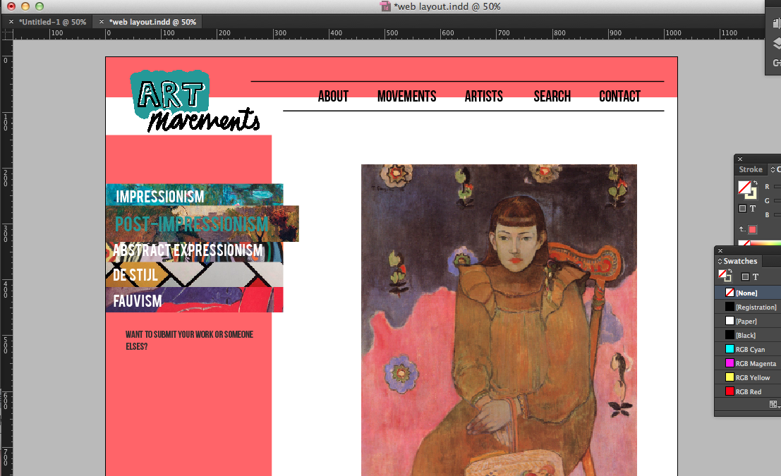
  • Here are some initial sketches, I'm thinking of making 'ART' reflective of making, and 'movements' more neutral.
  • I've experimented putting layers of the word 'ART' on top of each other using outlines and clashing colours. Doing this can make the type border on scruffy, so its hard to get the balance of expressive yet clean.
  • Many of my experiments look childish and a bit too colour clashing, like the blue with the pink.
  • With the word 'movements', I've experimented with handwriting, as it is neat and expressive without being too heavy. However, a lot of it isn't neat enough and all of the place, and a little illegible. 
  • Sans serif fonts would possibly make the logo simpler and a nice balance, but I can't seem to find one that works well enough. The fonts I tried in order are Quicksand, Ostrich Sans, and Roboto Condensed.  Quicksand is simplistic and minimal but the dotted pattern is distracted and clashes with the first half of the logo. The other fonts just don't look right with any of the 'art' sketches.


  • I chose a certain sketch I did of the word 'ART' with overlaying letter outlines. With the black letters, I differed the thickness of the outlines in different places; the main body of the 'A' is 3px, whereas the counter is 1px.
  • I like the unruliness and experimental feel this gives off.
  • The brushstroke feel to the pink background is to reflect paint, although I am not sure what colour to choose for this.


  • I experimented with different colours, but I think it depends on the design and colours used for the rest of the website. A nice bright colour would work well if I keep the web design simple and mostly white: for this I like the dark red... I think the royal blue is a little reminiscent of social media and is just generally overdone.
  • The pale orangey yellow seems like a colour used to attract children which would be the wrong effect.

I distorted the letters to make them a little neater.


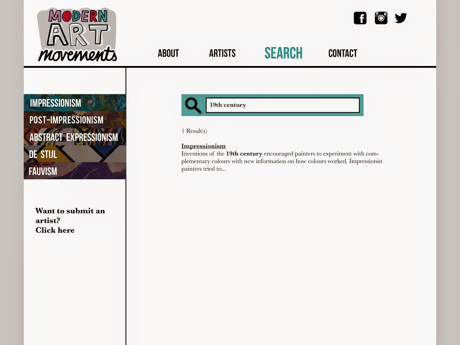
I have decided to add 'modern' to the logo name, making it 'Modern art movements', which is a lot more precise and true to the information on my website.

I drew the letters for 'modern' by hand using a tablet to fit the rest of the logo. I warped the letters in illustrator so make them neat, but still kept the individual hand rendered feel.
I've experimented with colours randomly across the letters, as colour is needed to spice it up.
I think 3 colours is a bit too many, and there needs to be some kind of order in which it is used, instead of random letters as above.


I've experimented with the logo layout trying to find the best balance.


I made the hand drawn letters much neater and more legible in illustrator as seen above, making the logo more user friendly and clear.


I have experimented with different colours in hopes of giving the logo more life. I like the two on the right, as a mixture of colour and white in the 'modern' letters makes the word hard to read.
The blue mixed with red and green however, seems to also affect the readability, as the blue is too dark in comparison, therefore the lilac colour seems to be better to go with.