 |
| Desktop mock-up |
 |
| Mock-up of the website's homepage in Google Chrome |
 |
| The header/menu stays in place when scrolling, so to keep it consistent. |
 |
| The 'about' page is a brief explanation of why the website exists |
 |
| Each menu has drop down options to make it easier for viewers to navigate quickly. |
 |
| This is an example of how the webpages for each artist look. Images are displayed in square, thumbnail styles which can be clicked through for the full artwork. |
 |
| The layout of each art movement page has basic information and the relevant artists. |

 |
| When hovered over, each image shows the artist in clear letters. |
 |
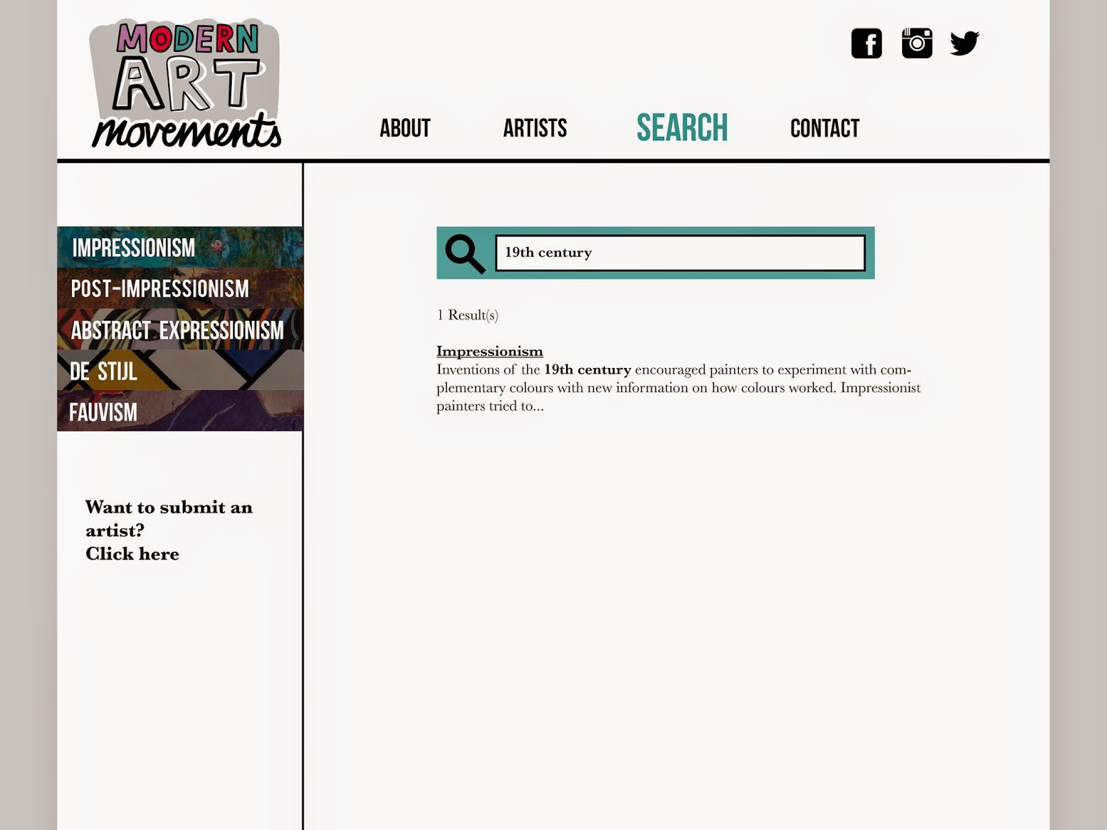
| The search option shows clear results underneath the search bar. |
I am happy with the outcome of my website, as I am confident that it is easy to navigate and straight forward.
No comments:
Post a Comment