
- Opening Indesign, I have started on my webpage. I want to create an attractive menu for the art movements that attracts viewers to click on them.. I thought a good idea for this would be to take small snippets of a piece of artwork from the movement and use it as the individual menu button.

- I like the font Bebas, which above you can see being used in the horizontal menu, and the art movements menu down the side.
- I'm not definitely sure about using this typeface yet, as I'm very aware of the harshness of all the capital letters (Bebas has no lowercase). I picked it because it is youthful and modern... a lot of sans serif typefaces are dull to me.
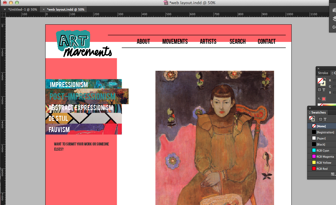

- I have added some colour to highlight the menus and break up the content a little. The pink didn't really seem suiting, but I'm warming to the green colour, however I think it might be a little too much to take in for people visiting the site, and may detract from the colourful content.
- The homepage so far consists of a piece of art work, labelled 'Artwork of the week'. The idea is to change the image weekly, to give a taster of the work on the website, and to make the homepage have a simple, suiting feature.
- The highlighted, larger menu option at the side shows how it will look when the viewer hovers their mouse over it, to make it clear.

- Above shows the page of the artist Claude Monet. The selected works are presented through square thumbnails, which can be clicked through to see the full image. Underneath is a summary of the artist and their techniques, which is currently in Helvetica Light - is it a plain, and simple typeface which needs to blend in and not be noticed, but only read.

I have put a black box behind the imagery of the side menu, and made the images slightly transparent to mute the bright colours so the names are easier to read.
Following feedback, I have scrapped colour for the background of any part of the website to simplify the layout. Above is a layout I am trying out, along with the two images below.
 |
| I've introduced Baskerville as a font for the content, as bebas neue is too harsh to use for all titles. Baskerville bold works well for headers and Baskerville regular/semibold for text. |

Based on my experience with user friendly websites, I prefer the last image in terms of layout. The border I have placed on either side centres the content and focuses it, making it neater and more together. The top menu bar being aligned with the logo seems to work better and come across clearer.

- I created some black vector icons belonging to popular social media as a means of appealing and drawing in young audiences. Many websites these days have accounts on at least one of these so to better connect with viewers and people who are interested.
- I also got rid of the 'links' option in the menu as it seemed unnecessary. It was going to display the sources of information.

- To make navigation clear, I have changed the colour of a menu option and enlarged it when it is hovered over/clicked. This shows what page the visitor is on without adding an unnecessary header. It keeps it simple.
- My 'about' page is a short paragraph describing the site, while still using keywords that optimise the search engine results.
No comments:
Post a Comment