I started this animation after starting Rebirth, so I could move faster along with my knowledge I have learnt from creating that one.
With Tamar's drawings, I scanned them in and manipulated them for the animation - having these initial images is crucial and they serve as the main features of the plot for me to work with.
Above the first and last images were drawn by Tamar, which I made into vectors. From these, I used the onion skin feature to draw the frames in between so that it morphs into a cloud - this is so that it clearly portrays the brain as a rain cloud, to show that it is the monster of the story and the negativity it has.
As we have decided to use simple outlines of the animation's features, we want to pick a background colour that sets the mood. The theme of the story is personal struggles such as depression or anxiety - the colour cannot be bright and cheerful, so we've tried out some dull colours that still make the animation enjoyable to watch.
A little too dark - the black line doesn't stand out enough.
Quite sickly and reminiscent of babies or children.
Again, maybe a little too dark, but quite fond of this subdued purple.
This colour is minty green, and is very subtle so it doesn't distract from the simple black lines and shapes. It isn't cheerful at all - but its still quite pleasant and easy on the eyes.
We decided to carry on the smooth flow by zooming out and moving the heart into the frame to kickstart the context of the story - this means that at the start, the brain is the main feature to set the scene so to speak, then the next step is taken with the heart being shown directly underneath the transformed cloud.
Adapting Tamar's drawings, I have altered the size of the sun gradually so it changes from hiding behind the cloud to poking out and emitting strong rays to show that the positivity can come through and overtake the storm.
I have created the stages of the storm, which has been very time consuming because it is very trial and error - I constantly have to eliminate some features or make frames shorter so the video isn't too long. The sun is constantly moving around and battling with the rain - I tried out different thickness of lines and altering between small dots and long lines to show the heaviness of the storm.
We added waves around the heart to show how it was heating up from the sun, but we took them out as they affected the polished simplicity of the whole animation and the sun beating down is enough to convey this.
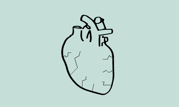
We have actually scrapped the cracking of the heart when the sun is too hot because there is just too much to put into the animation.
We thought: how can we show the actual overcoming in the story, the most important part? As we previously discussed, we thought that plants growing would be a really clear way to show growth and nurturing of the soul/heart. It also links really well to the storm idea, because plants can't thrive in storms or the heat, there has to be a good balance (just like a balance of healthy thoughts).
I drew some leaves and vines to show it growing upwards - Tamar said that they should be green as the colour will contribute to the symbolism.
I made the cloud morph back into the brain so that the ending can link to the start - the context is made very clear and shows that the monster inside the brain has been defeated, and the positivity has spread to it.
After we had done this, someone made a suggestion to us that a really nice and emotive ending would be to have flowers sprout from the brain to show the plants have fully blossomed, so Tamar drew different stages of flowers which I sorted through and picked the best ones.