Wednesday 31 December 2014

Responsive // Feathr: final wallpaper designs


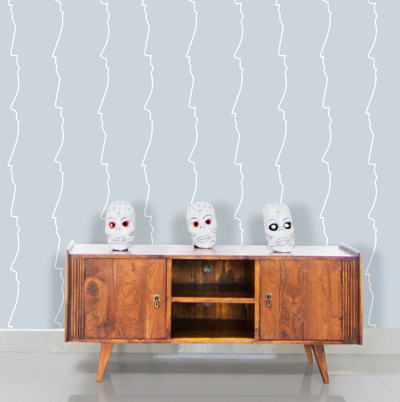
This is the total ratings each of my designs received by the end of the voting period.
My flamingo design was ranked 4th out of nearly 800 designs by the end of the competition, which I'm very happy with.
During the end of the competition I watched it bounce back and forth between the first few pages so I posted it on a few social media sites and sent to some friends for further support. However, most of the votes I received were not through me asking people to, which is why I am surprised I got this far.
I am still awaiting the results, which are not entirely based on ranking of votes, so it is unclear who the winner may be.


OUGD504 // Studio Brief 04: Further interactive print research


http://welovetypography.com/post/10360/


http://bpando.org/2013/06/28/logo-designers-anonymous/

Where special print treatments and stickers have often been used as a superfluous side-show or vanity exercise within the context of self-initiated projects, Designers Anonymous have used peelable adhesives and heat reactive inks to introduce a literal, layered quality and a big ‘reveal’ that take the simple redacted/anonymous concept from their earlier identity – and in conjunction with the new icons / logo set – adds a much-needed dimensionality, approachability and personality.


http://www.fromupnorth.com/print-design-inspiration-991/


https://www.behance.net/gallery/The-Curiosity-Project/4712757

Tuesday 30 December 2014

OUGD504 // Studio Brief 04: Print design research

Marbling


Marbling is very mesmirizing to me and something I definitely want to try out. After looking at the technique, I have found it is more complicated than I previously thought and requires certain ingredients that I don't have.
Given that I don't have long to design my website advertisements, it seems that I cannot try marbling for this project. However the colours and shapes have inspired me and I find them very engaging.

Friday 19 December 2014

Responsive // Feathr: wallpaper development


I came up with this illustration of joined facial profiles just by sketching whatever came into my head. I wanted to create something personal and I think this is an interesting and original idea that I haven't seen done before.
It is quite easy to turn into a repeating pattern, which I did by rearranging many times to make sure the lines could appear continuous.


I have tried out many colours, trying to create a design that isn't too overwhelming. The colours above are nice and quite appropriate for wallpaper, but I'm not happy with them entirely because they seem too normal.


I have been quite tentative about using a lot of black but I used an off-black background and a few different colours for the lines and I think the design is much more unusual and eye-catching.

Thursday 18 December 2014

Responsive // Feathr: Flamingo development

There are many wallpaper designs that feature birds as seen in my research, so I want to expand on this.
Flamingoes are very vivid and majestic animals, that are quite different to other birds. This makes them a different feature to other generic wallpapers.


Using acrylic paint, I have painted one using an orangey red palette. This colour is very vibrant and adds something new to the wallpaper scene!

I scanned it and made some changes to it in photoshop to make it neater. Feathr's submission page lets you view how it will look on the wall which is hugely helpful.


At first I have gone with the simple option of putting the flamingo on a white background without using a seamless pattern (they are not overlapping). I experimented with different sizes to try and judge how they will be viewed from certain distances. I found the first size more appropriate and more suiting for any wall size.


I tried lots more variations.. but I found that the simpler the better - let the flamingoes speak for themselves! Multicoloured is just too much for wallpaper.

I then moved on to overlapping the flamingoes to create more of an ongoing pattern - this was pretty hard as it meant I had to learn how to do seamless patterns in photoshop. It is straightforward but a long process to get it perfect.


In the end I chose a grey background and the flamingoes overlapping in a seamless pattern. This is simple but quite vivid. They look like they are doing the conga in diagonal lines so I've named it 'Flamingo Conga'!

Responsive // Feathr: wallpaper development


I have started off by doodling on a piece of paper to ignite ideas. I have drawn whatever comes into my head, while trying to think in terms of continuous designs. It has taken me awhile to come up with something that I like.
Themes I have touched on:

  • geometric continuous shapes
  • skyline
  • faces and profiles
  • leaves and plants
  • cat eyes
  • birds
  • spirals
From these sketches, I've taken the plants and faces and drawn them with more detail in illustrator, still trying to come up with ideas.


I like the flowers and leaves, but I'm not really inspired by them to create a pattern. I want to create something that isn't usually seen in wallpaper.


The faces I have drawn are very simplistic and eery, I feel they have a unique and artistic touch to them. I've tried two different layouts, when facing each other it signifies two people communicating in some way; I like the context this could bring. When laying them other each other as seen on the right, it creates an interesting shape. However as a wallpaper this may seem unclear from a certain distance.


I made the background black to make an unusual wallpaper, with blue scribbles for an artistic aesthetic. I don't like how the colours look together, so this hasn't been successful. Black is quite dark for a wallpaper, realistically it is not sought after and would make a room very dull.


I tried using lighter colours that would be easy on the eyes in a home setting. These work a lot better but they seem quite boring to me; they don't stand out enough.


This is another experiment I did with colour, which is too bright and clashy.


I have decided to pick some colours that are a mixture of bright and neutral, so I've made a stripe pattern of 4 colours. However they are quite clashy being as bold as they are, so I've lowered the transparency levels to make them blend a little better together as a pattern: