Saturday, 23 January 2016

Secret 7" // Initial ideas

From listening to the song and studying the lyrics and the music video that accompanies it, I did some sketches to get the ideas flowing.


  • Red, blue and yellow are the main colours used in the video - using these colours could give the design more context.
  • there is a clear theme of a gorilla, bananas and basketball - how could these be used?
  • 3D type that spells out his name is used on the basketball shirt of 'Trevor' (the new guy) the gorilla, I thought it looked cool and could possibly lead to something.
  • one of the lyrics is 'wait 10 years we'll be together' - could something come from this?
  • 'the less I know the better' - a locked box with a padlock could signify that the details need to be locked away from his sight.


I started creating thumbnail sketches based off of my own interpretations that are not to do with the video.
  1. hands covering the face signifies blocking out the details about his ex lover with her new interest. How could this be done creatively? This idea could be done well if the medium was colourful and individual.
  2. (across) the skeleton is a symbol for waiting '10 years' for her to become available, as is mentioned in the song. This is a humorous idea that depicts how ludicrous and long it would be to wait for someone for so long. 
  3. The eyes are the singer and the stairs depict how the girl is flaunting her new found happiness; this shows she is surrounding him and stepping around and over him.
  4. Similar idea; the new couple are being flaunted and he is sinking lower out of sadness and jealousy. He is powerless.
  5. -
  6. Teardrops slowly turning into a basketball - his sadness and 'Trevor' are intertwined - Trevor is a basketball player in the video.
  7. Similar to the previous ideas - She is walking away from him, moving upwards in her happiness while he is stuck in the same place.
  8. Out of the eye sketches, I think number 7 - The rest don't have great composition.

I have gone on to come up with some more thumbnails - with a focus on themes from the music video. All through the video there are themes of basketballs and round shapes:


I wanted to take inspiration from this and create something based off these findings. In the video, Trevor the gorilla who takes his girlfriend is a basketball player and the basketballs are used throughout as a symbol of jealousy.


2. The basketball is centre, with flickers surrounding it. I was thinking about the concept of the basketball being the world, meaning that the girl being with Trevor has taken over his thoughts, and it seems like his whole world. Trevor has a power over him.
In this thumbnail, it's not clear that the basketball is meant to be a planet, so it is a little unclear what the basketball is representing by floating in the middle of the sleeve.

3. I have taken this concept further by creating a solar system around the largest ball - making it a sun, as in the solar system the planets orbit the sun. This steps up the concept by making Trevor and the girl his whole world and more. He can't get away from them or get her back.

4. I changed the layout of the solar system and made it central - which makes it clear and bolder.

I have also experimented with the use of bananas, which are used in relation to Trevor in the video - using the three main colours. I think it makes for a cool visual, but it lacks a little context.

Friday, 22 January 2016

Secret 7" // Lyric research

'The Less I Know the Better' lyrics
[Verse 1]
Someone said they left together
I ran out the door to get her
She was holding hands with Trevor
Not the greatest feeling ever
Said, "Pull yourself together
You should try your luck with Heather"
Then I heard they slept together
Oh, the less I know the better
[Chorus 1]
Oh my love, can't you see yourself by my side
No surprise when you're on his shoulder like every night
Oh my love, can't you see that you're on my mind
Don't suppose we could convince your lover to change his mind
So goodbye 
[Verse 2]
She said, "It's not now or never
Wait 10 years, we'll be together"
I said, "Better late than never
Just don't make me wait forever"
Don't make me wait forever
[Chorus 2]
Oh my love, can't you see yourself by my side?
I don't suppose you could convince your lover to change his mind 
[Outro]
I was doing fine without ya
'Til I saw your face, now I can't erase
Giving in to all his bullshit
Is this what you want, is this who you are?
I was doing fine without ya
'Til I saw your eyes turn away from mine
Oh, sweet darling, where he wants you
Said, "Come on Superman, say your stupid line"

This song seems to be about unrequited love, it is clear that he is singing about a girl going off with someone else and breaking his heart. He sings about questioning her if she is making the right decision, and she wants him to wait for her.

Themes:
  • love
  • heartbreak
  • jealousy
He seems obsessive over the situation, and quite desperate in his emotions.

I need to think of how the emotive atmosphere can be conveyed.

Thursday, 21 January 2016

Secret 7" // Visual research

Tame Impala - Currents, the album 'The Less I Know The Better' is featured on

Why have I chosen Tame Impala to design for?
  • They are one of my favourite bands, so I couldn't resist. I find their music inspiring and so energetic and unique.
  • Their album covers and music videos are always really creative and colourful; their styles coincide with my own graphic design interests.


Other Tame Impala album covers:


Their music is described as 'psychedelic rock' and their album artwork reflects that with certain elements. The imagery used is often highly saturated in colour, with strange illusion effects. Their albums definitely have a 'retro' feel to them.

I have always noticed how vivid their music videos are, so I have screenshotted some scenes that I find interesting.


Stills from the music video for 'The Less I Know the Better'


With a mixture of animated illustration and surreal high school scenes, an important element of this video is colour to correlate all the imagery. The use of blue, yellow and red stands out the most, and is used in all of the clothing and animation.

The use of a gorilla and lots of symbolic messages throughout (hair, bananas, sex, sports) makes it very conceptually pleasing.

Stills from the music video for 'Feels Like We Only Go Backwards'


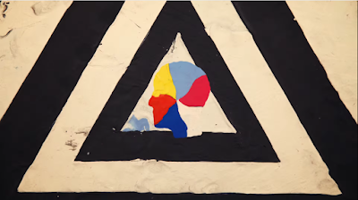
The animation for this video is impressive, as it is very fast and often syncs with the beat of the song. It seems to be made out of plasticine or a similar material, zooming in and out of symbols and rapidly changing from one colour to the next.

It is hard to work out what the concept is, or if there is one at all. The imagery is constantly changing between different themes that don't seem to be related.

That being said, the outcome really suits their upbeat music and the psychedelic style.


Wes Wilson's 'psychedelic' design

Wes Wilson is an artist who is known for designing psychedelic posters, which I came across while searching for psychedelic art. 


The vivid colours and trippy imagery and type certainly remind me of Tame Impala's often recurring style.


From this research I have gotten some ideas based on colour and abstract imagery. I want to capture the essence of the song and of Tame Impala, and I might take inspiration from the video to create something true to them.

Past successful submissions

These two designs particularly caught my eye, as they are quite abstract and vivid in colour. Neither of them have any obvious connotations that clearly show which song, this gives an extra air of secrecy. However, I think it is particularly powerful to use a feature that relates strongly to the song or artist.


These designs are not digital, they are physical pieces that have been made by hand, quite creatively. This has fuelled my desire to create something physical this year: I have not made it into the final designs the last two years, and I think making something quite unique will give me more of a chance third time round.

Tuesday, 19 January 2016

Competition Brief // Secret 7"

Brief
Create a sleeve design that symbolises the song 'The Less I Know The Better' by Tame Impala.
If the design is chosen to be in the exhibition, it will be up for sale.
Be as creative and unique as possible; they are looking for something that stands out and shows true skill and creativity.

Concentrate your design on what will be the front, only this will be visible in the exhibition.

Mandatory Requirements
  • Your design must not include the artist’s name or the song title.
  • Dimensions should be 184mm x 184mm, with a 3mm bleed all the way around. That’s 190mm x 190mm in total.
  • Your file must be produced in CMYK so it’s set-up to be printed. Any PMS specials will be converted. Metallic or fluorescent inks cannot be reproduced
  • Your file must be 300dpi
  • Your file must be saved as either a Tiff, JPEG or PDF
  • You must have until 23:59 GMT on 2 March 2016 to upload your designs. Late submission will not be accepted. We advise that you don’t wait till the last few minutes to upload, as the site will be busy
Deliverables
  • A 184mm x 184mm record sleeve cover, physical or digital.
  • Accompanying design boards and blogposts.


It is that time of year again: Secret 7" is calling for record sleeve submissions from a choice of 7 songs.


Why have I chosen this brief?
  • I've always really enjoyed Secret 7". My designs have never been chosen so I am more determined than ever this year as I feel a lot more confident about my work.
  • It's really open and lets me be creative and think outside the box. I have just finished Context of Practice, so I need something to get my creative juices flowing once again.
  • Interpreting the music in my own individual way lets me think deeply about what I am designing.
  • If I get chosen, then my work will be out there and I will get exposure.

Thursday, 17 December 2015

Cocktails & Wines // Over.

The last correspondence I had with Sam was around a month ago - saying that he was going to mull it over. With hearing nothing since then, I have come to the conclusion that I am no longer needed.

Even though the brief didn't get very far at all, the communication has been very helpful and an insight into the working world for me. I have learnt a lot about how to effectively email back and forth about a project.