Monday, 17 February 2014

Studio Brief 1: Final Secret 7" Designs


 Above are my 5 final designs for Secret 7". I have submitted them all to the competition:


I am hoping that at least one will be accepted, but I'm not getting my hopes up.


Larger versions of the designs:


Saturday, 15 February 2014

Studio Brief 1: Flamingo design


For my flamingo design I started off by painting a bird from various photographs I found on the internet. I then scanned in my chosen painting and cleaned up the legs a little bit.


I added realistic looking feet onto the flamingos legs by tracing images and using parts of the legs to fill in the colour.


I then cleaned up the edges of the bird to make it neater.

My design for the interim crit:


I altered the colours for the design to make the flamingo more pink than orange, and I added a black border around the edge.


Development after interim crit

From the crit I learnt that a lot of flamingos have been submitted so far to Secret 7", so I need to work on making my flamingo unique which it isn't at the moment (see above).
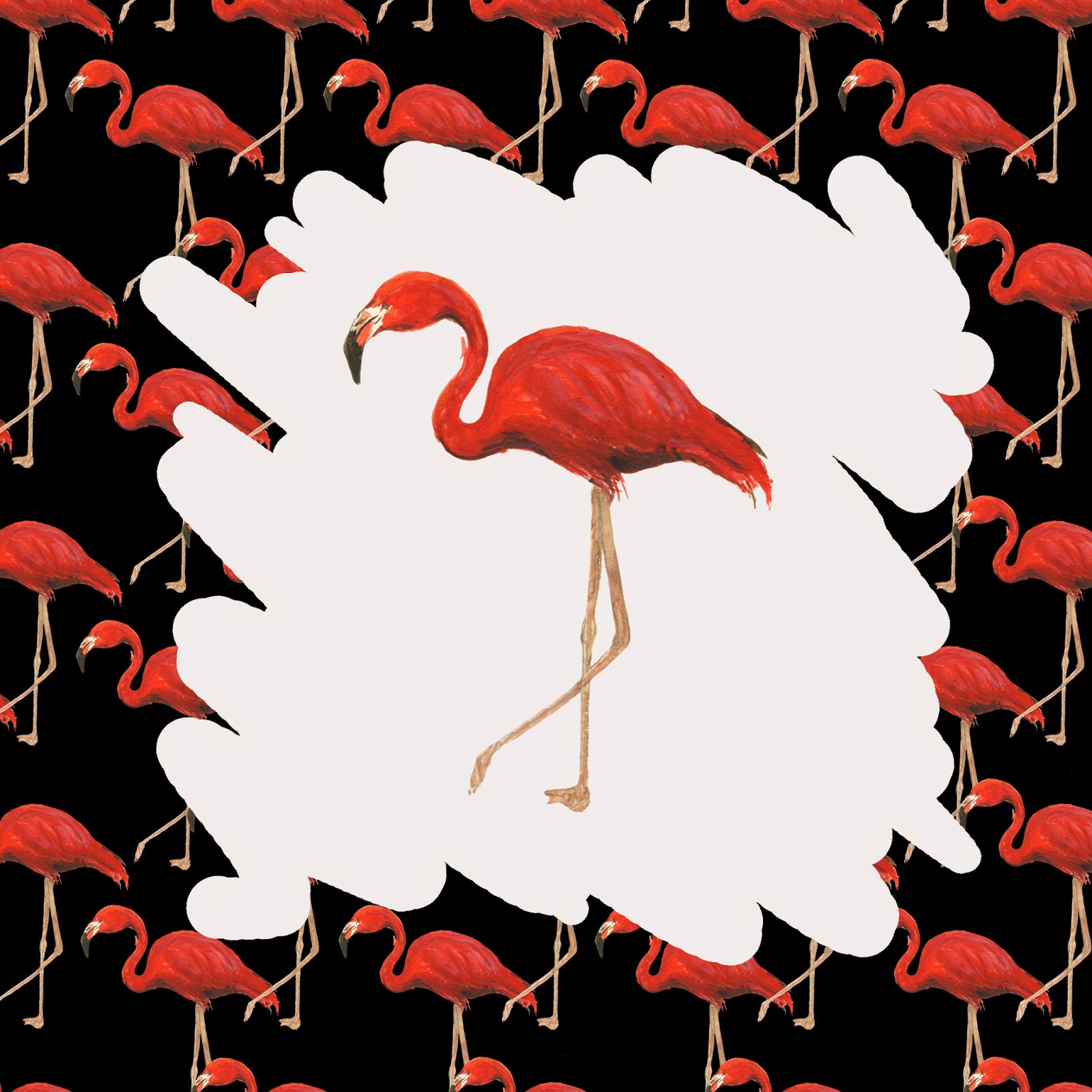
Below is some experimentation I did when trying to figure out the composition. I have thought of making a pattern from the flamingos.


Above are some extra paintings I did, that I haven't worked on much. I like the simplicity but I wasn't sure I could make them stand out so I haven't developed them.


This is my final design. I have added the eye in the corner which is taken from my eye pattern design, because I like the flamingo pattern but it needed another feature. The eye is fitting because it adds a small glimpse of the glamour I was trying to portray with my eye designs. It also works as my signature or trademark as I often draw eyes similar to this.
I decided to duplicate the flamingo in further reference to the lyric "Just like flamingos look the same"; they all look identical and there are many of them.
I have struggled with making the flamingo unique to me, but I feel this design is bold and bright and speaks for Roxy Music well. I am hoping that the Secret 7" judges agree.

I think if I had more time to work on it, I would develop the other flamingo paintings, to see what I could do with them. I think that this design could be a bit much for some people as the flamingos are very bright and the pattern could be seen as quite cluttered.

Thursday, 13 February 2014

Studio Brief 1: Sinking design

"Throw me a line, I'm sinking fast" is the lyric that inspires this design. I want it to look like someone is struggling who is sinking in the water.
I've started off by drawing an illustration of a hand, for which I am using a few different sources such as photos and my own hand. I've drawn it in the position of reaching for something.


Next I want to try to make an illustration of water for the background, as seen below. I've used a photograph from the internet to see if it'll work and I have found it too difficult, as it has ended up just looking like messy squiggles that don't resemble anything.


Since the drawing of the water has failed, I've decided to find a photograph I took last year of water in a swimming pool that could be quite fitting. Below is my development of this and different variations I've tried out.


Here I have made the water only show through on the fingernails which makes an interesting effect.


I altered the colours using brightness/contrast, hue and saturation and levels etc on photoshop. The blue of the water was too vivid so I have dumbed it down a little.

My design for the interim crit:


I like the vividness of this design, and I feel that the colours are a nice mixture of neon and subtle. The only thing I have found is that some people can't tell that it is water, which ruins the effect of the cover design. I don't feel this is my strongest design so I'm not developing it further, however I think I will still submit it to Secret 7", because why not.

Studio Brief 1: Eye pattern design


This is my second design, which goes hand in hand with my other eye design as it has the same concept of subtle glamour. I like the playfulness of this design, and the simplicity. I'm hoping the different styles of the eyes makes for a captivating design when I submit it to Secret 7". A few people in the interim crit said that it was the strongest, however I am not going to develop it further.

Studio Brief 1: Neon lights design

For my fourth design, I want to incorporate neon lights into it because of my previously stated initial idea that comes from fairground rides. This links to the lyric "Take me on a roller coaster", which portrays excitement and seems to be a metaphor for taking the band on an exciting journey into the music industry.
For this, I thought of taking photographs of some lights that are dotted around my college. I'm pretty pleased with how these photographs turned out as I wasn't definitely going to use them as a design on their own, but now I'm happy with the dark pink photographs as opposed to the lighter ones. I think they portray Roxy Music quite well, and emit excitement that is prominent in 'Virginia Plain'.


I chose my favourite photo and cut it down to the record size, and played around with the levels and saturation, etc to get the best balance of colours.


I cut out the pink light and played around with simplifying the design, but I prefer the original photo.


I also learnt from internet tutorials how to make a neon light effect on photoshop with the paintbrush tool, which looks quite effective, but I gave up on this idea and thought it best to stick with the photograph.

My design for the interim crit:


I will not be developing this design further, but I will still submit it to the competition. From the interim crit I saw that no one mentioned this design, which made me think it probably came across as a filler or quite boring. This put me off developing it, but I really like it myself as a photograph. Maybe it doesn't work as a record sleeve as it isn't very clear in it's communication.