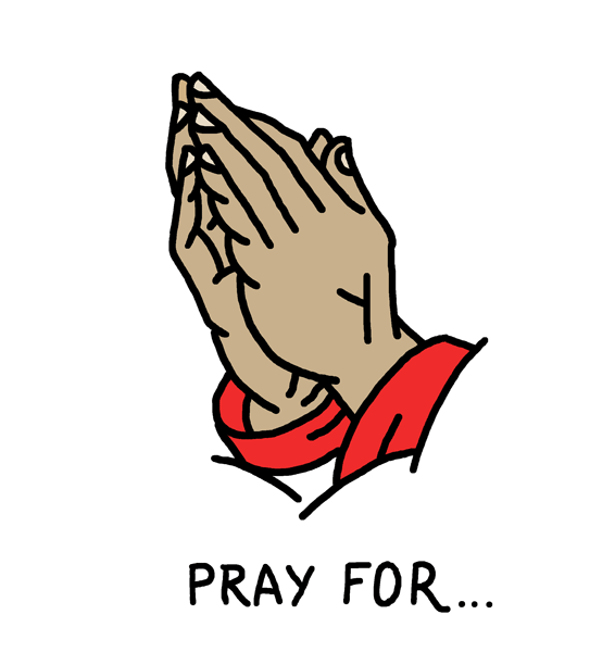
Overcoming the Monster
We revisited this brief and talked through our ideas again while sketching things out.

I said that a cloud doesn't look dissimilar from a brain, and touching on that could really make the animation effective. It could turn into a cloud to represent the bad vibes that it passes on to the heart, and to touch on the weather element by raining down.
Tamar discussed with me how the heart could be giving off rays of distress or radiance, just something to communicate the emotions.

We talked through how plants could grow, and that could tie into the weather - when the weather is bad, the plants are ruined. When the weather gets better, the plants thrive and grow.

We went back and forth between the order of the weather and if there were too many stages -
Rain > plants grow in the heart
Heavy rain > heart gets flooded
Sun comes out > flood dries up, plants start to grow again
Sun gets too hot > plants die
A healthy balance of rain and sunshine > plants grow back and they engulf the brain, which overcomes the monster.
We kept touching on the fact that we don't have very long to get the message across, but we also are very aware that overcoming a monster means that it is not easy, and there has to be a battle. We also don't want to create some kind of story that is saying that overcoming depression is simple.
A thought on the side I had:
One little plant could survive and it could be something recurring through all the stories to band them together.
Storyboard

The final sequence that we came up with. We are a little aware that we may have to shorten some parts or get rid of them so that it fits into the time frame, but we want to at least try it.
Tragedy

We did a bit of brainstorming for 'tragedy', as we gave up on 'rags to riches' as it seemed too complicated to produce. We seemed to be thinking in too literal terms, meaning we haven't come up with anything interesting. We talked about natural disasters, which just seemed to generic and impersonal unlike our other stories.
We discussed doing comedy instead of tragedy - Tamar said there is pressure to be funny but I disagree. I think that making something really personal that is humorous would be easier than tragedy.
Rebirth
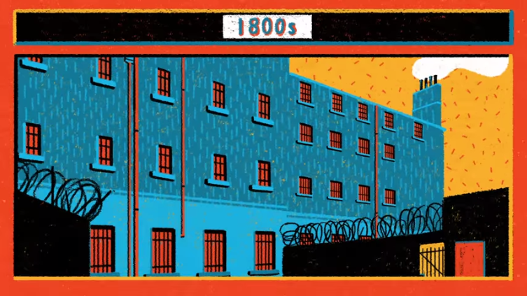
We started to properly talk about how the animation will look. As we want to go with a sketchy naive style, I have the fear of it looking too messy. We are a little unsure on how to draw the buildings.


Next we drew out the jacket - specifically, Tamar did as I liked how she drew the figure previously. I scanned in one that we liked and tweaked it a little. We then printed out copies to draw the pattern onto, but realised it would be easier to do blocks of patterns and lay the jacket on top of them in illustrator.


I showed Tamar the legs that I created to animate the character walking, and we agreed that they could look a lot better. We printed them off and Tamar tried out drawing them in a more stylised way.

We agreed that they could work.