The last correspondence I had with Sam was around a month ago - saying that he was going to mull it over. With hearing nothing since then, I have come to the conclusion that I am no longer needed.
Even though the brief didn't get very far at all, the communication has been very helpful and an insight into the working world for me. I have learnt a lot about how to effectively email back and forth about a project.
Thursday, 17 December 2015
Saturday, 7 November 2015
LCA Christmas Card // Final design and evaluation


In the final design, the combination of hand rendered type and painted illustrations create a lighthearted and upbeat aesthetic. The illustrations show figures creating and placing different festive objects; this is to communicate to alumni the art and design talent of students at Leeds College of Art. The type is in a playful, personalised style to create a friendly and warm feel, as it is a lighthearted greetings card.
The back of the card is simply the college logo, as a more serious and legitimate reminder of who we are and what we do.
Evaluation
Overall the design clearly communicates the festivity of Christmas, as the features such as mistletoe are widely associated with the holiday. As my design did not get chosen for the final card, it is possible that it does not appeal to the target audience as strongly as it could. This could be because doesn't completely polished and professional. I could have created something more original such as putting thought into the packaging of it, instead of it just being a double sided card.
LCA Christmas card // development
From what I previously scanned in, I have arranged the illustrations with some of the typography in photoshop.

I have cleaned up the drawings, such as making the lines neater and I replaced the christmas pudding with another better drawing.
In terms of colour, I have made the text red as it is a colour commonly known as festive. It's a deep red, which is quite warm and cosy, which is appropriate to create a mood of festivity.


For the background colour, I immediately tried shades of green, as it is very commonly paired with red in the context of Christmas. However, I really don't think it is effective - it looks too harsh and bright, and also very stereotypically festive - which it doesn't need to be and maybe that would be off-putting to look at.

Blue seems to work better, as it is quite muted, so the red type stands out more. More attention can be paid to the illustrations.

Next, online I found a textured effect which I added to the design, which gives it a warmer, less digital feel. This also made me think that it could be printed on coloured paper that would have a similar effect in its rough aesthetic.


I made the festive objects white so that the illustrations are clearer - now it is easier to see what exactly is happening. It also makes the design a little brighter, as the illustrations in all black seemed very dull.

I tried out some of the other type I created to see how it would look. Its a little too messy and childish looking. The other type is more exciting and friendly as the capital letters make more of an impact.


I added snowflakes, as there seemed to be some empty space. The white dots add even more of a festive feel, but subtly.
Wednesday, 4 November 2015
LCA Christmas card // Research and ideas
Last year two third year graphic design students were chosen for their card design.

Their design is pretty impressive, as the focus is more on the packaging rather than the design of the card itself. It is packaged like a present, which is very much appropriate. The illustration for the front of the card is quite underwhelming and a very childlike - it doesn't seem to represent the college in all its diversity and creativity. However, the cracker package it comes in makes it very strong overall.
I am feeling quite overwhelmed by my dissertation, so I do not want to give myself too much to complete. As I want to expand my illustration skills, I want to create a one sided card with a simple, festive illustration on the front.
I need to create something that reflects how much talent and creativity LCA has, without symbolising our course's skills in particular.
It also needs to be festive. So the important thing to research here is Christmas symbolism.
In the brief it stated that these key words need to be considered:
Christmas, friendly, creative, vibrant, specialist, independent, unique, innovative, quality, and contemporary.
What do we associate with Christmas?
- Santa Claus
- christmas crackers
- party hats
- mistletoe
- holly and ivy
- presents
- snow, snowmen, frost
- christmas trees
- christmas pudding
- reindeer
I started sketching from these symbols to get the ball rolling.

It occurred to me that a drawing of a building with lots of windows could give a lighthearted insight into the practices of the students. It is a cosy way of showing creatives at work. But this could possibly lack a clear festive feel.

I have thought of making the building into a subtle christmas tree shape, to make it more festive.

Another idea is to have 'students' creating the christmas symbols on the card, to connote our skills in creating things. I definitely want to embody what we do and to remind the receiver that we're here and we're talented.


The illustration in which I used colour was a little too unruly and messy. I prefer the black outlines, which I may or may not digitally edit. The naivety of the style is friendly and personal, giving a lighthearted feel - something important when it's Christmas.


I have begun creating a hand rendered typeface to use with the illustrations, as it fits in with the aesthetic well. I've tried out different styles to figure out which is best and which suits the tone of voice, which needs to be friendly and informative. I've concluded that the letters at the bottom of the first image work the best - the way that they are mismatched gives character and warmth - the other styles seemed a little too harsh or messy.
LCA Christmas Card // Christmas illustration and card research


These designs are all very typical, but they successfully communicate festivity. I want to create something that has a similar friendly, warm feel, but also reflects the theme of the college - art and design.
Tuesday, 3 November 2015
Competition Brief // Leeds College of Art Christmas Card
Brief
To design and make 75 Leeds College of Art Christmas Cards to be mailed out to key College contacts.
Purpose
Leeds College of Art works with a variety of businesses including governors, community groups, artists, suppliers, creative businesses etc. As a seasonal gesture of appreciation and thanks, staff here at the College would like to post a Christmas card to those that we work with.
Mandatory Requirements
The card must have a crafted feel, but look professional and artistic. You will be responsible for the production of the cards. The final cards must fit inside an A5 envelope.
Content
‘Merry Christmas and Happy New Year from Leeds College of Art’
Tone of Voice
• A friendly and informative tone of voice should be used.
• It should be professional, considered, and innovative whilst portraying the College as a leader in art, design, media and communications education.
Concept/Ideas
Please consider and reflect these words in your concepts and ideas:This brief caught my eye as it is fun, is a good opportunity to use my illustrative style, and really gives me a platform to get creative. I have never done Christmas-themed design before, so it should be an interesting and new experience.
Christmas, friendly, creative, vibrant, specialist, independent, unique, innovative, quality, and contemporary.
Saturday, 24 October 2015
Cocktails & Wines // Emails
Following on from my email to Sam about brand guidelines etc, he emailed back.


This information has helped a lot, and its clear that he doesn't have
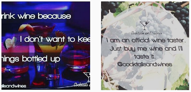
any specific ideas and needs a lot of ideas generated for him. The images he referred to in the email:

I'm not sure what he means by each number meaning something different: each number is a logo or just a label on a product? This is uninspiring to me.
Logos like these are very effective and memorable. although it can be very difficult and a long process to come up with them.
One thing that has stuck out to me is the dullness of the name 'Cocktails and Wines'... so I brought it up.

I mentioned how the name isn't memorable or original enough: I wouldn't want to fully design something that may be unsuccessful or changed down the line. It also wouldn't look too great in my portfolio!

Asking for any similar brands means that I can see the kind of thing that needs to be created, or figure out how to stand out from these companies.

It seems now that the idea of the brand has changed to focus on bartending weddings.

This link has given me a better idea of what he is going for: sleek and sophisticated bar equipment.


Tuesday, 13 October 2015
Live brief // Cocktails & Wines
Live brief
For one of my live briefs I have offered to rebrand a new business that Sam, a friend of mine is starting up. I met him at my part-time job, which he has now left to pursue this brand alongside his degree.

The logo doesn't even fit in the circular icon space, and the martini glass isn't even centred. Not to mention the images with overlaying text are pixellated and the worst things I've ever seen.

From this I've realised that he needs a lot of guidance for how branding and logo design works, as I am in need of a lot more information and specific details... eg brand guidelines.
I emailed back:
I used my own branding knowledge and some research on the internet to inform this email, which I sent so that I can get enough information to start designing.
30 minutes have been spent so far - I am trying to record how long I spend on this as he says he can hopefully pay me for my time (one day).
For one of my live briefs I have offered to rebrand a new business that Sam, a friend of mine is starting up. I met him at my part-time job, which he has now left to pursue this brand alongside his degree.
Cocktails and Wines - an educational service which provides invaluable information into the world of alcohol through a series of videos and tutorials.
When I first saw the logo and the posts on the instagram page, I instantly offered to help as the designs are atrocious. (This is because on the internet he had sourced very low paid graphic designers in the Philippines to design his content.)


The logo doesn't even fit in the circular icon space, and the martini glass isn't even centred. Not to mention the images with overlaying text are pixellated and the worst things I've ever seen.
I was sent an email with a document detailing the company.
Business Overview
Cocktails and Wines is an educational service which provides invaluable information into the world of alcohol through a series of videos and tutorials. As alcohol is and continues to be a big problem in the UK with over 9 million people drinking over the recommended daily limit and almost 7,000 alcohol related deaths in 2012 alone. Through a series of educational videos on wine and tutorials on alcohol, cocktails and wines aims to at least reach those people who we would have otherwise not been able to reach.Research shows that an estimated 7.5 million people are unaware the damage their drinking is causing which might be due to the fact that alcohol is 61% more affordable than it was in the 1980's, we aim to raise more awareness through a fun and engaging way.The service we provide is information about alcohol by teaching our customers how to make cocktails and a deeper understanding on the subject of wine. The products we sell is our own branded cocktail and bar equipments which we use in these video productions, with the definite goal of breaking into the bar equipment supply industry.The videos will be released weekly on our website and linked to our different social media accounts and the products, as well as being sold on our website, will be sold on Amazon and on Ebay.Distribution will be handled by fulfilment by Amazon (FBA). FBA makes it possible to ship your inventory to the amazon fulfilment centres and for a small fee, they handle all our distribution needs including those not made on the amazon selling platform. This we will give us more time to focus on growing the company.The ultimate goal is to become the number one supplier of cocktail and bar equipments in the UK but first we need to develop our online presence.In a years time we will be trading with bars and restaurants around the UK. In three years we aim to become the supplier of bar equipments for majority of the bars in Yorkshire. In 5 years, we aim to be supplying bar equipments to majority of the bars in the UK.The way the industry is now is that most of my competition either focus just on cocktail masterclasses or on bar equipment supply. This business merges these two parts of the industry and offers it at a better value than is possible by just focusing on one.The cocktails and wine videos will be free and published on our different social media accounts to raise awareness and at the same time build reputation through branding; something none of my competition is doing at the moment.Products and ServicesCocktails and Wines offer both service and product. This service we offer is unlimited free information into the world of wines, tutorials on how to make different types of cocktails and a free eBook to accompany it when any customer signs up. The product we offer come in two categories called the tripwire and the core sale which is described below. And after 6 months of building our reputation in the bar equipment supply industry, we will market our products to bars and restaurants around the UK.The Tripwire - Cocktail Box 1. The contents of the first cocktail box (of which the box will be carefully manufactured to suit the contents on the box) include:• Company Branded Cocktail Shaker• 2 Sided-Jigger• Free PourerThe Core Sale - Cocktail Box 2. The contents of the second cocktail box (of which the box will be carefully manufactured to suit the contents on the box) include:• Company Branded Cocktail Shaker• A Boston Glass with measuring scales in mL• A Customised Branded Boston Tin• 2 Sided-Jigger• Bar Spoon• Hawthorne Strainer• Muddler• Free Pourer

-Dear SophieThis is the direction i want to take the company so you have a better understanding on how you will go about designing the logo.Everything we are doing now is a means to raise awareness of the brand. We intend to start suppling cocktail and bar equipments to bars and restaurants across the UK.Please let me know if there is anything else you need from me.ThanksSam
From this I've realised that he needs a lot of guidance for how branding and logo design works, as I am in need of a lot more information and specific details... eg brand guidelines.
I emailed back:
Hey,-
Yup, got it pretty clearly. Few questions and clarifications.
I see that you've completely changed from wanting to bar tend at parties to wanting to sell bar tending products, correct? Why's that? I'm guessing it's because you've talked to an accountant and the raffle method wasn't feasible.
Primary target audience?Apart from the obvious audience of people interested in cocktails and alcohol, is there a certain demographic you want to attract? (Age range, location, income... etc) It could be that you want to appeal to everyone, but a little more information in this area would be v. helpful.
Unique selling pointI gather from the overview that your unique selling point that differentiates you from competitors is the use of social media, and the merging of both tutorials and the selling of bar equipment.
Problem solvingYour business solves the problem of people not having proper knowledge on how to make cocktails. But I'm confused about your mention of alcohol related dangers, are you going to include this in your tutorials? How? Does that not go against what you're trying to market? I think this could be executed but in a playful way, as a reminder for customers to be careful. (Or is this a legal thing, like you need to include warnings?)
What keywords best describe how you would like your business to be portrayed?For example - traditional, corporate, professional, established, affordable, edgy, modern, stylish, fun, creative, trust, loyalty...
What's not working about your current brand/logo?I think the current logo and your social media posts are very basic and look very cheaply designed (I know, you know this too). Could you explain more if you feel you need to add to this?
Specifications
- Any specific elements you would like to see incorporated in your logo? (Icons, symbols, imagery, characters etc)
- Do you have a tag line or slogan that needs to be included? (there doesn't need to be)
- Any colour preferences or brand colours which must be adhered to? (we need to work on creating brand guidelines)
- Any restrictions on the design that I need to be aware of?
- Could you provide 5 businesses or logos that you like or feel work well if you can? Maybe some that you have been inspired by, or feel are successful and you like how they portray themselves. (why?)
- Where will the logo primarily be used and in which mediums? (Printed materials, website, social media, merchandise etc)
- In any of these mediums, what are the restrictions?
So yeah, basically I need guidance, and I need you to outline any ideas you may have. If parts of above you can't answer fully, then ask for my input and I can give suggestions, before I move on to designing.
THANKS!
I used my own branding knowledge and some research on the internet to inform this email, which I sent so that I can get enough information to start designing.
30 minutes have been spent so far - I am trying to record how long I spend on this as he says he can hopefully pay me for my time (one day).
Wednesday, 7 October 2015
Collaboration // Sophie + Tamar
Developing ideas
After further discussion, we have decided to focus on developing the idea of an illustrative, plant based publication.
Directions we could go in:
Plant and health research
From the information I have found on how plants are healthy, I discussed with Tamar that for our content we need to narrow it down to the health benefits of plants in the workplace, as there are a lot of pros in the areas of environment/urban/schools.
I came across a lot of websites that provide information but don't back it up, or it seems to be to help them sell a certain product. The website below seems trusted and there are listed sources for the information, that mostly comes from scientific studies.
After further discussion, we have decided to focus on developing the idea of an illustrative, plant based publication.
Directions we could go in:
- represent a small plant business, or market sellers
- health and creative benefits
- psychological
- pollution
As something that is relevant to us both in our fields, we feel that creating something based on the health and creative benefits of plants would be interesting and light-hearted, while being informative.
It also occurred to me that our Level 6 studio is very bare and just plain white... This could be an interesting factor in this project.
Plant and health research
We decided between us that I would plan out the publication and find the content and do some research into the subject.
From the information I have found on how plants are healthy, I discussed with Tamar that for our content we need to narrow it down to the health benefits of plants in the workplace, as there are a lot of pros in the areas of environment/urban/schools.
I came across a lot of websites that provide information but don't back it up, or it seems to be to help them sell a certain product. The website below seems trusted and there are listed sources for the information, that mostly comes from scientific studies.
http://ellisonchair.tamu.edu/health-and-well-being-benefits-of-plants/#.Vi0TJrTtmkp
A summary of the relevant points explained:
http://workdesign.com/2012/07/the-benefits-of-plants-in-the-workplace/
This article included some interesting information, including:
This is quite an astonishing find, as the percentages clearly prove how plants really do make a difference. However, only 60 office workers were monitored, which doesn't seem like enough.
http://www.ngia.com.au/Attachment?Action=Download&Attachment_id=1430
I have found some interesting statistics that prove various ways in which plants can benefit us when we are working.
A summary of the relevant points explained:
Concentration and MemoryFlowers Generate HappinessHealth and RecreationAccelerates Healing ProcessImproves Relationships/CompassionImproved Human Performance/EnergyLearningMedicinal PropertiesMental HealthReduce StressAnother website with sources:
http://workdesign.com/2012/07/the-benefits-of-plants-in-the-workplace/
This article included some interesting information, including:
The analysis compared symptoms when plants were present and when they were absent. The results showed that:
- Neuropsychological symptoms were reduced by 23% when plants were present. Fatigue reduced the most – by 30%
- Mucous membrane symptoms were reduced by 24% overall when plants were present. Cough decreased by 37% and dry throat by 25%
- Dry or flushed skin was reduced by 23% with plants in the workspace
This is quite an astonishing find, as the percentages clearly prove how plants really do make a difference. However, only 60 office workers were monitored, which doesn't seem like enough.
http://www.ngia.com.au/Attachment?Action=Download&Attachment_id=1430
New University of Technology Sydney (UTS) research made possible by nursery levy voluntary contribution funding has found strong evidence supporting the benefits of office plants for reducing stress and negative mood states in office workers. Plants were found to promote wellbeing, and therefore, potentially performance. Staff who had plants placed in their offices showed reductions in stress levels and negative feelings of a magnitude of 30 to 60%, while those with no plants recorded increases in stress and negativity of 20 to 40%, over the 3-month test period. Importantly, just one office plant was enough to make all the difference.http://www.cardiff.ac.uk/news/view/47147-flower-power
Marlon Nieuwenhuis added: "Simply enriching a previously Spartan space with plants served to increase productivity by 15% - a figure that aligns closely with findings in previously conducted laboratory studies. This conclusion is at odds with the present economic and political zeitgeist as well as with modern 'lean' management techniques, yet it nevertheless identifies a pathway to a more enjoyable, more comfortable and a more profitable form of office-based working."Research overview
I have found some interesting statistics that prove various ways in which plants can benefit us when we are working.
Content plan
From the research I have conducted, I have narrowed it down to certain areas to focus a double page on each:
From the research I have conducted, I have narrowed it down to certain areas to focus a double page on each:
- Introduction into plants and the benefits
- stress reduction
- improve air quality
- lower background noise
- improve concentration and memory
- flowers generate happiness
- improves compassion
- increases energy
- increases creativity
Thursday, 24 September 2015
Collaboration // Sophie + Tamar
Collaborate with someone outside of the programme
For this brief, I have decided to work with someone I know from the printed textiles course, Tamar Attia.
Why did I choose her to collaborate with?


Her work comes in different forms, such as collage, felt material, monoprints, linoprints. One thing I haven't done enough is experiment with different mediums... I think this will be a good learning curve for me and a way to venture into new materials.
As soon as I asked Tamar if she would be interested, she immediately said she would love to, even though she doesn't need to do it for any of her modules. Enthusiasm is key!
Initial ideas and discussion
We met a couple of days later and had a discussion about what direction we could go in. I explained that I'd like to make one of two options:
We agreed that one of these ideas would be better for a collab than rebranding.
Revision
Plants
For this brief, I have decided to work with someone I know from the printed textiles course, Tamar Attia.
Why did I choose her to collaborate with?
- an enthusiastic person not afraid to share ideas, and excited to try new things
- her work is very expressive and vibrant, thus I think our styles would complement each other
- working with patterns would be really interesting, as that isn't something I've done a lot.
- I really like her designs!
A preview of Tamar's previous surface patterns:


Her work comes in different forms, such as collage, felt material, monoprints, linoprints. One thing I haven't done enough is experiment with different mediums... I think this will be a good learning curve for me and a way to venture into new materials.
As soon as I asked Tamar if she would be interested, she immediately said she would love to, even though she doesn't need to do it for any of her modules. Enthusiasm is key!
Initial ideas and discussion
We met a couple of days later and had a discussion about what direction we could go in. I explained that I'd like to make one of two options:
- branding
- publication
From this Tamar said that she would be interested in rebranding, as it's new to her and it would be a clear brief as it would be a preexisting brand. But after some discussion about concepts, we were leaning more towards campaigns and ideas of informing:
- plants - how to look after indoor potted plants, as this is something people struggle and fail with.
- fun revision books for young students, as a way to engage them with visual learning material
- science simplified - for adults who are curious about how the world works, but can't remember much of what they were taught in school.
- childrens book - use illustration and fun layouts to entertain young children.
- raising awareness of dyslexia and other learning difficulties, or creating material for young people struggling with them.
We agreed that one of these ideas would be better for a collab than rebranding.
Revision
- we discussed this idea further and tried to grasp an idea of what content would be needed by visiting the BBC bitesize website.
- We then decided that it would be difficult to create a small publication as there needs to be a lot of information for school subject revision... our budget wouldn't cover it and we would be out of our depth with so much to process.
Plants
- This started off as a very basic idea: but we got immediately inspired by the many plants I have dotted around my bedroom, and I brought up how they are proven to increase health and workflow in various ways.
- From this we thought: create a small book or publication that informs the reader about the benefits of being surrounded by plants, as I'm sure that a lot of people won't be aware of them.
- This would be in the hopes of improving people's office spaces and work performances... while keeping them healthy. We would also include the initial idea of showing people how to look after various different types of plants.
- An added note: Tamar uses a lot of leaves and plant-like shapes in her work, so this seems well suited to her style.
Thursday, 21 May 2015
OUGD505 // Evaluation
This module has taught me so much about research, and I have learnt how to effectively explore a subject in order to create fully informed graphic design to make a change. My time management was note quite as organised as my previous modules, as it was the last one of the year, meaning that I left a lot of the practical side until it was very late.
Studio Brief 01
By exploring films and theories about female characters, I realised that it is a much more complicated subject than I thought. I also realised more than I ever have previously how much pop culture can affect young generations. It made me feel more passionate about the change that is needed. I think this definitely affected my motivation and made me more enthusiastic about my outcome... I really enjoyed every part of this brief.
However I definitely feel like I rushed the zine, which I felt super disappointed about as this subject was really interesting to me. I wasn't organised with my time and let my essay and the COP module get in the way a little bit. This was unfortunate but I have definitely learnt from this for third year. Saying that, I am happy with most of the zine, especially the stock and the simple, easy layout. I feel that the target audience was a well thought through process and the outcome is suiting to a young audience. A few people saw it before it was handed in and enjoyed flicking through it and looking at the pictures: success!
The illustrations came out mostly good, but I'm a perfectionist with any imagery I create and I definitely want to develop this work further over summer for my own benefit and portfolio, as I think it has more potential. For example, I would like to print off a high quality version that can be binded with coloured thread, and using more coloured inks in the prints. This would be a hypothetical 'publication' rather than just a low cost 'zine'.
Studio Brief 02
This brief was enjoyable as it was small, and I could attend to it with more of a laidback approach. Also, the exhibition element drove me to work harder on it than I may have.
I didn't spend that long on it compared to past projects so I felt uneasy putting it out there - but this taught me to get to the point with my designs and not think about decision making for too long... I can be indecisive about certain features.
As the other brief was much larger, I found that I focused less on this one, which is something that is natural. Some projects will be more important than others and balancing them in an appropriate manner is needed.
I think I could have done a little more research into the book contents than I have, as I took on the book name more than the content - however, I believe that successful design can work this way well too.
Women in Film // Stock and binding
After my first illustrations before I changed them and worked on them further, I printed out some rough examples on coloured paper as I was thinking of using it to brighten up the zine, rather than printing colour which is more expensive.

I also wanted to test out the composition, and this was partly what made me want to change the illustrations and abolish the hand rendered letters as it was looking too messy. Multi-coloured paper does look bright and inviting, but I found that it detracted a little too much from the info and images.
I have moved on to wanting to use light grey paper, as it adds an interesting element but isn't distracting.


I printed the front cover on silver GF Smith stock, using the normal studio printer (to fit in with the zine low budget). It surprisingly came out perfectly on the second try.

I would have loved to have done binding with thread but I ran out of time, so I stapled the booklet.
When folding it I made a crease in the paper, and the staple missed the fold, which affected the presentation of the zine. However, as these are supposed to be sold at a low price, things like this aren't too big of a deal.

Subscribe to:
Comments (Atom)