This module has expanded my knowledge and ability in many different areas, because of the freedom and the professionalism that was applied.
Collaboration was a huge turning point for me, in that I gradually improved on my communication skills and was able to speak my mind a lot more while listening to others. I learnt how to keep organised so that other people's time was not wasted, as well as my own. Working with another creative meant that both our strengths could come together to make something twice as strong as if I had worked on my own. I meant to collaborate more, but it was difficult to fit it in with people when our availability clashed. I could have benefitted even more and I hope to collaborate with more people very soon.
Live briefs taught me that compromise is very real in the industry, and that is something I have never had to think about in level 4 and 5. Having to take criticism and think about someone elses needs before your own is very important in creating something successful.
This year I have definitely tried my best in creating conceptual work, and all of my projects definitely have a deeper meaning. I learnt that creating work without a concept is actually very difficult and not something I can easily do as a designer.
I have learnt many new skills, such as Adobe After Effects, Adobe Animate/ Flash, and how to screen print and prepare a screen completely independently. These skills were very rewarding, and will definitely be vital in my future creative endeavours. I would have liked to have explored more traditional print processes, and I could have if I had organised my time better. Unfortunately these skills would have been even more useful if I had spent second year exploring them, so that I could have worked faster and more efficiently with them this year.
Time management was something I was definitely better with this year. The strict deadline of live briefs helped with this and also the knowledge that I had to complete a set number of briefs. Having a short placement also taught me how to juggle tasks and made me a lot more efficient. However, I found often that the time I had given myself to complete a task was not realistic, and I would often go over, resulting in other things getting pushed back. This seems to be me not realising the length of some projects before I start them as I tried a lot of new things.
My knowledge of typography improved this year and how to use it effectively in design; in the past I have had no interest in typefaces or working with type, but now I certainly see how strong it can look and how creatively it can be used. I also invested in some professional typefaces and broadened my database.
Things I could further improve on include my ability to ask for feedback and welcome criticism; I am very sensitive with showing people my work and lack confidence in what I create.
Monday, 23 May 2016
Zine // Collage
Anthony Gerace


.jpg)

.jpg)
.jpg)
.jpg)


.jpg)
.jpg)
Ben Branagan
http://www.itsnicethat.com/articles/ben-branagan-possible-disasters-210316
Ben Branagan likens his ongoing series of collages to sketches, a way to work through ideas in a quick, informal way. The series, he explains, is a sort of inversion of American artist Susan Hiller’s suggestion that “the act of cogitation is a form of collage.”
“Where as previously I might have separated out a certain type of image or ones sourced from a particular place, with this series I want to collect a more chaotic or fragmentary view of the world, a heap of parts that overlap and intermingle, drawn from a wide range of sources; contemporary magazines, old books, things I’ve found, things I’ve photographed myself,” he explains.
“A lot of the motivations for the images are formal: certain shapes and contours suggest themselves, then repeat, lurking and moving through to subsequent images.”


DR.ME
http://www.dr-me.com/


Thursday, 19 May 2016
Zine // Paint
Sawdust create a paint typeface as studio experiment
Sawdust, aka Rob Gonzalez and Jonathan Quainton, have just released the fruits of one of their recent studio projects, making a typeface from acrylic paint that uses folds and shadows to examine “dimensionality.”


Ryan Hopkinson and Andrew Stellitano’s Strokes celebrate the start of artistic endeavour
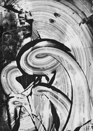
Their current project, Strokes, is a series of five images that seek to define a single paint stroke as a physical structure. “The project initially started with the discussion of painting and how/why specific works can be defined by movement, style or history,” says Ryan. “Our conversation progressed to the point where we thought about that first paint stroke and if you could define a piece of work from it.”
The strokes appear suspended in mid air, and it is difficult to discern the scale or the purpose of the movement of each. “Each stroke is completely unique and hand made, we tested a varying range of materials to find the most flexible and durable as we wanted to flex and skew each stroke at will,” says Ryan. “I think the hardest part was getting the texture looking correct. We needed to delicately apply each look to create a diverse range to sculpt and then shoot.”


http://www.richardsweeney.co.uk/drawings


http://www.itsnicethat.com/articles/mia-christopher


Their current project, Strokes, is a series of five images that seek to define a single paint stroke as a physical structure. “The project initially started with the discussion of painting and how/why specific works can be defined by movement, style or history,” says Ryan. “Our conversation progressed to the point where we thought about that first paint stroke and if you could define a piece of work from it.”
The strokes appear suspended in mid air, and it is difficult to discern the scale or the purpose of the movement of each. “Each stroke is completely unique and hand made, we tested a varying range of materials to find the most flexible and durable as we wanted to flex and skew each stroke at will,” says Ryan. “I think the hardest part was getting the texture looking correct. We needed to delicately apply each look to create a diverse range to sculpt and then shoot.”

http://www.itsnicethat.com/articles/kei-imazu-paintings


http://www.richardsweeney.co.uk/drawings


http://www.itsnicethat.com/articles/mia-christopher
Monday, 16 May 2016
Tamar Attia // Lookbook - development
I asked Tamar to take some clear photographs of her work, as this gives much more of a realistic insight into her designs - photographs show the texture, the way they drape. Even how they work together as a set. Using only scans would result in a very 2D vision of her work.
Below are her photographs she took of her work in her studio space.


We sorted through them together, whilst I picked out the best ones and advised her on which we should not use - some have bad lighting or have a lot of creases in the fabric. Also, the last couple of designs don't seem to fit in with the rest of the collection at all - the colours blue and brown together aren't used anywhere else. Tamar agreed with me on this and said I didn't have to use them.
She showed me her physical final fabrics that she will be submitting as this collection. It was great to see them all in person for the first time and get a feel for the textures and sizing - the patterns are all massive.


What I took from this is that the size of her designs should factor into the layout of the lookbook - such as a few full spreads of individual designs to show the size.


Subscribe to:
Comments (Atom)