Design a range of promotional posters for the Computerspiele museum in Berlin to attract visitors. Consider the history and nostalgia of the game consoles and how this can be fed into the modern world to create interest. Also consider how paper stock can be experimented with to acheive different moods.Background considerationsComputerspiele museum is a small museum showcasing the history of computer games, with a range of game consoles and interactive computers.There is not much promotional material for the museum, and the website is quite poorly designed.Mandatory requirementsThree A3 printed postersDeliverablesA range of stock usedA3 printed postersTimespan: 2 weeksFormat: Printed poster series
http://www.computerspielemuseum.de/1210_Home.htm

A few years ago I went to Computerspiele museum and found it an exciting experience, with lots to interact with.


These are some photos I took when I was there. The main selling point of it is that everyone can interact with all of the games and be fascinated by older technology.
Target audience
- children, as it is hands on with lots of games to play
- technology enthusiasts
- gamers
- people interested in history and culture
- create something that depicts the hands on feel to the museum, as that is it's main selling point.
- communicate the amount of old computer games there are, that date back decades, and that aren't accessible in normal settings anymore.
- create an air of excitement and abolish the grey colours and dreariness that may be associated with old computers and systems by using bright colour.
- approach it as somewhere similar to big main galleries and museums, as the content on their website currently seems very amateur.
I have looked at museum posters, to gain an insight into how type and imagery work together in a context of history and information, while still being entertaining.


These posters seem to mostly use just one image, along with very bold typography - the Science museum's font is incredibly suiting, although it is hard to explain why - but most people would see the connection between the letter style and the context.
The Science museum also uses a theme of exploring - the first two designs are inviting the viewer to touch and and interact, as the advent calendar and reaching out to touch are both very clear in their symbolism.
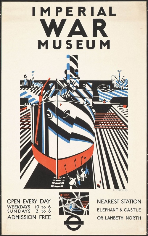


These posters each have vintage and retro styles, as they are advertising historical content. By using a style from a specific era in this way, it ignites a feeling of nostalgia and communicates the right information instantly, to the right target audience.
No comments:
Post a Comment