As the museum is based around the history of computer and video games, I want to have a retro feel to my posters, to fully communicate the interesting past of technology through using nostalgic design. I have sourced a lot of graphic design based around video games from the 1970s/80s/90s which has given me some vital insight.
http://www.itsnicethat.com/articles/80s-cereals
Art of the Arcade
artofthearcade.com
This is a really interesting website that has a large archive of old computer game graphic design. It has a wide array of posters and promotional materials from the 1970s and 80s.
| 1980s |
I have found a lot of Pong material, which was one of the first popular and well known computer games.
| 1979 |
| Various illustrations from Activision early packaging 1982 |
| 1980 |
| 1980s |
Noir Lac's picturesqure videogame imagery
http://noirlac.tumblr.com/
Nostalgia!
Sega Mega Drive/Gensis: Collected Works
http://www.itsnicethat.com/articles/sega-mega-drive-slash-genesis-collected-works
Now Darren (aka Wallzo) and his team are back with Sega Mega Drive/Genesis: Collected Works, which they describe as “the definitive retrospective of the console.” It includes original hardware plans, concept illustrations for many of the Mega Drive’s most iconic games and interviews with the developers who worked for Sega during its glory years.
The simplified imagery of the game technology in this book, in the form of line drawings, makes for an atmospheric depiction.
Here I have collected design that has an old, nostalgic feel to it, but is mostly not related to games or software.
Vault of VHS
vaultofvhs.com
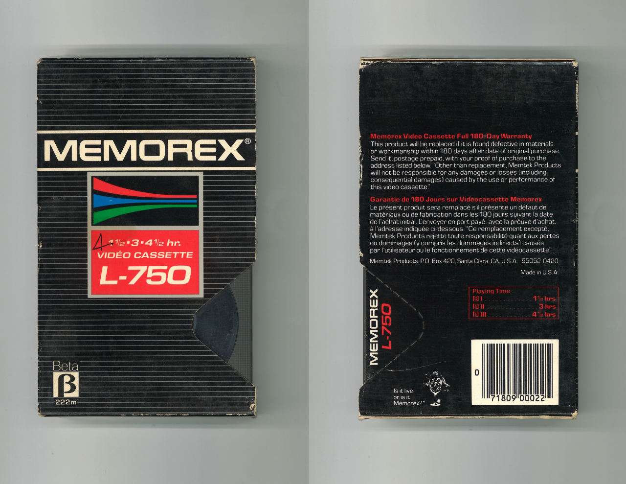
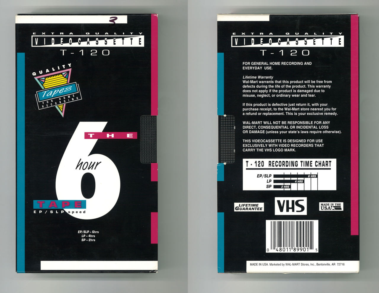
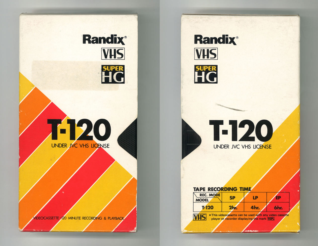
This set has a huge collection of old cassette packaging, which certainly incorporates quite old styled design in a similar way as video game designs.
Jaime Zuverza
http://www.zuverza.com/
http://acacio-ortas.tumblr.com/
These designs are inspired by 90s technology, and are certainly reminiscent of Windows 95. They are interesting in the nostalgic sense, but this aesthetic seems a little too risky, unless aimed at a very particular target audience.
David Rudnick
The restricted colours of these posters channels printing restrictios of the past quite instantly.
https://www.daftpunk.com/
Daft Punk's merchandise is a perfect example of recreating 80's graphic design, and it does so perfectly.
From all of this retro design research, there are a lot of clear trends and common ways that the era was communicated, that they are still prevalent today in symbolising times gone by.


No comments:
Post a Comment