Today I was at my placement at The Archipelago, where I discussed with them how I'm starting a lookbook for a printed textiles student. They do ongoing editorial work for artist Laura Slater, who works with textile patterns for furniture and wrapping paper.
The book is big, at A2 size, so that her physical designs on fabric can be included to size and be touched and felt. I find this unusual and really intriguing, as its much more personal and inviting.
The outside of the publication is made from very thick card, which has been embossed with her name in simple sans serif type. It is very subtle and creates a nice minimal design to contrast with her patterns to follow.
Included between some designs are paper inserts with text explaining the process and concept. These don't interfere with the fabric, by only covering half of a page.
Overall it is raw and textured, making it very inviting to touch and flick through. It gives the viewer a clear sense of how the patterns are in a realistic setting, without deterring from the fabric itself with heavy graphic design.
This is a smaller lookbook for the same artist a little later on in her career. In size it is a little bigger than A5, making it easy to flick through and hold. Printed on newspaper stock it is given a raw, earthy feel that greatly suits the crumbling warehouse feel to the photoshoots of her work inside.
The simple type has been carefully placed to not deter from the photograph on the cover, and with no extra details added it is very minimalist and suitable, as her designs are very colourful and speak for themselves.
The first page is simply text about the work with nothing to distract.
It is a very clear lookbook that is uncomplicated and pays respect to the work being presented.
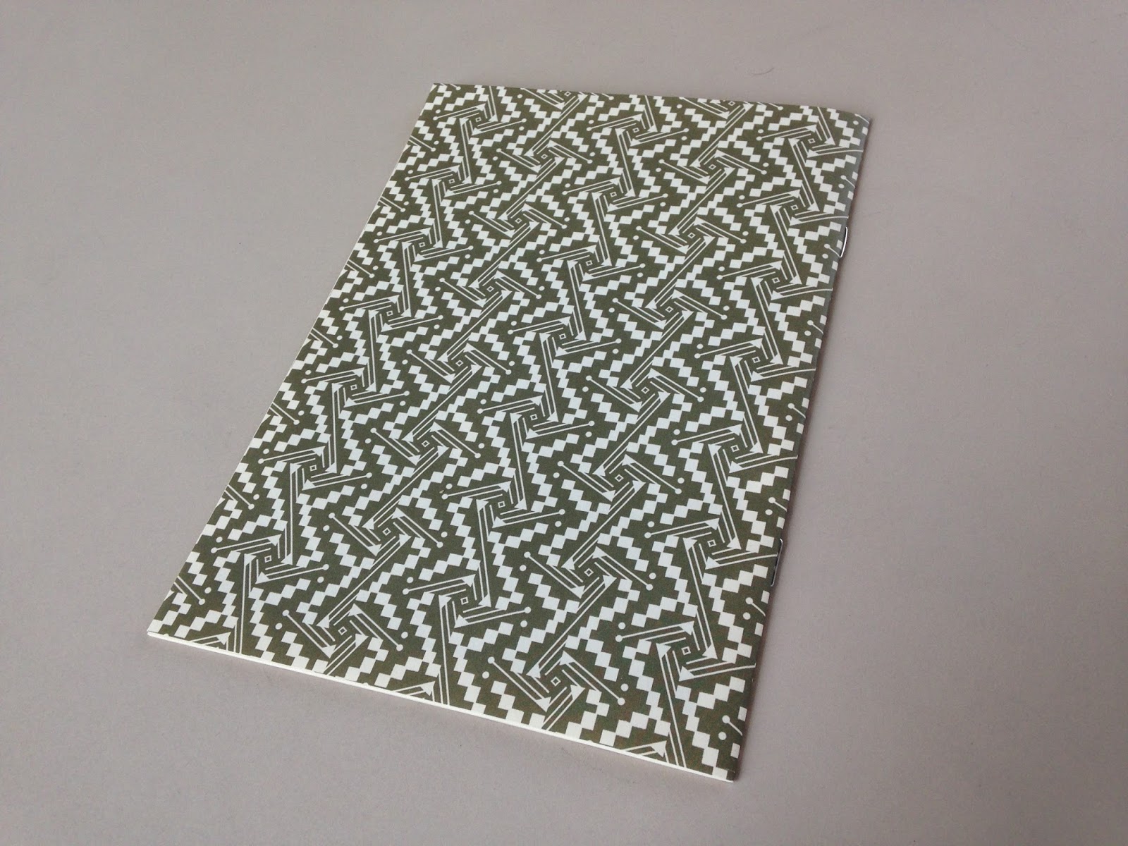
Another lookbook made for Laura Slater, in a very similar style.
This layout of the cushion designs mixes it up a bit and makes the booklet a bit more interesting. Dotted around the page they are spread out and well placed so that it is not too busy.
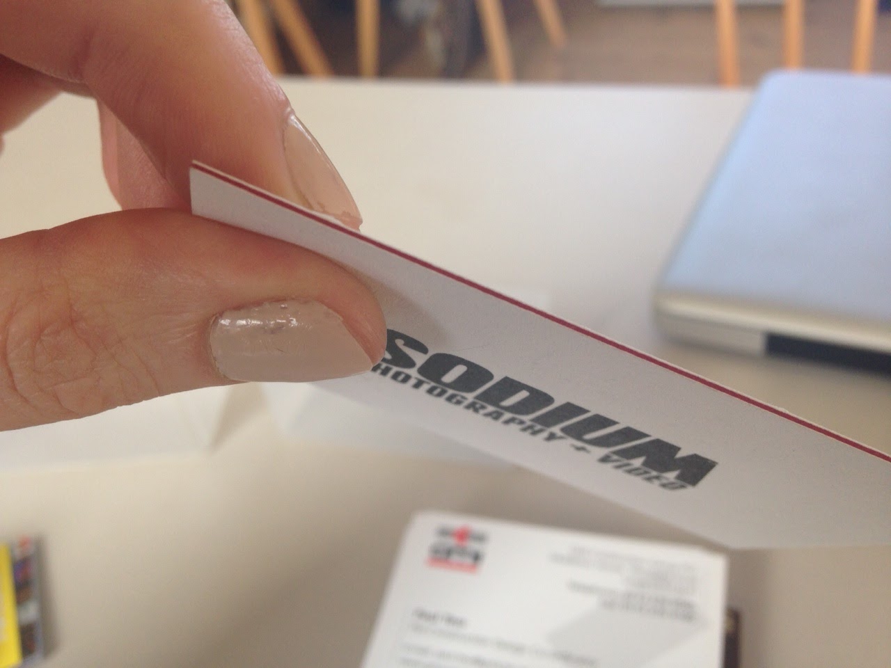
The following are some small booklets that they have in their studio (not by them). I was interested by the composition and layout of them all.
This small booklet showcasing photography is extremely minimal, but I'm most interested in the placement of the photographs on the pages. They are placed so that white space is very prominent on each spread, meaning that the viewer can pay more attention to each image as they are flicking through. Overall it is a
little too bare however, so it lost my attention as the photographs are quite hard to take in and there isn't much text at all.
-
The large text completely covering the first spread in this booklet engaged me. It seems unusually big compared to the size of the booklet - it is quite overbearing but something about it works, it forces you to take in atleast some of the words.
The text heavy pages paired with minimal spreads using clear photographs create a nice contrast.
-
I like the fold out parts of this small booklet as it makes it stand out from other publications. Anything that makes a book different from a normal layout creates interest within the reader who can open and fold out certain parts to reveal more.
-
The different sizes of the pages and the layers throughout this booklet makes flicking through it more enjoyable and fun. The punched holes are pretty unnecessary but it adds an extra element that adds to the neat aesthetic. This booklet was a bit dull however, with the choice of outer colour being a little off.
-
This small lookbook is very pleasing as the front cover is completely blank - why? Just what is inside? On opening it you are greeted by essentially another front cover which displays the artist's name on bright yellow stock - this pop of colour works so well against the dull grey. It also matches up with certain elements of her designs that have yellow in them.
-
-
-
-